Overview
Complete rebrand of Vain hair salon.
Timeframe
11 weeks (113 hrs )
Jan – Mar 2022
Client
(School project)
Roles
Branding, research, web design.
Tools
Adobe Suite: InDesign, Photoshop, Illustrator, AfterEffects. Figma.
Collaborators
Solo
———
Problem
Vain is a well-known salon that specializes in bold styles in Seattle. The brand lacks cohesion between its three physical locations, website, print collateral, and environmental graphics. This disconnect harms customer trust.
Solution
The goal was to rebrand Vain salon and build a complete brand style guide. This would lead to a direct increase in customer trust and overall sales.
How might we build a new identity that reflects Vain’s vibrant personality and maintains consistency across all avenues?
Research & Demographics
I began my process by researching Vain Salon. I aimed to find out who they are, what their values are, where they began, and what they are known for.
Vain started in the Belltown neighborhood of Seattle in 1996. Since then, their reputation as a cutting-edge, affirming, styling & coloring salon began to grow. Customers know them for celebrating personalities and styles of all kinds. People go to Vain for high-quality, expressive hair styling. Vain is a community-forward business that participates in activism and mentorships.
A statement from their website that stood out to me was: “We celebrate the diversity of our city and welcome all people into our salon.”
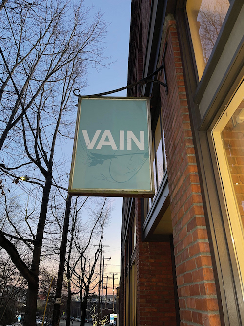
Vain's current storefront sign.
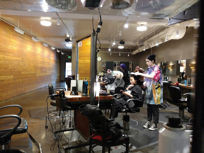
Vain's current interior.
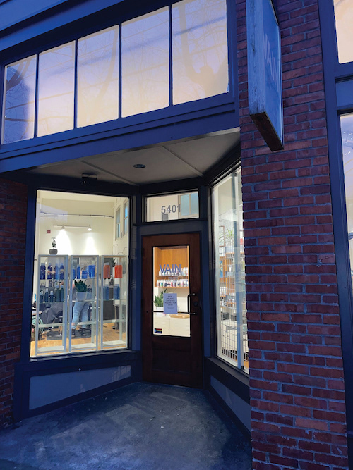
Vain's current storefront.
Process & Work
During my audit of Vain, I found the company history on their website, and I also noticed things that could be improved. Their website was simple but lacks personality. The line-height of body text did not adhere to WCAG guidelines, and their three attached social media accounts lacked cohesion.
While visiting the three locations, I noticed that except for the Vain logo (which seems to be simply their name in Helvetica all-caps) the inside of the three locations also lacked consistency. The print collateral didn’t reflect Vain’s vivid personality. It seemed to me that Vain’s exciting personality as demonstrated through word of mouth Google reviews was incongruent with the lackluster representation of their current brand identity.
This was the problem that I was delighted to solve.
Vain's website prior to the rebrand.
Vain's website prior to the rebrand.
Though I was excited to jump into color palettes, patterns, and typefaces, I knew that I should do a thorough exploration of the brand first. I began by laying out “tonal territories”.
In this part of the process, I worked with two other people who were also doing solo rebrands of Vain. By collaborating on this step, we were able to keep each other on track in discovering Vain’s core brand traits, instead of designing by projecting our individual styles onto Vain.
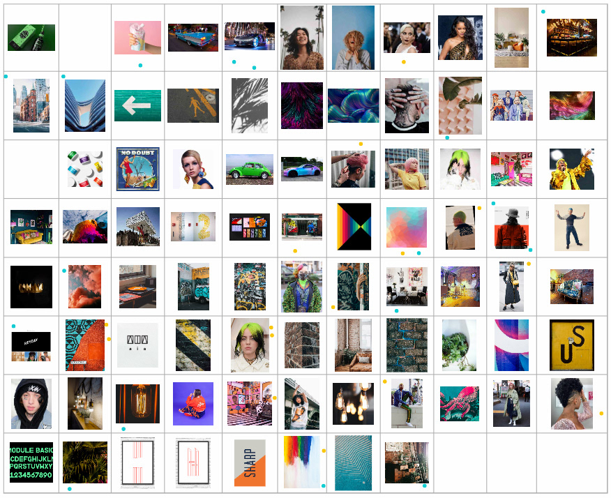
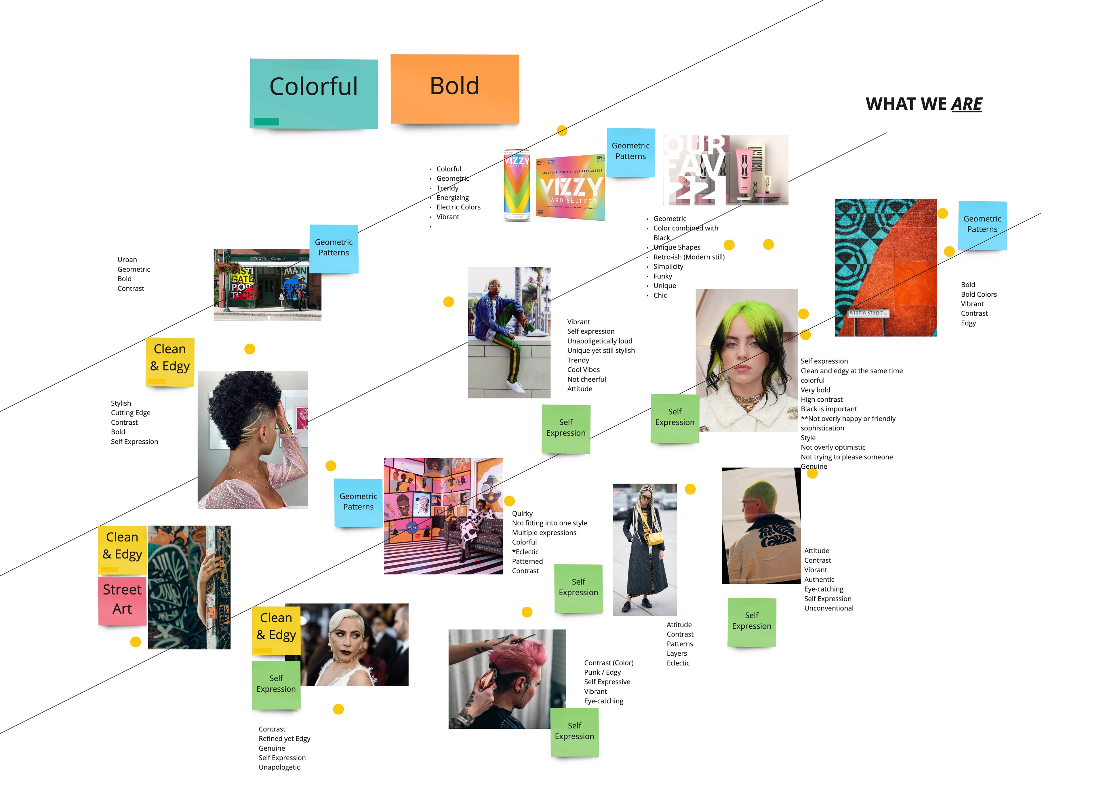
To create tonal territories, we each scoured the internet for photos that reminded us of Vain’s personality. We added these photos to a Miro board. Next, we used dot-voting to discover which images were most representative of Vain. We organized the photos into three categories: “what we are”, “what we are not”, and “maybe”. Then we took turns verbalizing what drove us to sort the images into these categories.
Tonal territory possibilities.
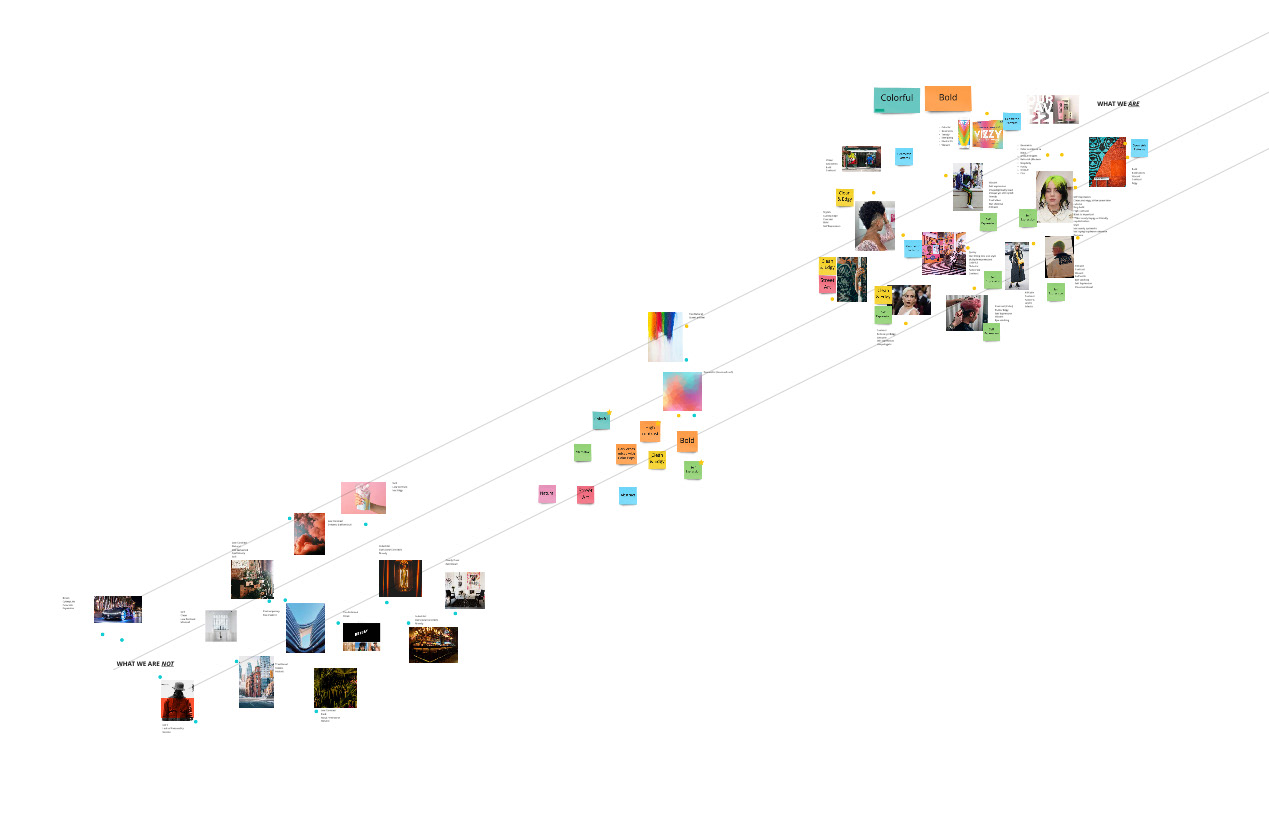
"What we are not." "Maybe." and "What we are."
Tonal territory description process.
At the end of this step, we were left with a long list of words and phrases that described Vain’s personality.
We consolidated this longer list into six categories: “Contrast”, “Refined yet edgy”, “Eclectic”, “Authentic”, “Vibrant”, and “Bold”. We then vetted these categories and narrowed them down to the three most poignant descriptors: “Refined yet edgy”, “Authentic”, and “Vibrant”. These were the three Tonal Territories of Vain Salon.
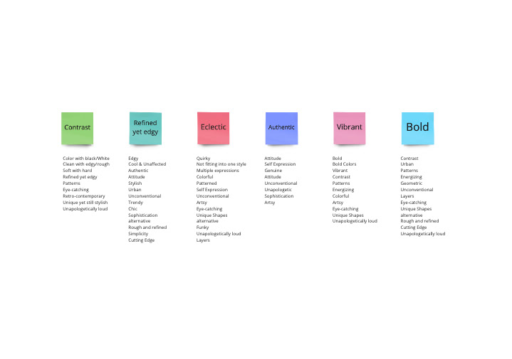
The first draft of Vain's descriptors.
Next, we used the tonal territories to help inspire a positioning statement.
“Vain is the hair salon that encourages you to express yourself fully. That's why we seek highly-skilled stylists that are unafraid to take risks to transform you. We strive to embolden our clients to unapologetically be their authentic selves.”
This statement would serve as the North Star to help guide us through the next steps and eventually I would modify it into a mission statement.
This statement would serve as the North Star to help guide us through the next steps and eventually I would modify it into a mission statement.
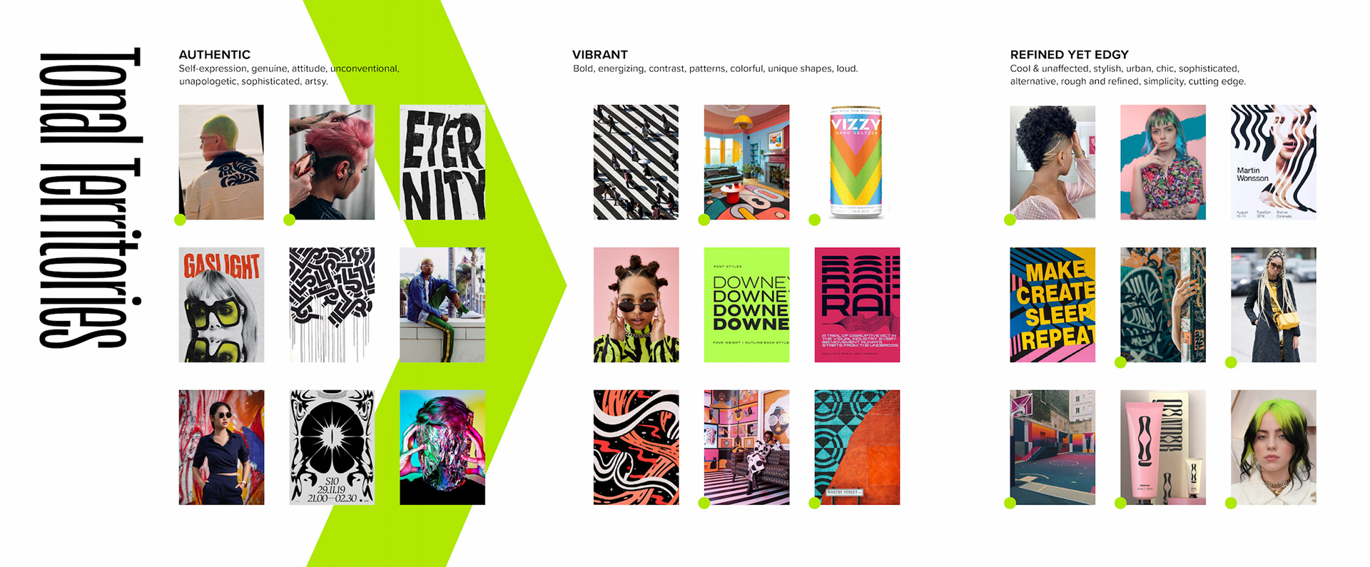
The three tonal territories.
At this point, the group disbanded and finished out the rest of our rebrand as individuals.
I used these three tonal territories as jumping-off points to create Concept Boards. Each concept board was a visual exploration of the tonal territory that it represented. These included typefaces, colors, photography, and patterns/textures.
I spent the next few weeks vetting these concept boards. I eliminated repeating elements and anything that didn’t feel like it truly reflected the positioning statement. I consolidated these three boards into one. Looking at this distilled, highly explored, visual representation of Vain’s true personality, I chose a Brand Concept phrase that represented this board, and Vain as a whole:
“Unapologetic style.”
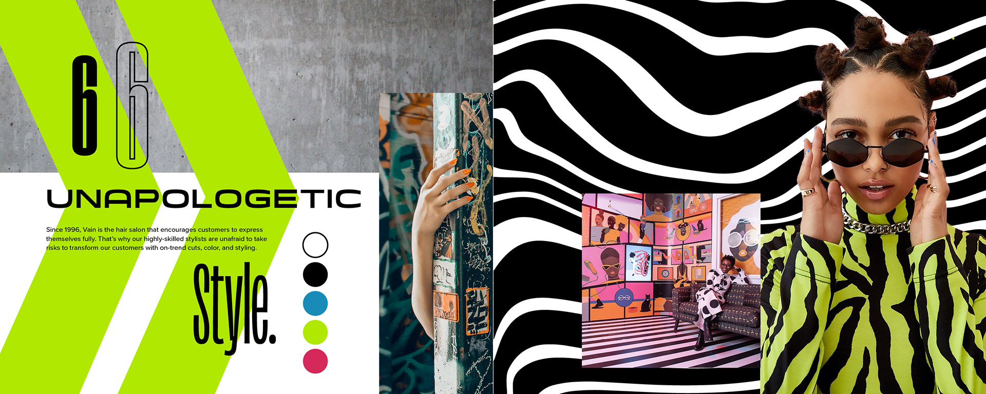
The concept board.
I charted a calendar of deliverables to help manage the immense project and began the brand guide document in InDesign.
The deliverables included customer touch-points and all of the ways that the brand might be applied; as well as the finished print-ready guidebook itself. The goal of the brand/style guide was: to describe everything that Vain was and was not, to show how to apply the brand to physical and digital assets, and demonstrate the overall persona of the company.
All whilst making sure that the guidebook itself reflected the new brand identity. I jokingly call this “Brandception” (referring to the 2010 film Inception) because of the many layers. The brand guide would be available for Vain to pass to future designers and to be used as a rulebook for the visual identity of the company.
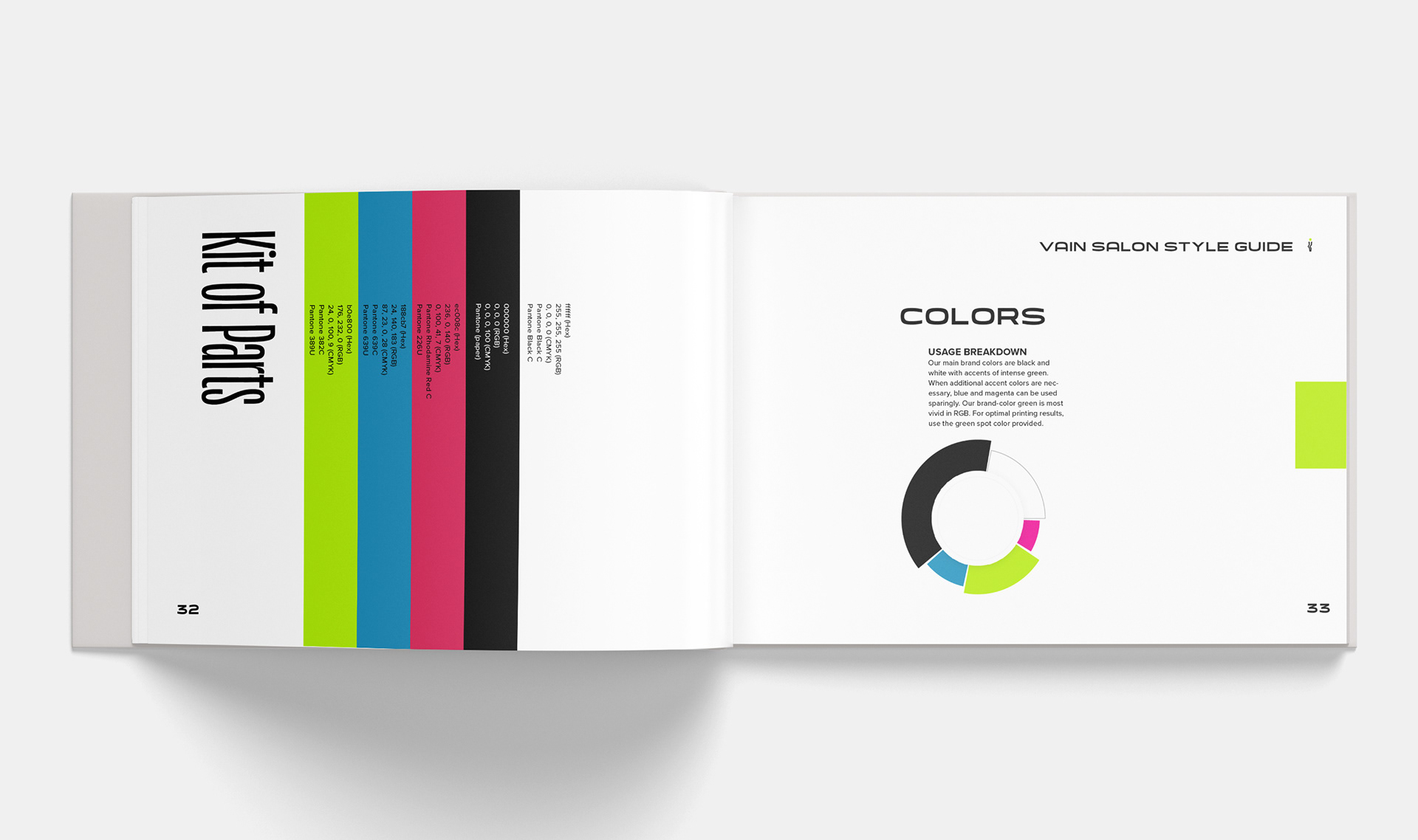
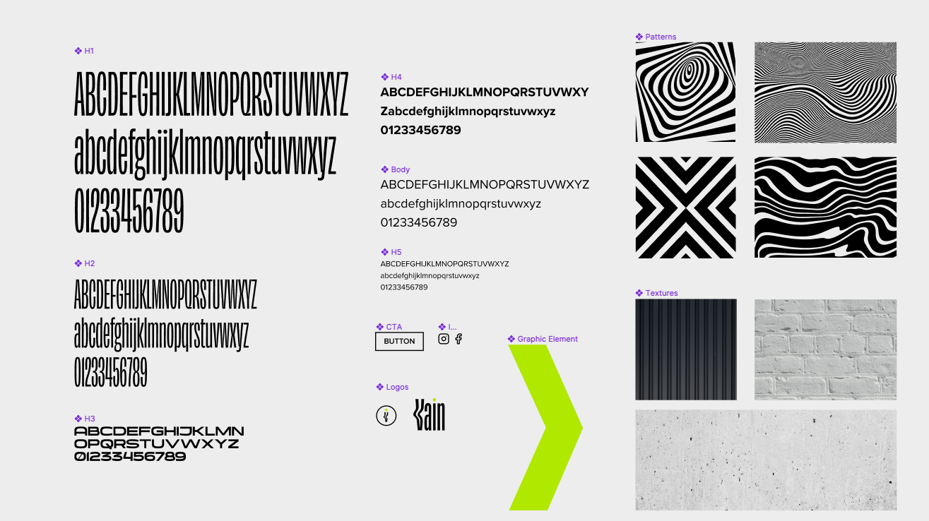
The color section of the brand guide.
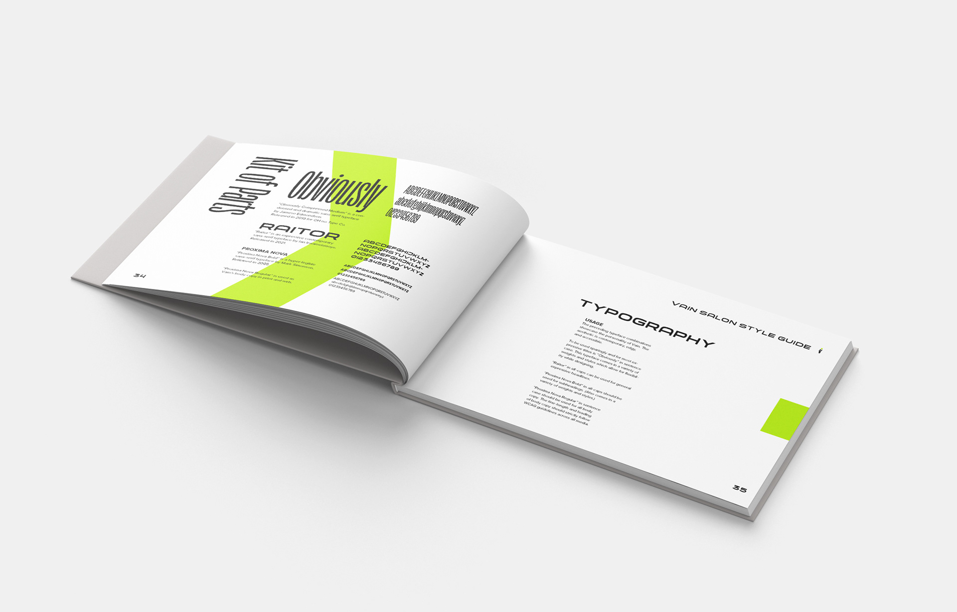
Typography section of the brand guide.
Using the concept board as my guide, I began sketching brandmark options.
Ultimately I settled on a warped-looking condensed sans-serif wordmark that reflected the Optical Art style patterning from my concept board. I expanded the wordmark to several versions for modularity.
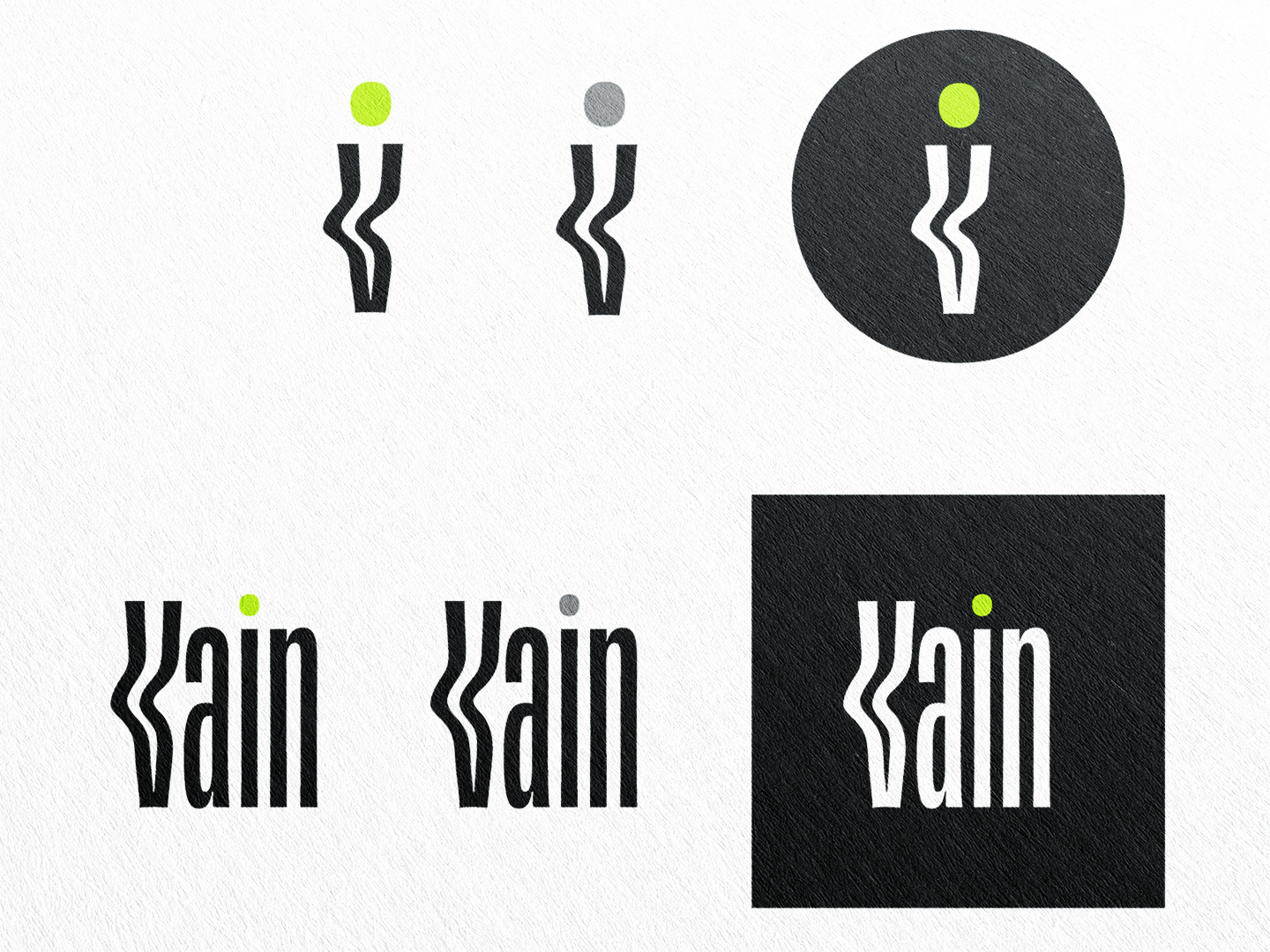
My redesign of Vain's logo.
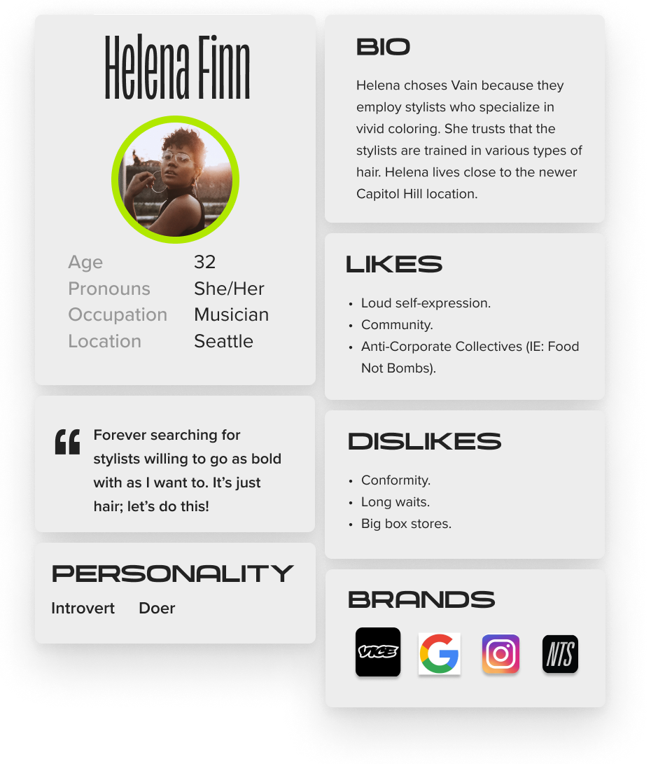
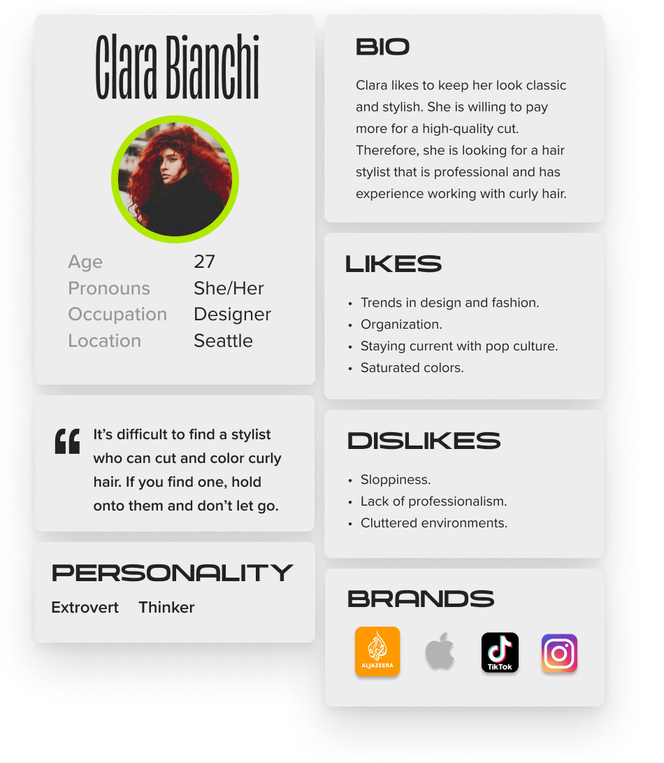
Based on the information I had gathered about Vain from word of mouth, online reviews, and their website, I created two user personas.
The needs and pain points of these users would serve as guides when thinking about how Vain’s brand should extend to different touchpoints.
I explored how the brand should be applied as environmental graphics to interior spaces.
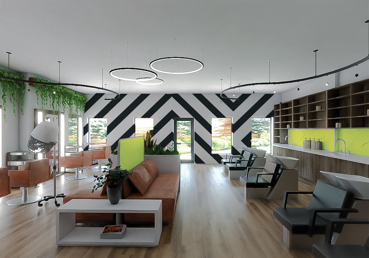
Interior design concept.
Wall graphics concept.
Interior design concept.
I further brought the brand to life by demonstrating how it would be applied to apparel and guerilla marketing.
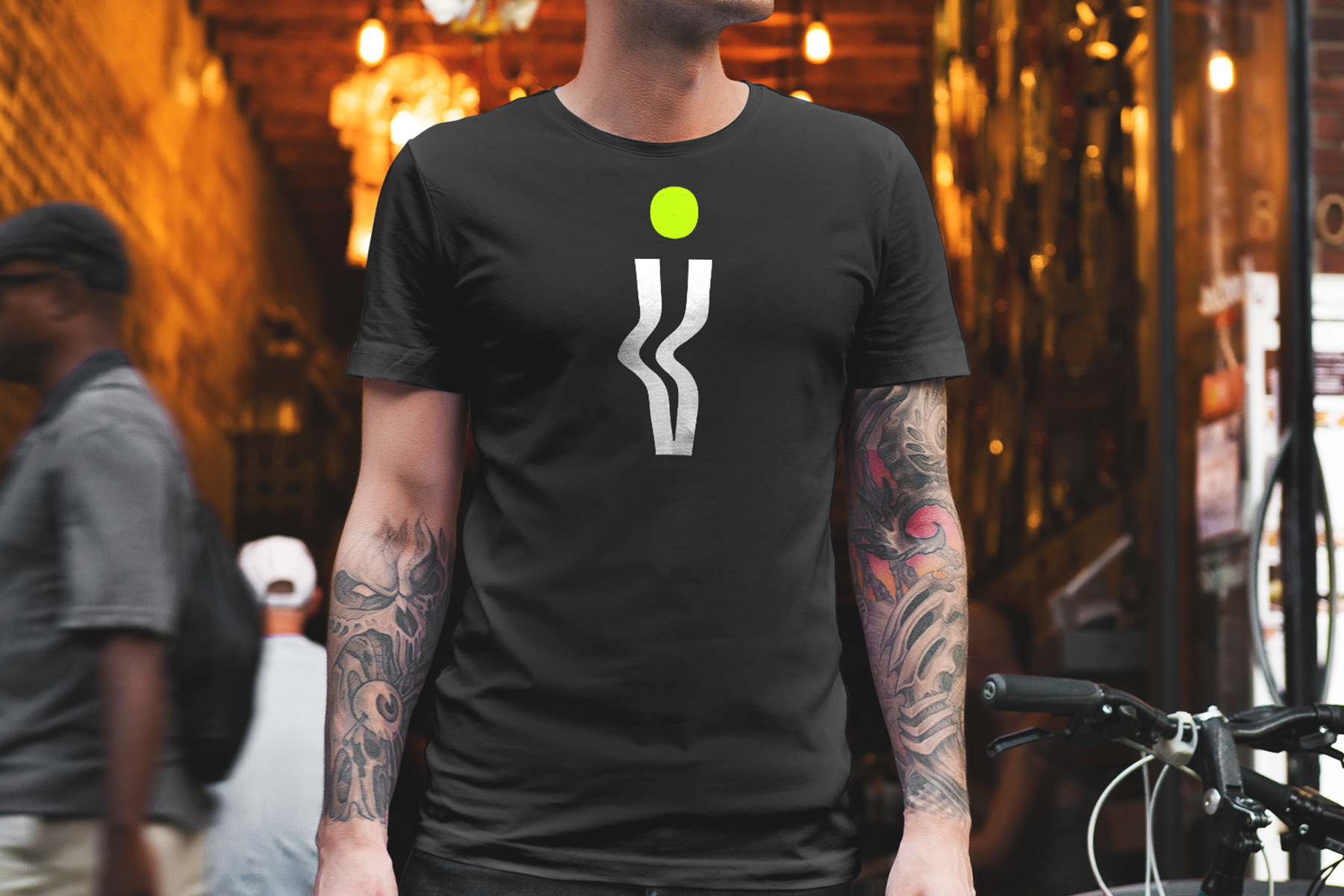
Logo applied to t-shirt.
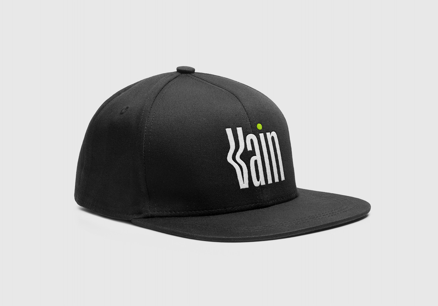
Logo applied to snap-back baseball cap.
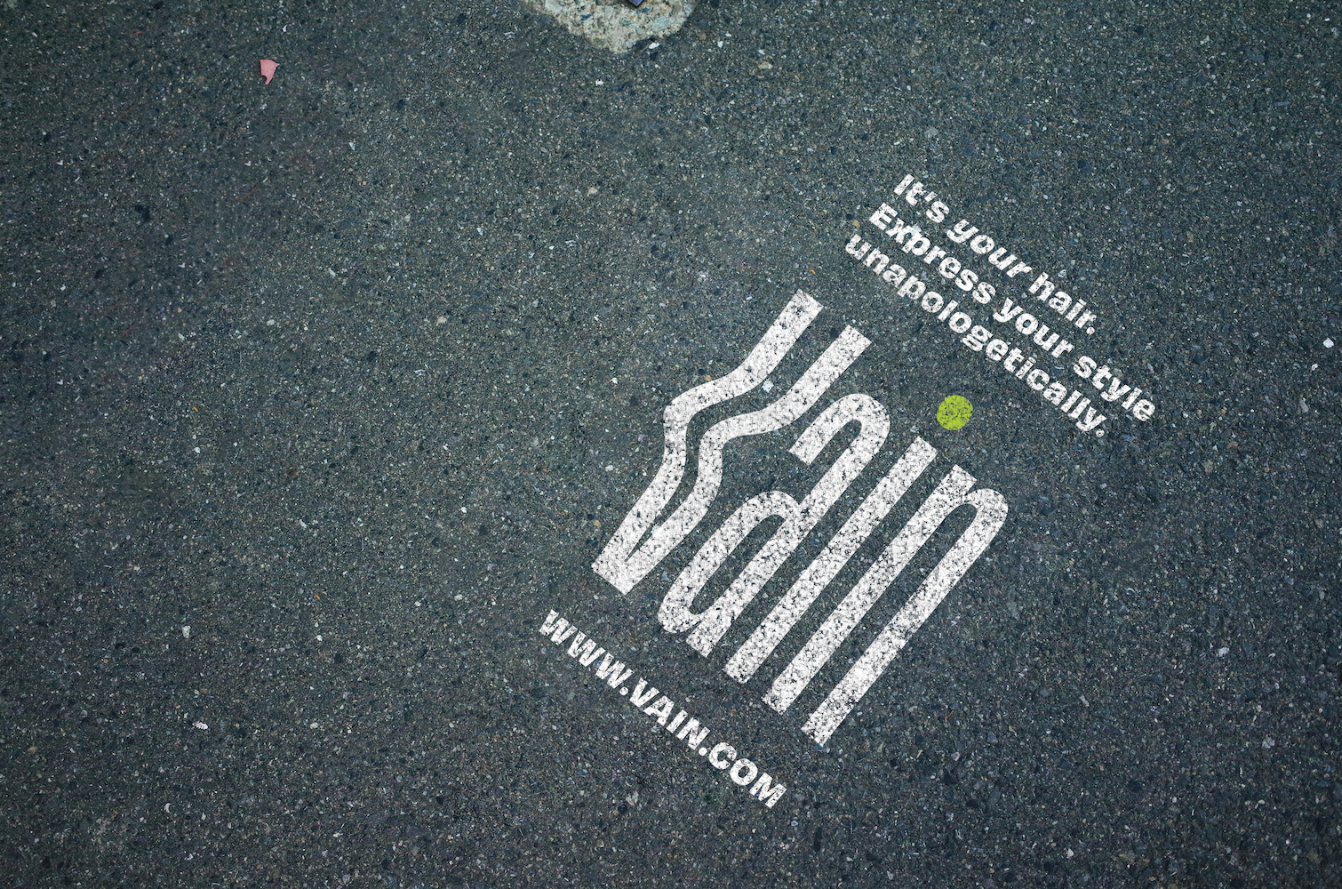
Guerilla marketing concept on pavement.
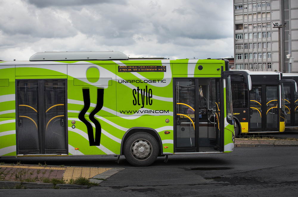
Vinyl bus wrap concept.
Next, I demonstrated how the brand should be applied to a business card and identity suite.
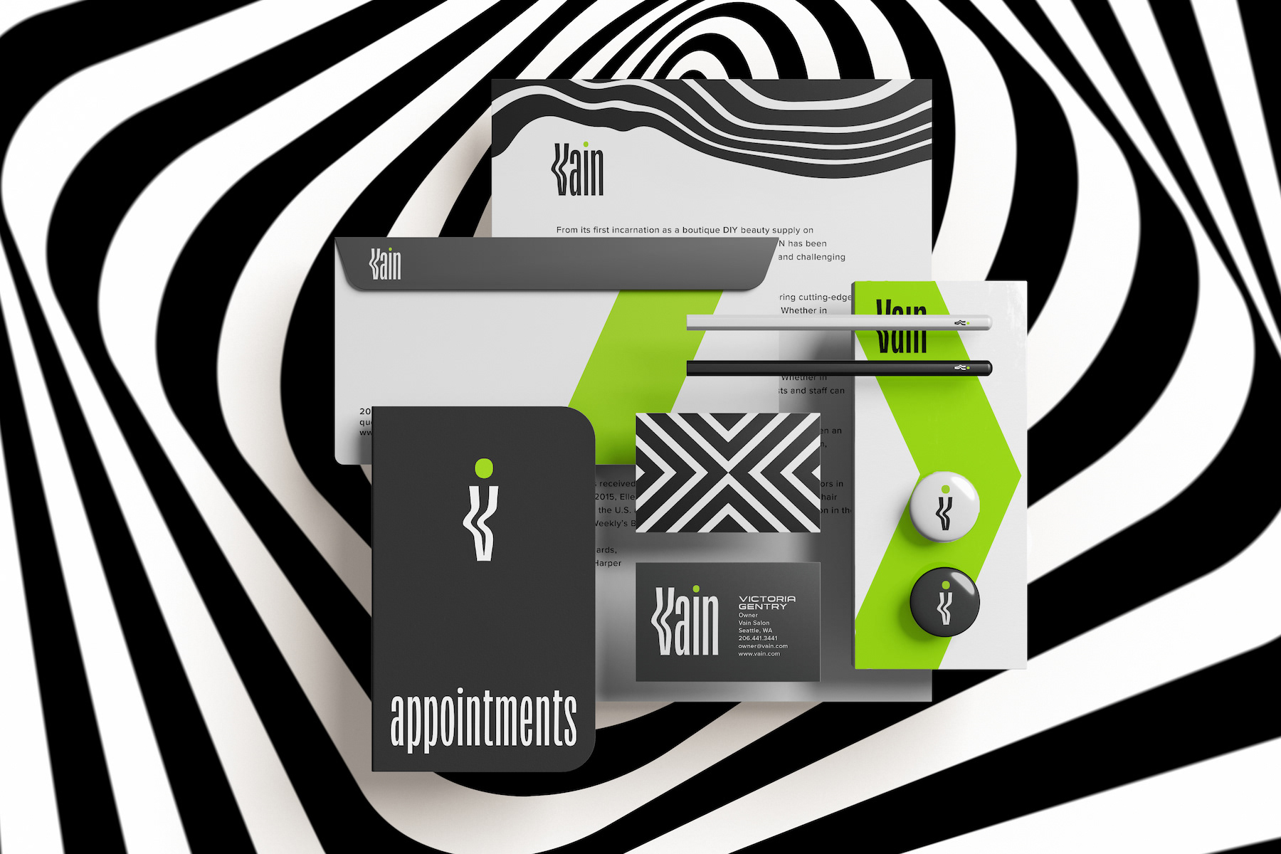
Identity suite.
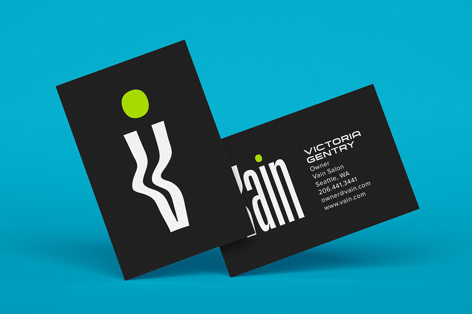
Business cards.
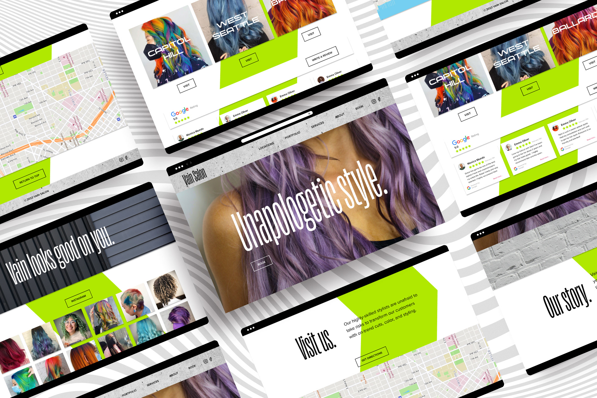
Most people’s first contact with the salon is through its website.
This puts even more importance on the fact that the website should be in line with the rest of the brand, it should be as accessible as possible, and easy to use. Using Figma, I designed a clickable high-fidelity prototype of what Vain’s landing page should look like according to its new visual identity.
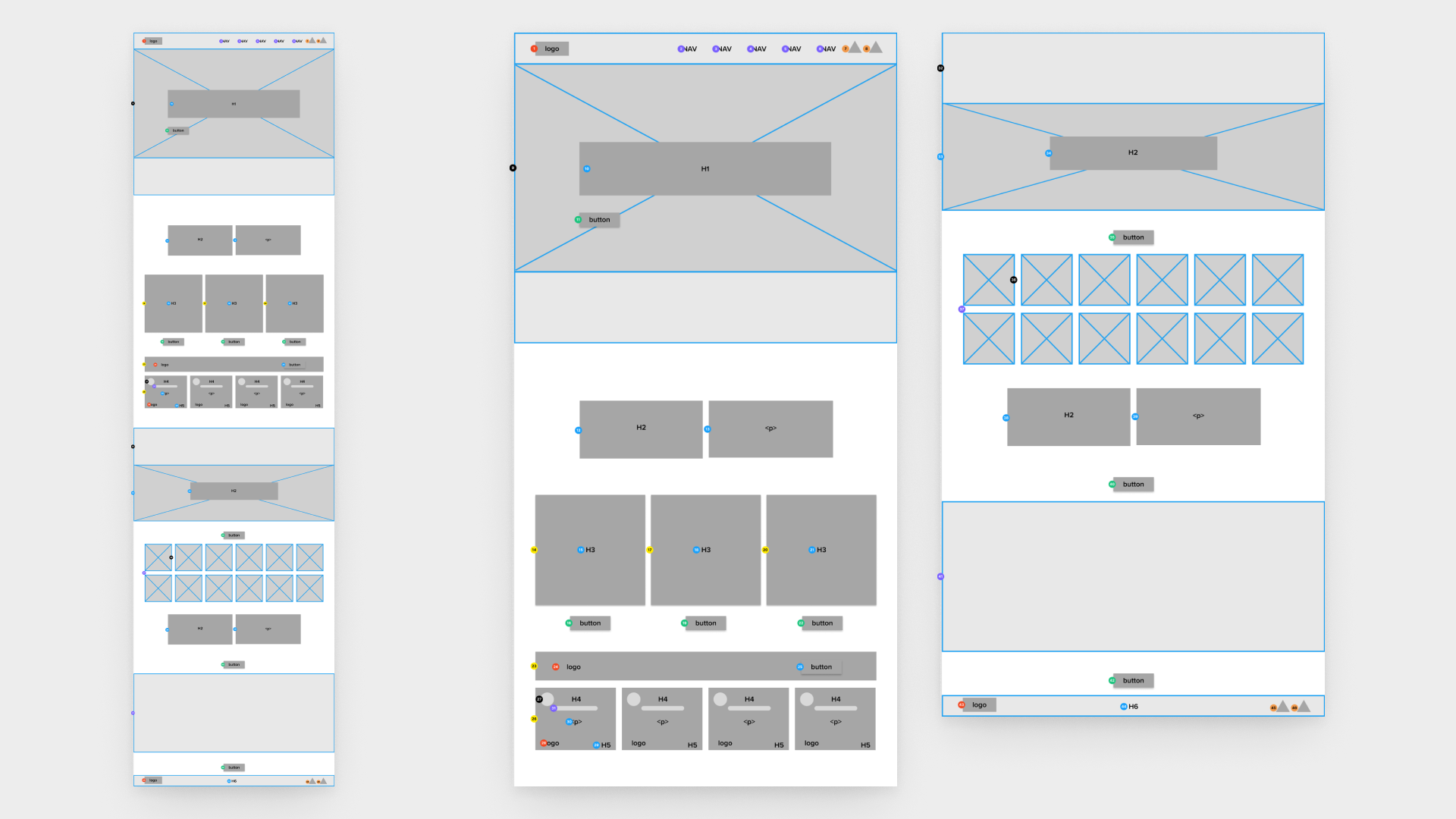
Annotated wireframe of the landing page.
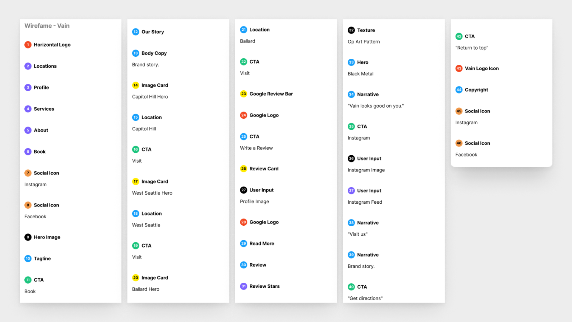
Wireframe annotations.
The component system in Figma.
To ensure that the new site was usable by a wide range of people, I adhered to the Web Content Accessibility Guidelines regarding color contrast and text size & spacing.
I conducted a color blindness audit to ensure that the visual identity of Vain would be accessible to those with Deuteranopia, Protanopia, and Tritanopia.
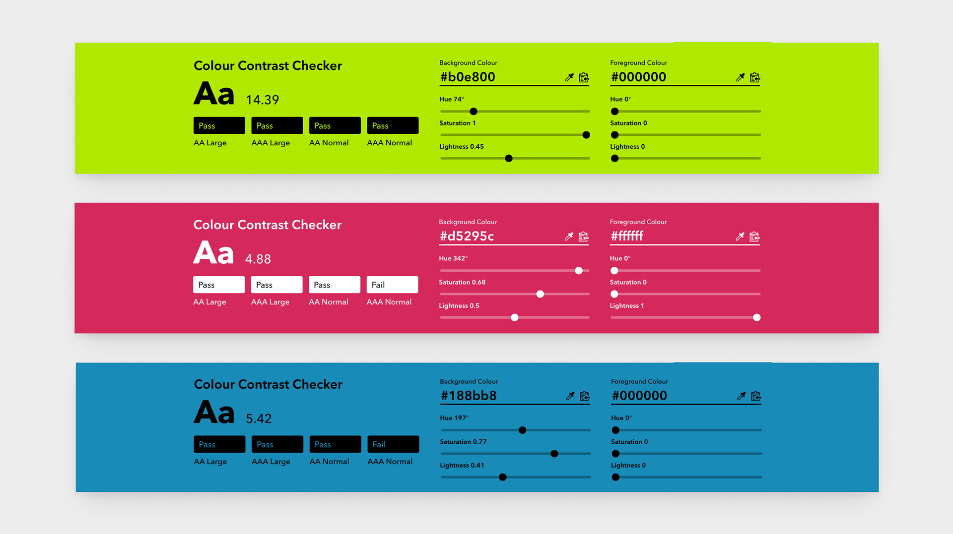
Color contrast audit.
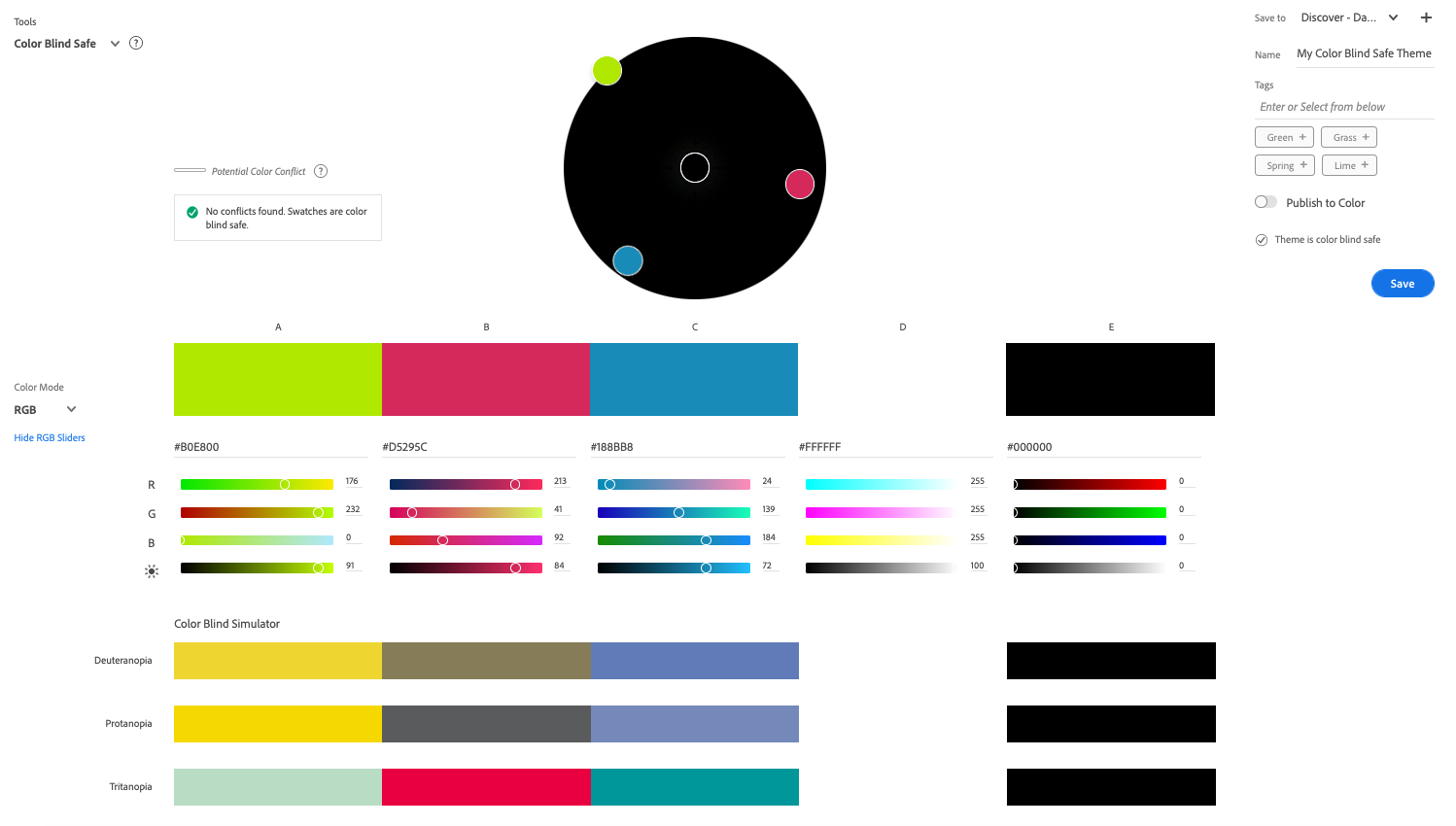
Color blindness audit.
Color was a challenge, as I chose the primary brand color to be a vivid green to match Vain's bold personality.
This green is also most true in RGB. When converting to CMYK for print, this color loses its vibrancy and no longer fits the brand. To remedy this, I translated the color into the closest Pantone match. I included these instructions in the guidebook.
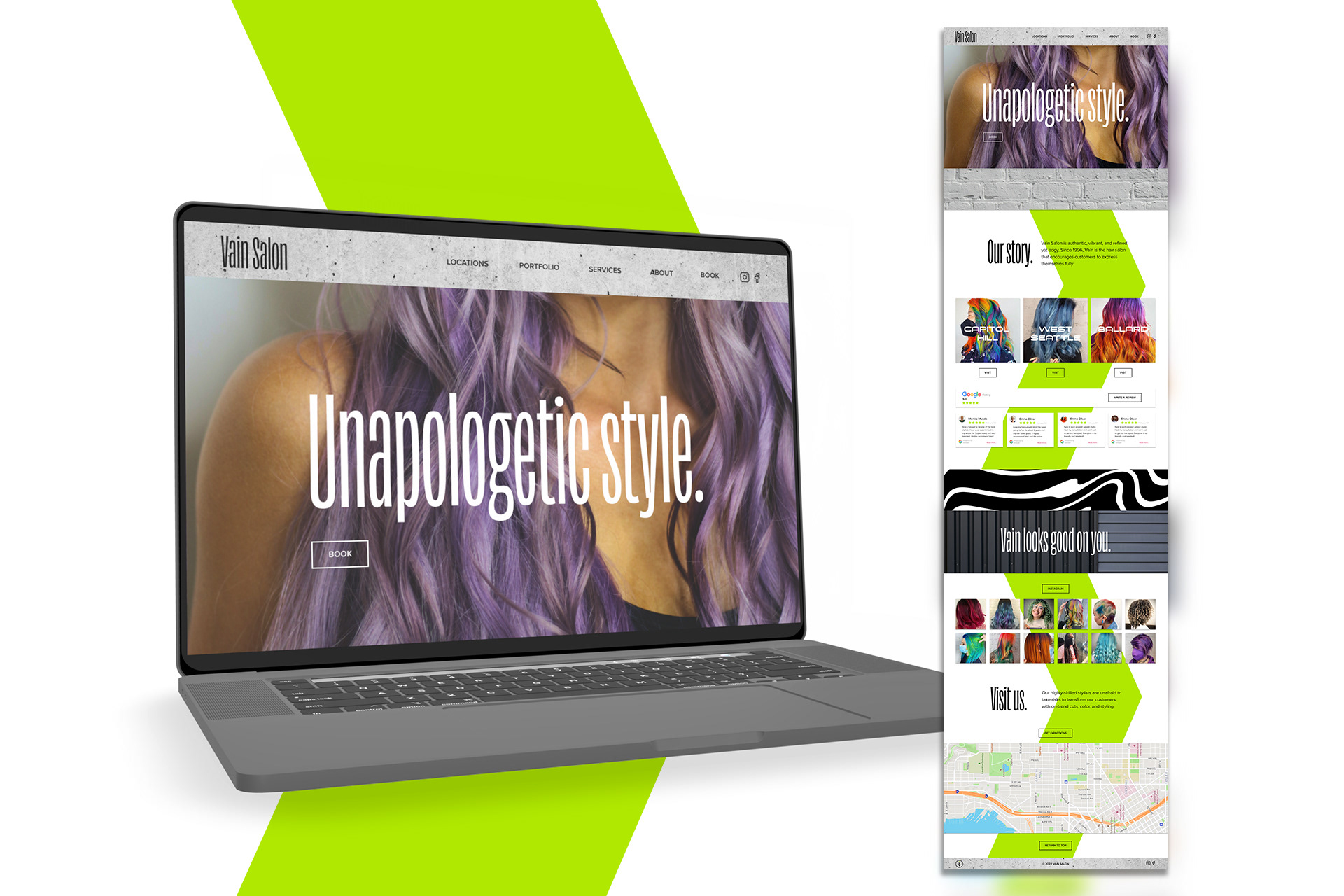
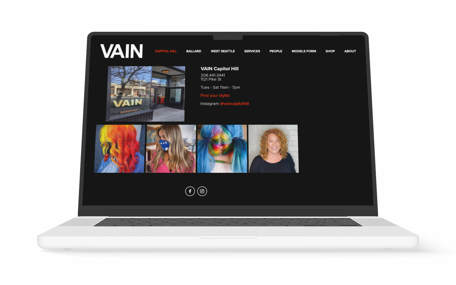
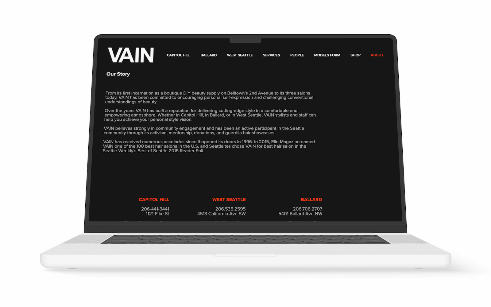
My redesign of Vain's landing page.
This also meant that I used fewer “op-art” patterns and brought in some of the brand’s other visual assets.
My redesign of Vain's landing page
In an exploration of what the brand should look like in motion, I used Adobe AfterEffects to demonstrate how the logo and patterning might behave.
This could be used for social media or the web. Motion graphics could be an exciting way to communicate Vain’s particularly electric personality.
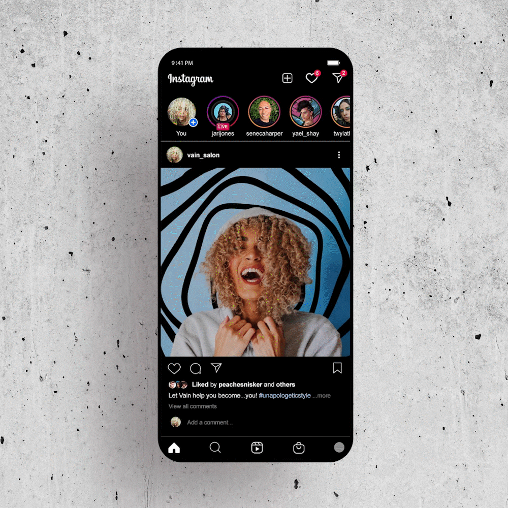
The application of motion graphics to Vain's social media.
Finally, I put everything into the brand guide. The sixty-page brand guide shows how to apply all of these assets. It also details how to approach color, typography, and photography.
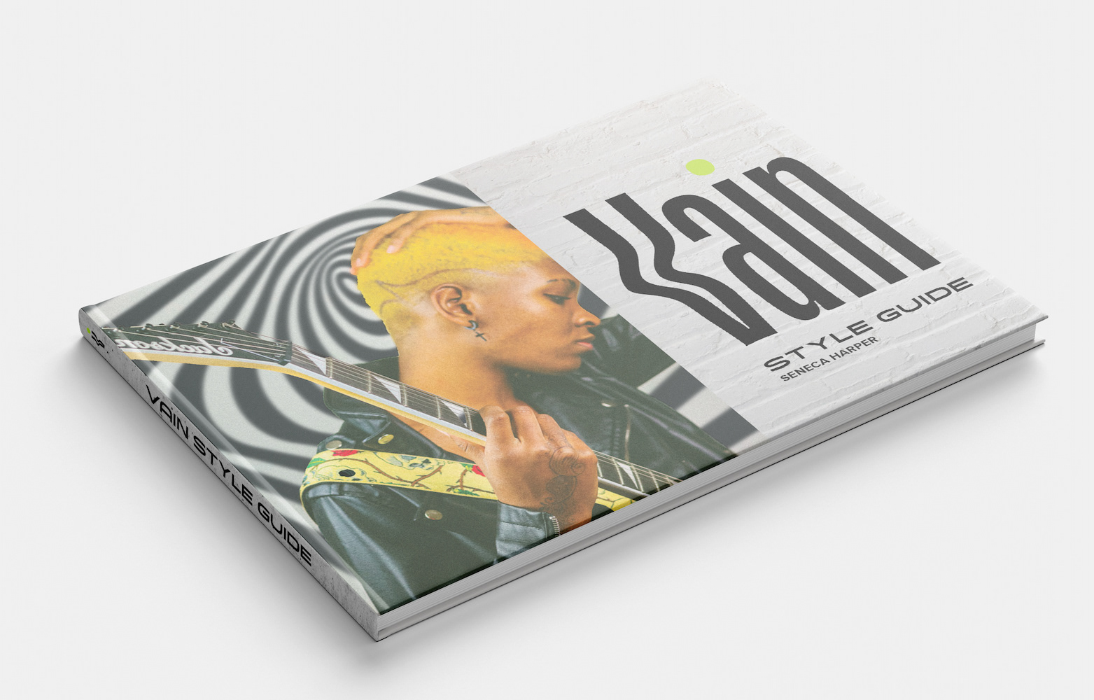
The cover of the brand guide.
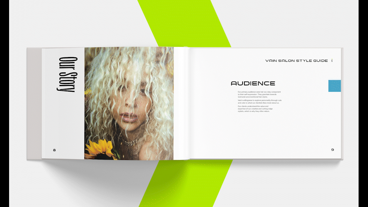
A few select pages from the brand guide.
Takeaways
Completing this rebrand by myself was a heavy lift, but ultimately it was an extremely rewarding experience.
If given the opportunity to do this project again, I would ask for at least one other designer to join my team. This would ensure that we stayed true to our user needs as well as maintained fresh perspectives.
It can be difficult to quickly switch back and forth between the left and right brain. I learned that once I allowed myself to commit to focusing on only visuals, then writing the accompanying copy in separate sessions, the writing came much more naturally. This also helped me keep the copy in “voice” with the brand.
My rebrand of Vain stays true to the attributes that we uncovered in our process while also providing Vain with a vibrant and current refresh. If Vain Salon were to take on the identity that I created, I’m sure they would experience a growth in customer trust and overall sales.
I’m very much looking forward to more brand work in the future!

← Branch

Anchor: AR Interface →