Overview
Grid Principles is a design system that I built, implemented, and maintained for a digital design agency.
Timeframe
July – September 2022
Client
Grid Principles; design agency
Roles
Research, UI Design, UX Design.
Tools
Sketch
Collaborators
Solo (with feedback from Seun Erinle: Art Director, Greg Brock: Developer, Logan Wells: Visual Designer, and Brennon Burnett: UX Intern)
–––
Problem
Grid Principles is a small mission-driven design agency that specializes in digital solutions and building unique websites.
The company only had a few Digital Designers and needed a way to further streamline their wireframing and low-fidelity drafting process.
Solution
My goal for this project was to create a reusable, flexible, and scalable design system that saves time without limiting the company’s designs.
The design system would need to be simple to implement. It should increase efficiency for the designers and the developer, and should help reduce design debt.
Research
“Atomic Design is a methodology created by Brad Frost seeking to provide direction on building interface design systems more deliberately and with explicit order and hierarchy.”
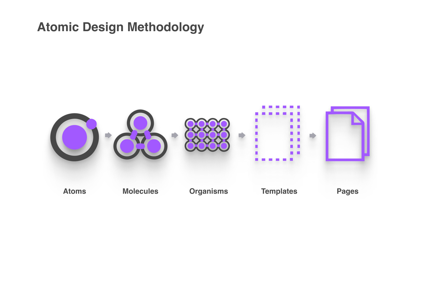
Diagram of the Atomic Design methodology.
As the newest Digital Designer added to the Grid Principles team, I had fresh eyes on their processes.
I knew right away that implementing a basic design system would help the company move through its web design process more quickly.
The main challenge of implementing a design system at Grid Principles would be to create a system that was extremely flexible.
This would allow for more creativity in design, as Grid Principles is known for its bespoke websites. Because the company doesn’t rely on a static user interface, the system would need to be easy to tailor and adjust components for each individual project.
I started by exploring other companies’ design systems such as REI’s Cedar, Google’s Material Design, AirBNB, Radiance, Henry, Ant, Carbon, and Microsoft’s Fluent.
These design systems are all mature, streamlined, and culminate in a variety of programming languages.
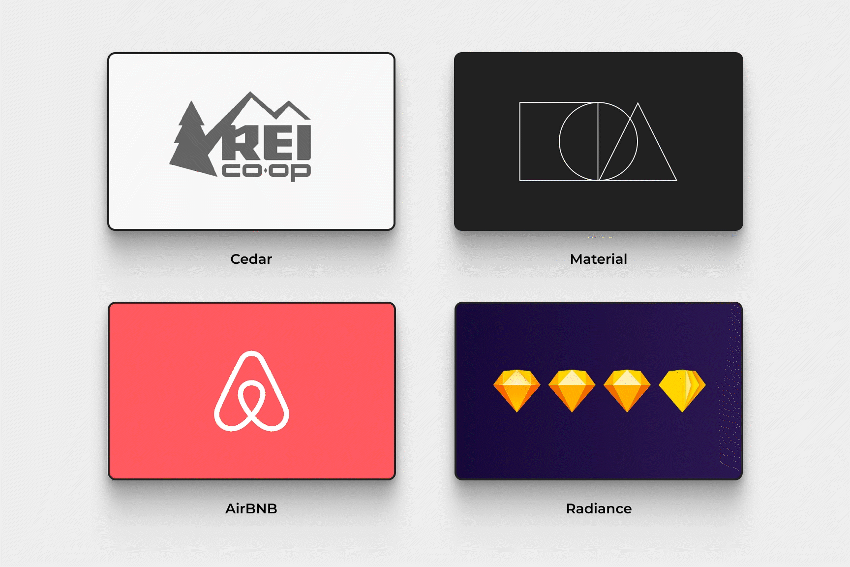
Noteworthy design systems that influenced my work.
As I interacted with these design systems I realized that the series of building blocks that comprise a design system, (Atoms ⟶ Molecules ⟶ Organisms ⟶ Templates ⟶ Pages), would need a living component library.
This way, the designer would be able to tailor the particles to create their own design system for each project as opposed to whole templates and pages that may be too inflexible.
Another interesting challenge is that Grid Principles uses Sketch for visual design.
Another hurdle was building in Sketch as opposed to Figma. Despite being better versed in Figma, I was able to adapt to the differences and master Sketch to the same level.
*It’s important to note that what we call “Symbols” in Sketch are referred to as “Components” in Figma.*
User interface design practice in Sketch.
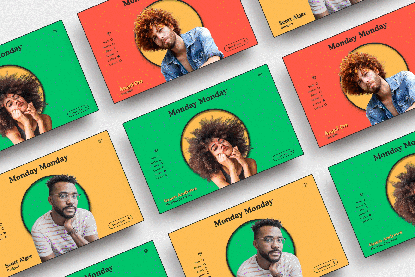
For the next step, I explored every website that Grid Principles made.
I took note of the most commonly used styles and elements to start the design system.
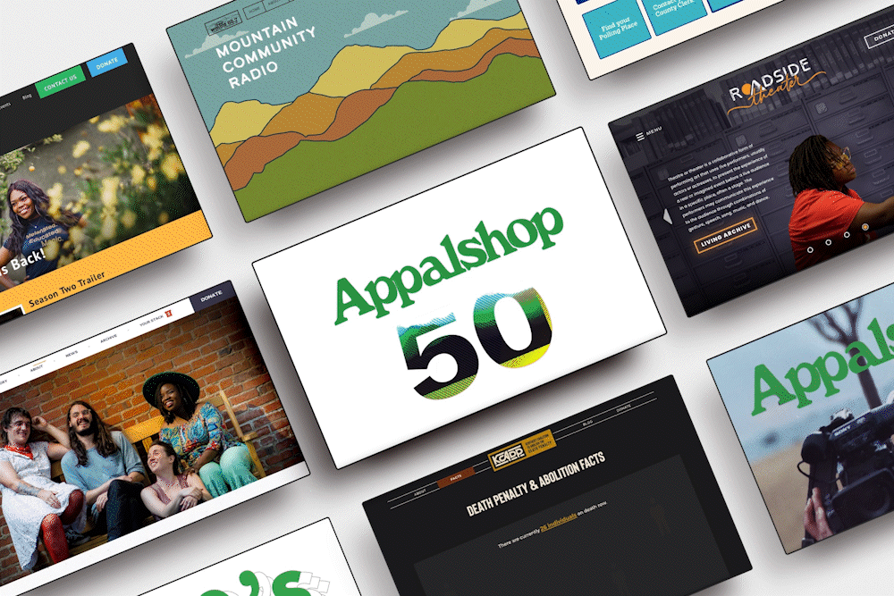
A sampling of Grid Principles' websites.
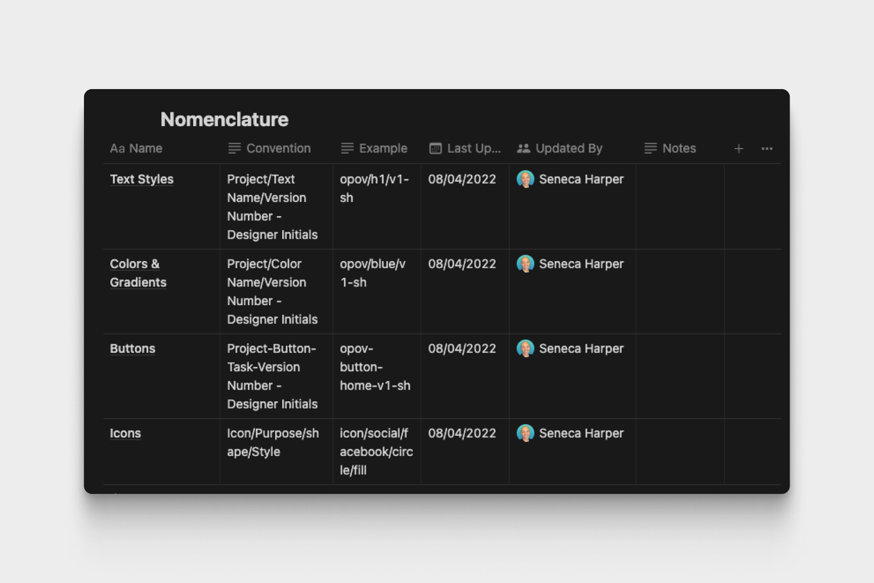
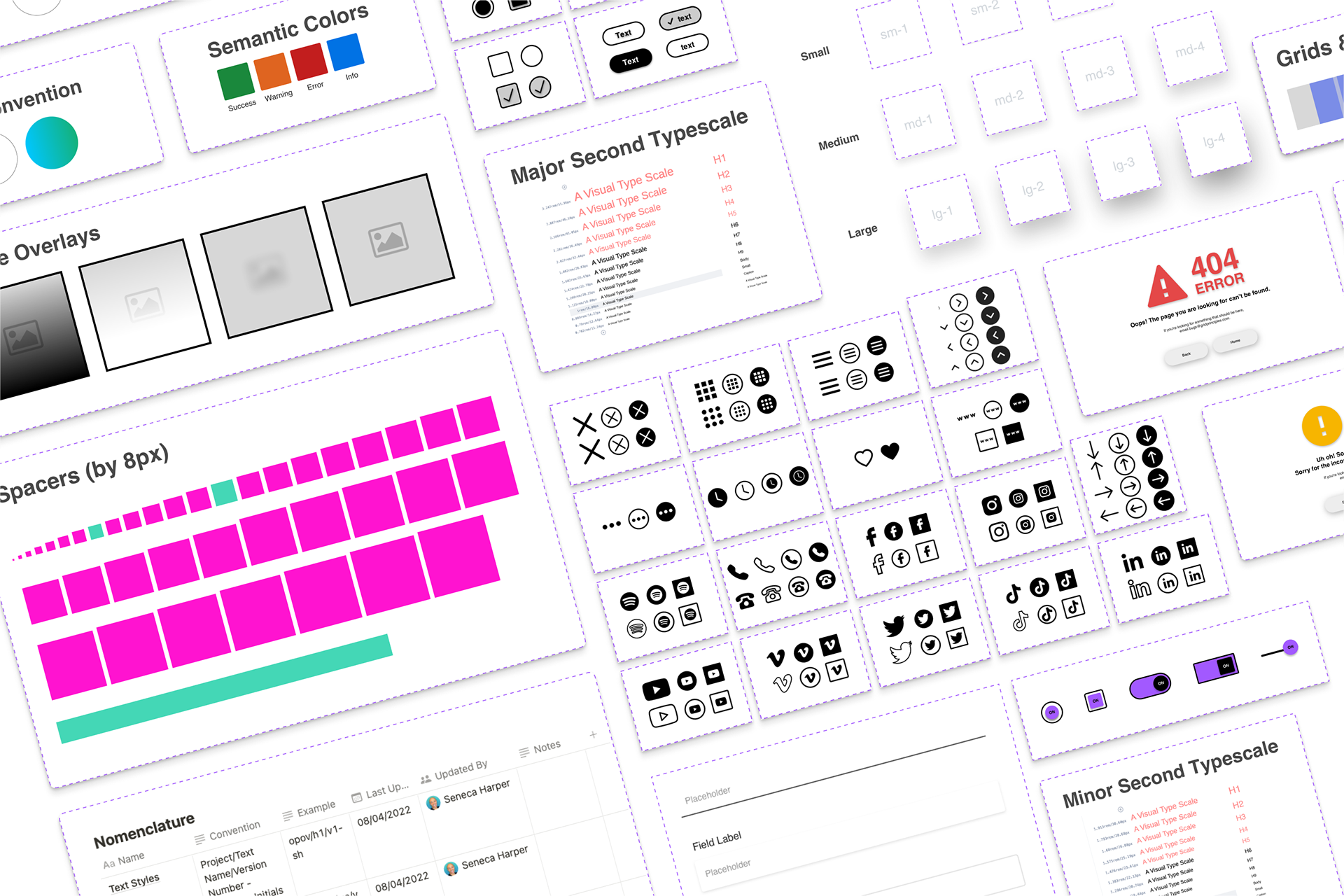
A table of the design system's nomenclature.
Nomenclature
Before crafting my first ‘Atoms’, I consulted with the owner, lead designer, and developer to establish a uniform nomenclature to help govern and maintain the library.
The nomenclature would dictate how components were organized and called up inside of Sketch, keep us organized, and help the developer when it came time to translate visual designs into code.
In Sketch, when a designer defines symbols, layer styles, and text styles, Sketch divides them into hierarchical categories in its symbols and text styles menus with the use of a “/” (forward slash).
Adhering to strict naming conventions and having a well-defined set of master categories gives Sketch libraries an organized structure and reduces confusion and inconsistencies.
Folder-naming demonstration in Sketch.
Next, I prepared a set of slides showing how our design system would work, along with a demo in Sketch that I presented to the company.
I then revised the slides for future use in onboarding. Using all the comments from multiple rounds of feedback, I moved forward with building Grid Principles’ first design system.
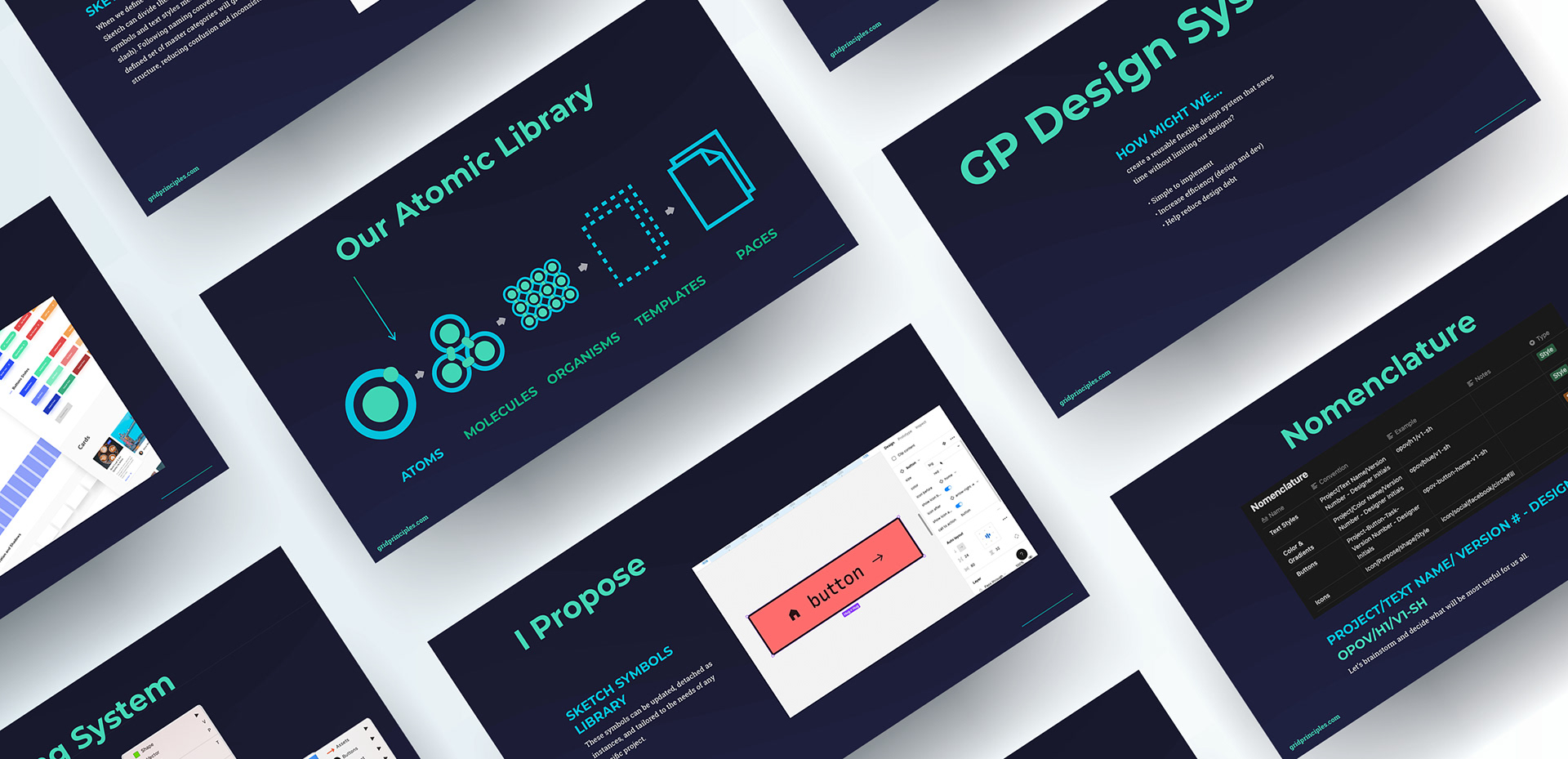
Slides from my presentation for Grid Principles.
I began to build a living library of symbols in Sketch.
These symbols could be updated inside the library at any time, detached as instances, and tailored to the needs of any specific project.
I first started with a 12-column “Grid & Guides” cheat sheet and spacers.
Based on best practices from User Interface and Web Design, the spacers would range from 8 pixels squared to 304 pixels squared. The spacers increase by increments of 8 pixels, with a few additional company-specific sizes.

Representation of the spacing system. (Animated in Figma)

Typographic scale samples.
Next, I created templates for eight typographic scales.
I crafted these in such a way that the designer could simply drop a scale into a project, immediately see how it looks to size, detach the instance, and turn the pre-determined values into text styles for their project.
This would save time on typographic scale conversion.
Colors and Gradients.
Because these would be different for every project, I only needed two elements to serve as templates for the nomenclature used to name and categorize these swatches.
Image overlays are something that Grid Principles uses in every web project.
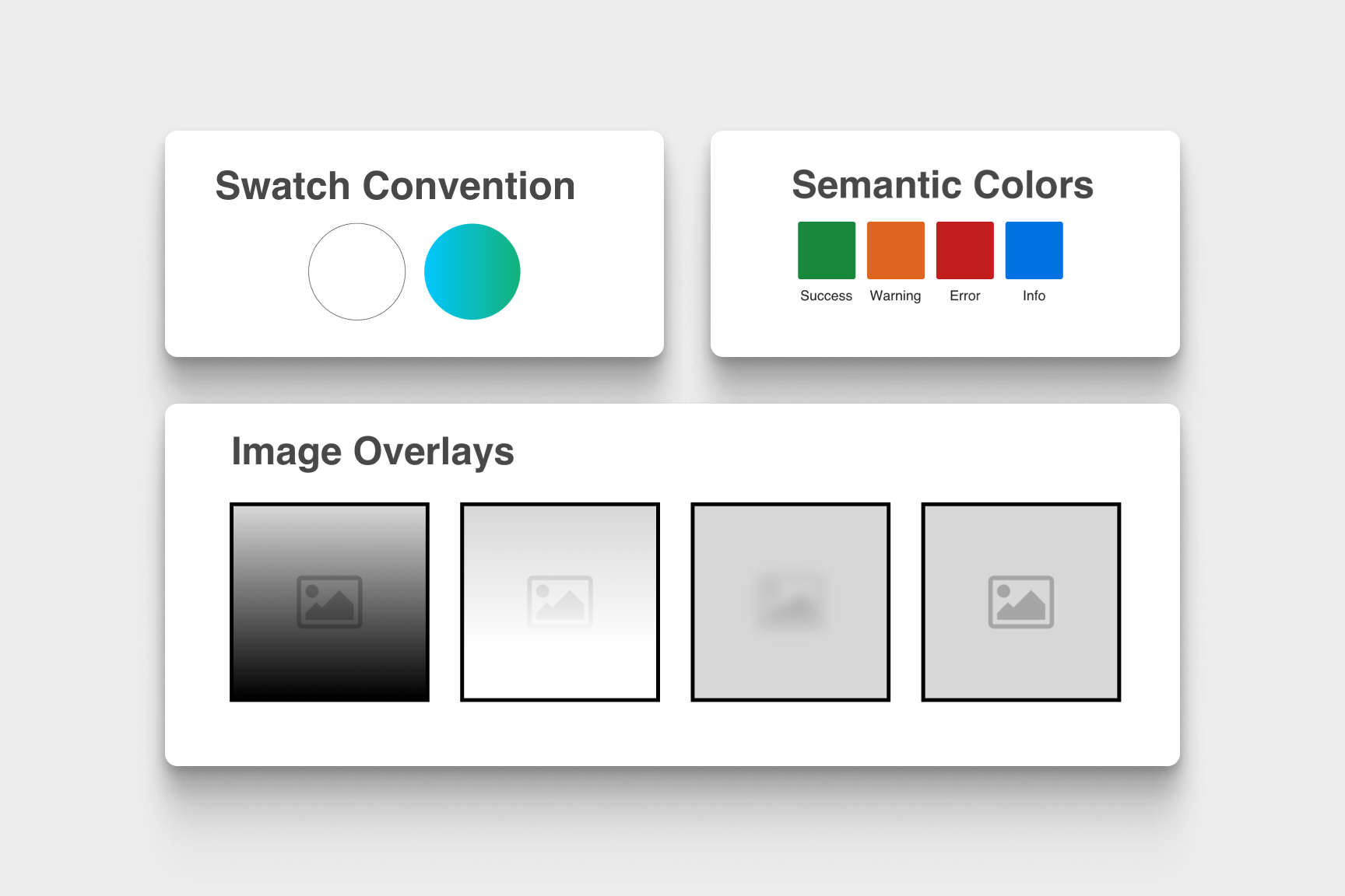
The color, gradient, and image overlay system.
The icon library would be the most commonly used part of the design system.
In my dissection of Grid Principles' previously created websites, I took note of the styles of icons that were most commonly used. I began to populate the library with these icons, each having about 2–4 variants per icon.
I chose to make them at a size of 46x46 px to help ensure cohesive size across elements (WCAG suggests 44px as the minimum size for touch-targets.).
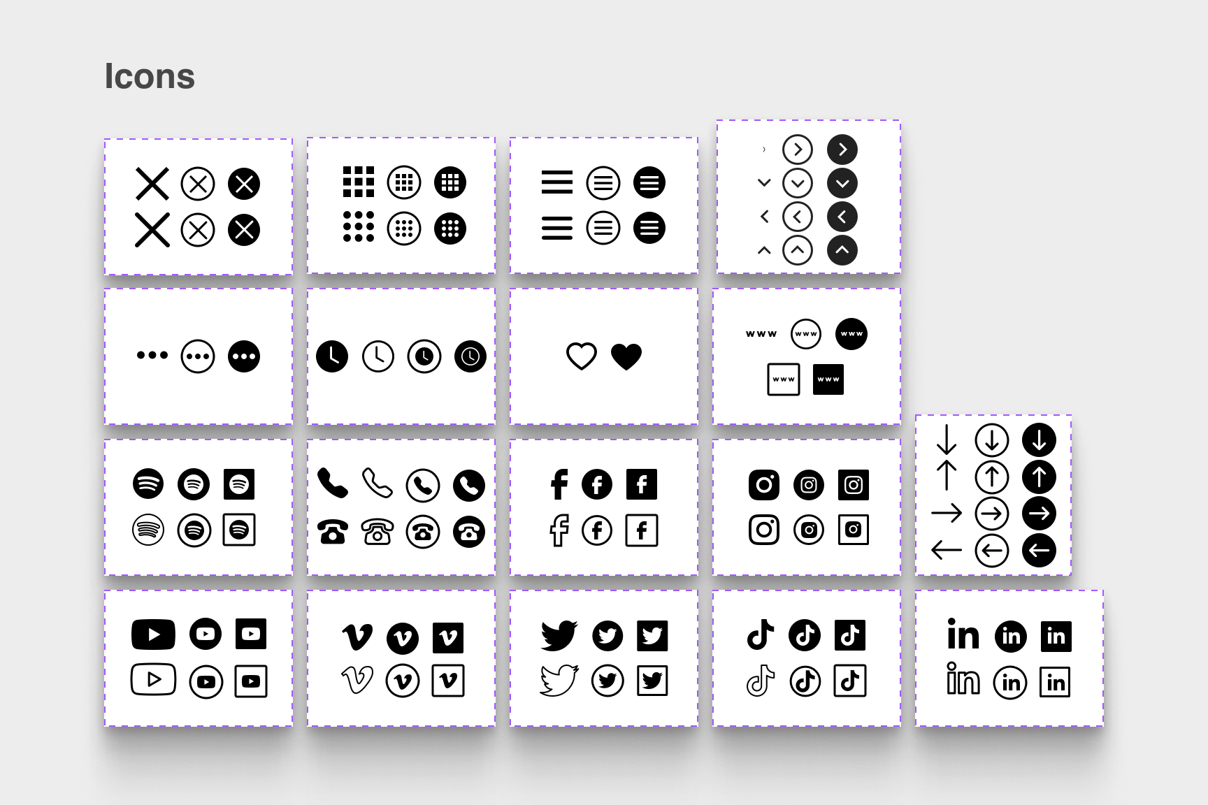
The icon library.
Other commonly used items would be Buttons.
I styled the buttons according to WCAG guidelines, using the icons from our library as variants, and set in auto layout.
This way, buttons with icons could contain any icon and any length of text combination and remain properly proportioned with no extra work from the designer.
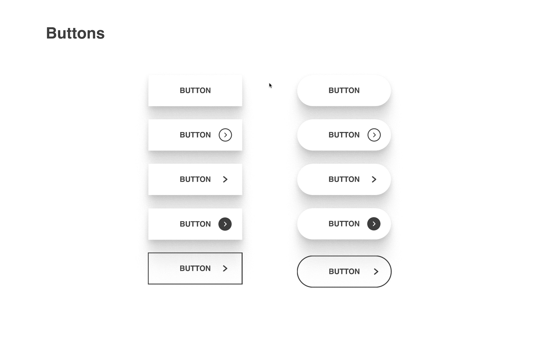
Button variants. (Animated in Figma)
Though shadows would always be specific to each individual project, I knew that having a selection of pre-made well-finessed shadows to choose from would be immensely helpful.
I created a series of 12 cards that each had shadow styles applied. Each shadow indicates design affordance; they are visual cues to help differentiate elements and to suggest how a user might be able to interact with that piece of the interface.
Having a large set of shadows at hand would allow the designer to quickly choose a set of shadows that convey what they needed for their project, and promptly turn them into cascading site-wide styles.
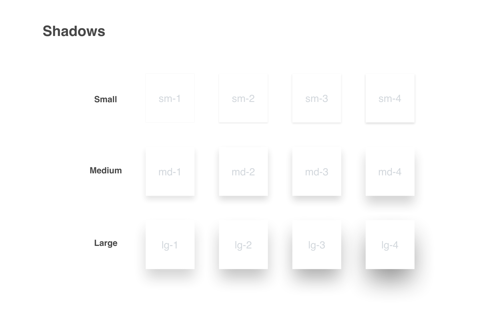
Shadow system.
Form fields and error page templates are other common elements that we use.
The most common errors are 404, 403, and 500 – used language for the messages that reflected Grid Principles branding/personality.
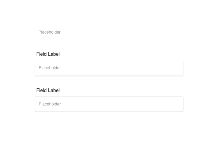
Form fields.
Selection controls are used throughout every site that Grid Principles builds.
I was sure to adhere to the WCAG while building a variety of selection controls for our library. This would save a lot of time for designers as they wouldn't have to memorize the WCAG regarding these sizes and contrast. These items can take a significant amount of time to rebuild each time.
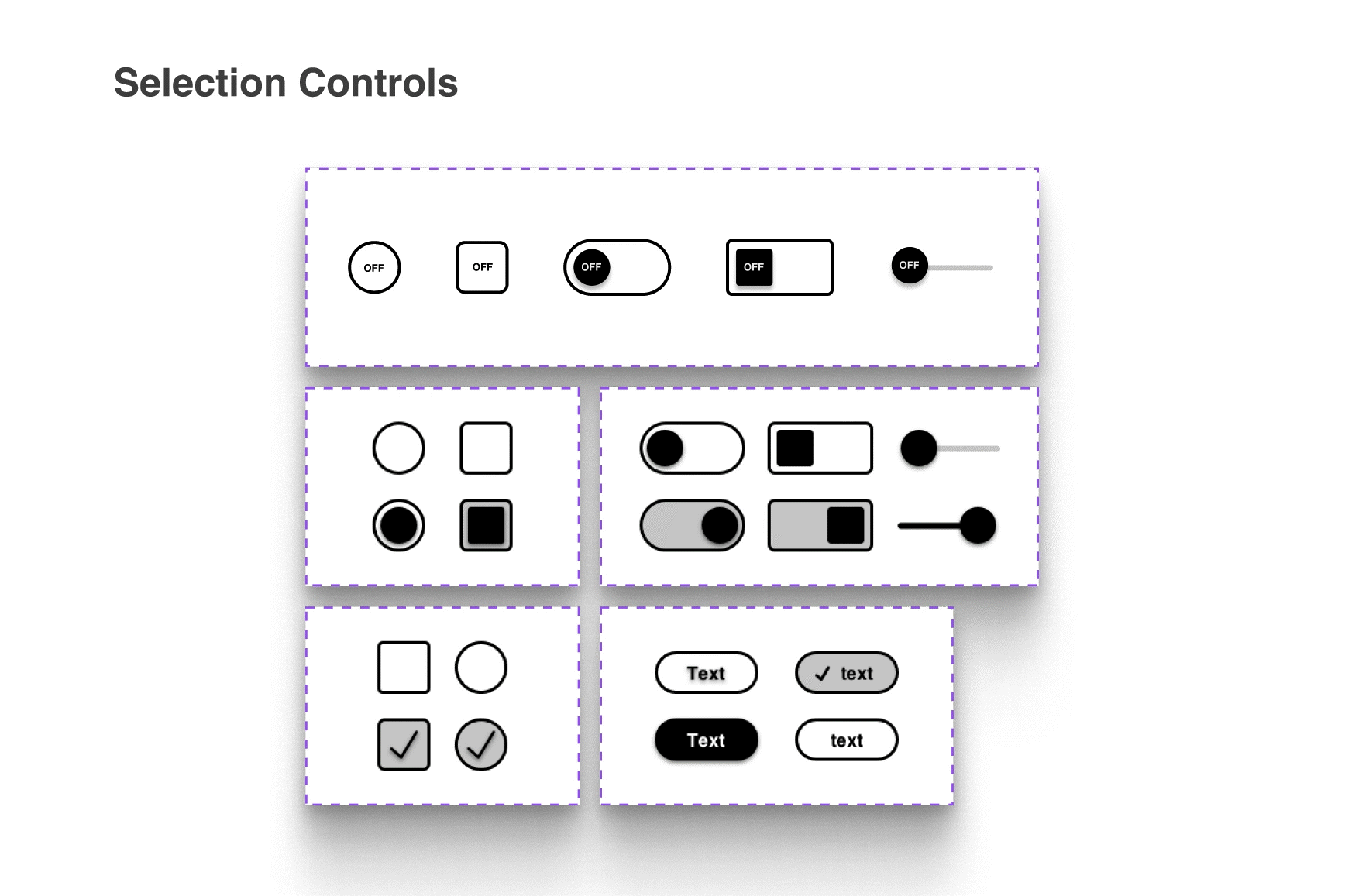
Selection controls. (Animated in Figma)
It was finally time to officially publish the design system!
After doing so, I created a “How to install” instructional inside of ClickUp. ClickUp is the main program that Grid Principles uses to assign and keep track of tasks and moving pieces of information. This would also be an important part of governing the design system.
Governance
When a change would need to be made, the proposed change would be added as a task inside of ClickUp. The task would be assigned to the lead designer, and the developer would also be tagged.
They would then either approve or deny this change. The lead designer would then assign the task to either a Digital Designer or the UX Intern to implement this change. The change will be made in the symbols library and the nomenclature would update accordingly.
Using ClickUp tasks in this way would ensure that the information travels through the proper channels and that nothing would slip through the cracks.
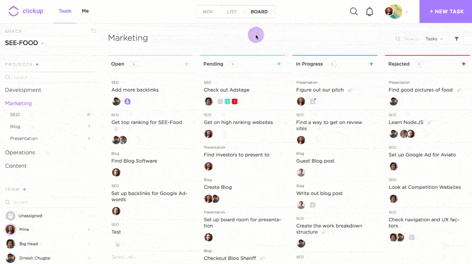
Demonstration of ClickUp. (By ClickUp.com)
Takeaway
I have successfully launched a robust, modular, design system for Grid Principles!
It is a flexible, scalable, Symbols library in Sketch. It increases efficiency, and speed, and reduces design debt. Like any well-tended garden, it will continue to grow and adapt to the needs of the company.
In the future, I would spend even more time workshopping the system with each person using it. This would ensure that we accounted for the unanticipated ways in which people might interact with it.
I would push to build the system in Figma rather than Sketch. This would allow for systematized micro-interactions and nested components.
I find this type of problem-solving deeply satisfying, and I look forward to crafting more design systems in the future.