Overview
ASESO was an exercise in developing and deploying a visual design language across web marketing and physical product.
Timeframe
11 weeks (29hrs)
April – June 2021
Client
(School project)
Roles
Research, visual design, branding, packaging design, web design.
Tools
Adobe Suite: Illustrator, Photoshop, Dimension. Figma, Webflow.
Client
(School project)
Collaborators
Solo
———
Problem
Black Seed (Nigella Sativa) and Turmeric are currently in vogue and are rumored to have anti-inflammatory qualities.
Create a high-end, edible, nutraceutical product that promises to help people with their health based on these two ingredients.
Solution
The goal for this design school project was to deliver a product concept and visual design language that was highly researched and science-based, that had an engaging narrative and accompanying visuals.
The product would be culturally sensitive; drawing research from the origins of the ingredients without borrowing design elements from their cultures. This would be a Golden Milk called “ASESO”.
Research & Demographics
The target audience for this product was affluent urbanites.
They would have a high disposable income, they value health, and they are drawn toward cutting-edge products. The user personas that I created from this prompt were also people who were interested in products that are validated by science, rather than merely the newest health trend.
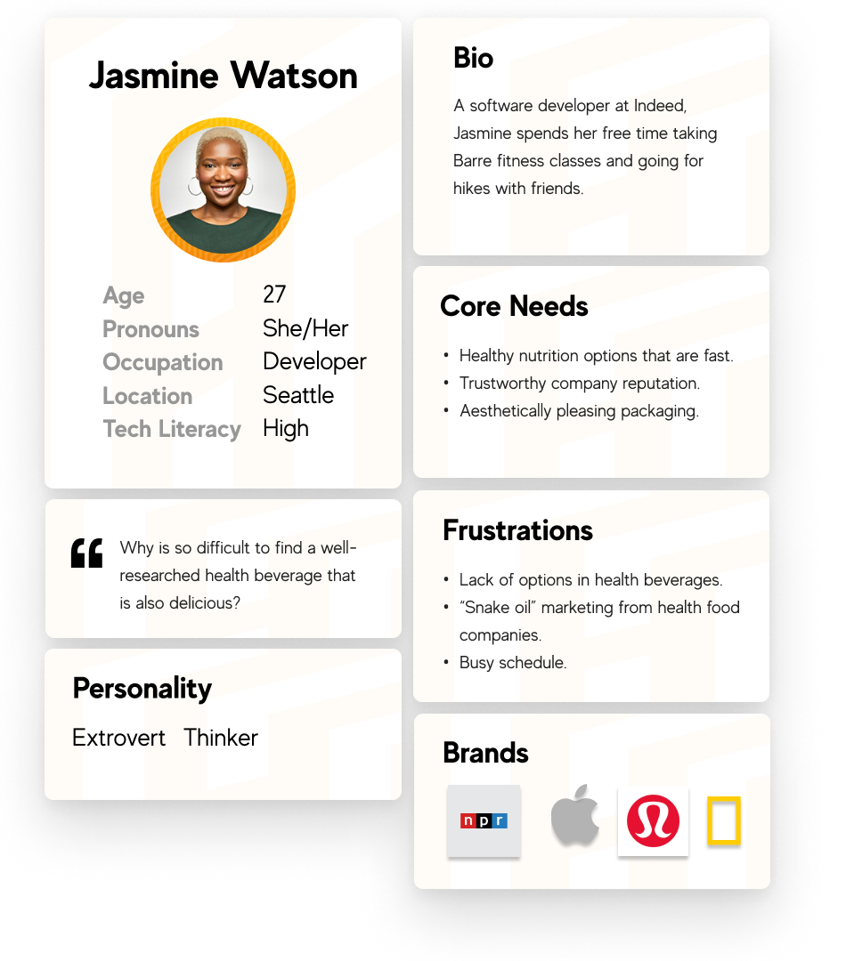
Jasmine is a back-end developer.
She gravitates toward sleek, modern-looking brands that offer high-quality products. She dislikes companies that promise the world but deliver very little in actuality.
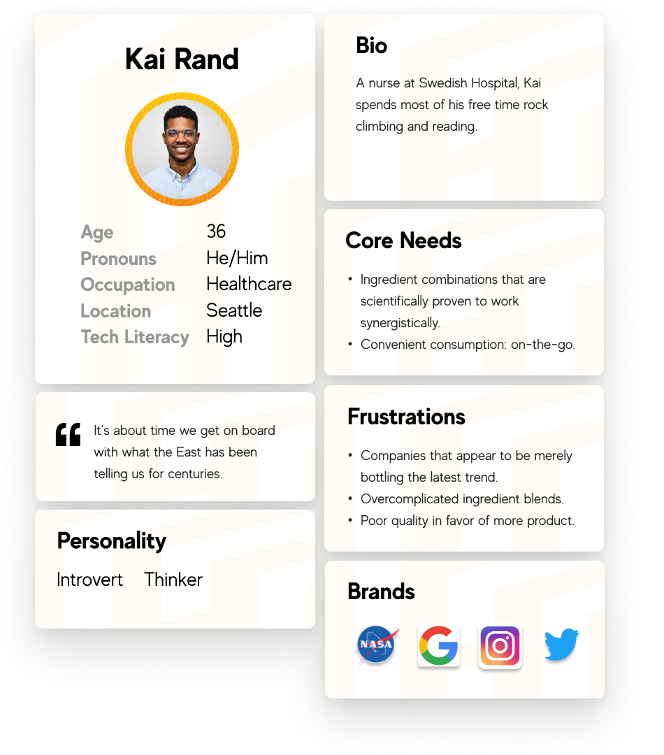
Kai is a nurse.
He spends lots of his time thinking about health and the human body. He reads ingredient lists carefully and appreciates when companies focus on science versus trends.
The problems to solve that I identified based on these personas were:
1. To engage the customer through an emotional narrative.
2. To help a customer understand the science of the product and how it would benefit them.
3. To create visual branding that reflects a product that is high-end, supported by facts, and pleasing to look at.
I began my competitive analysis and industry audit by looking at the branding and marketing strategies that local Seattle beverage companies were using; such as Pressed Juicery.
I discovered patterns in the use of modern typefaces, limited color palettes, and sensational company stories. Next, I conducted web searches for products that use similar ingredients. I found that certain ingredients were often used in tandem; turmeric + capsaicin, turmeric + Nigella sativa.
Companies often relied on either mystical claims about these herbs or explained in a clear logical way how they work synergistically to benefit the human body.
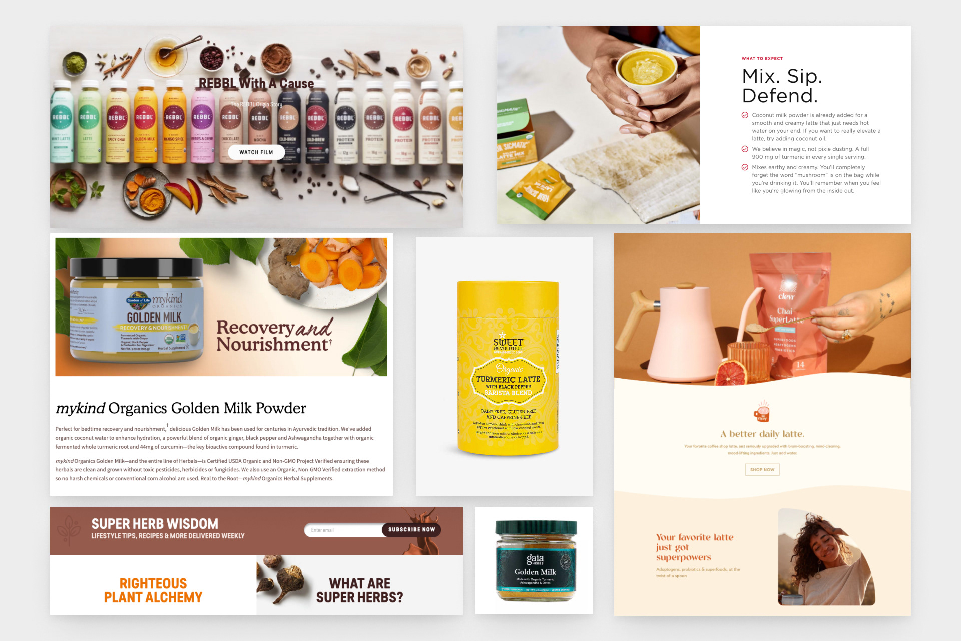
A brief overview of the competitive analysis and industry audit.
Through researching these herbs and spices, I learned that the most important components were Curcumin, Piperine, and Capsaicin.
I cross-referenced my research, then I dove into the cultural origins of these ingredients. Sumerian clay tablets dating back to the 3rd millennium BCE spoke of the Babylonian moon god Sin; the overseer of herbs and spices.
Nearby on the timeline, the ancient Greeks also had access to these ingredients. In reading about the Greek family of deities that represented health, I was inspired to name this golden milk beverage after the lesser-known sister of Panacea, Daughter of Epione and Asclepius — Aceso.

A visual sample of my research.
Aceso represented the healing process itself.
When creating the logo for this product line, I drew upon their family symbols. The brandmark is an abstract spearhead coupled with an ear of wheat.
To help boost the specificity of search results, I changed the name subtly to Aseso. This mythological history plus a myriad of scientific facts about the ingredients served as my company story.
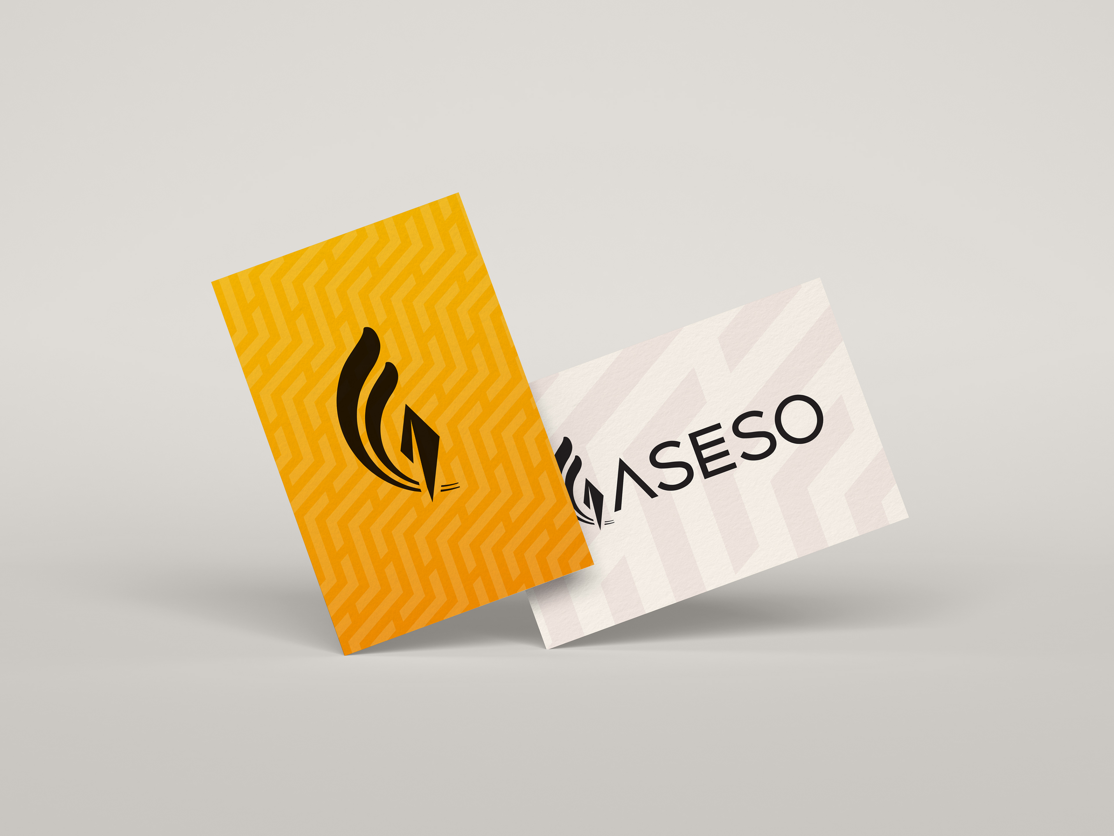
Word mark and pictorial mark logo.
Logo animated in AfterEffects.
Process & Work
Inspired by the Greeks’ love for mathematical patterns, I chose to bring these onto the packaging.
I used bold geometric patterns on the background to compliment the modern sans-serif typefaces that I chose. The body text was the hyper-legible “Proxima Nova”, while the brandmark and H1 for the website were “Made Evolve Sans”. I kept the color palette limited, to maintain brand cohesion and a premium feel.
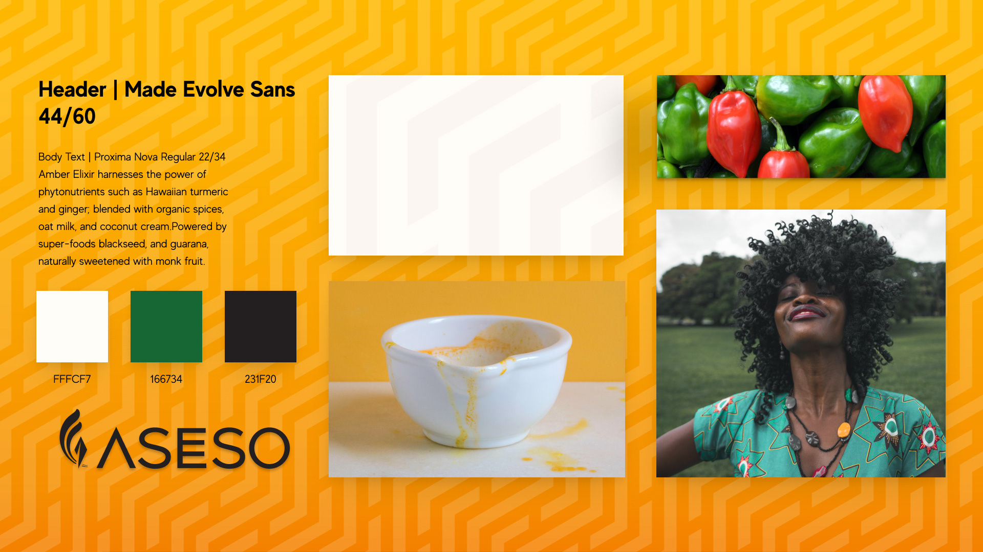
Visual design concept.
I conducted a color blindness audit to ensure that the visual identity of ASESO would be accessible to those with Deuteranopia, Protanopia, and Tritanopia.
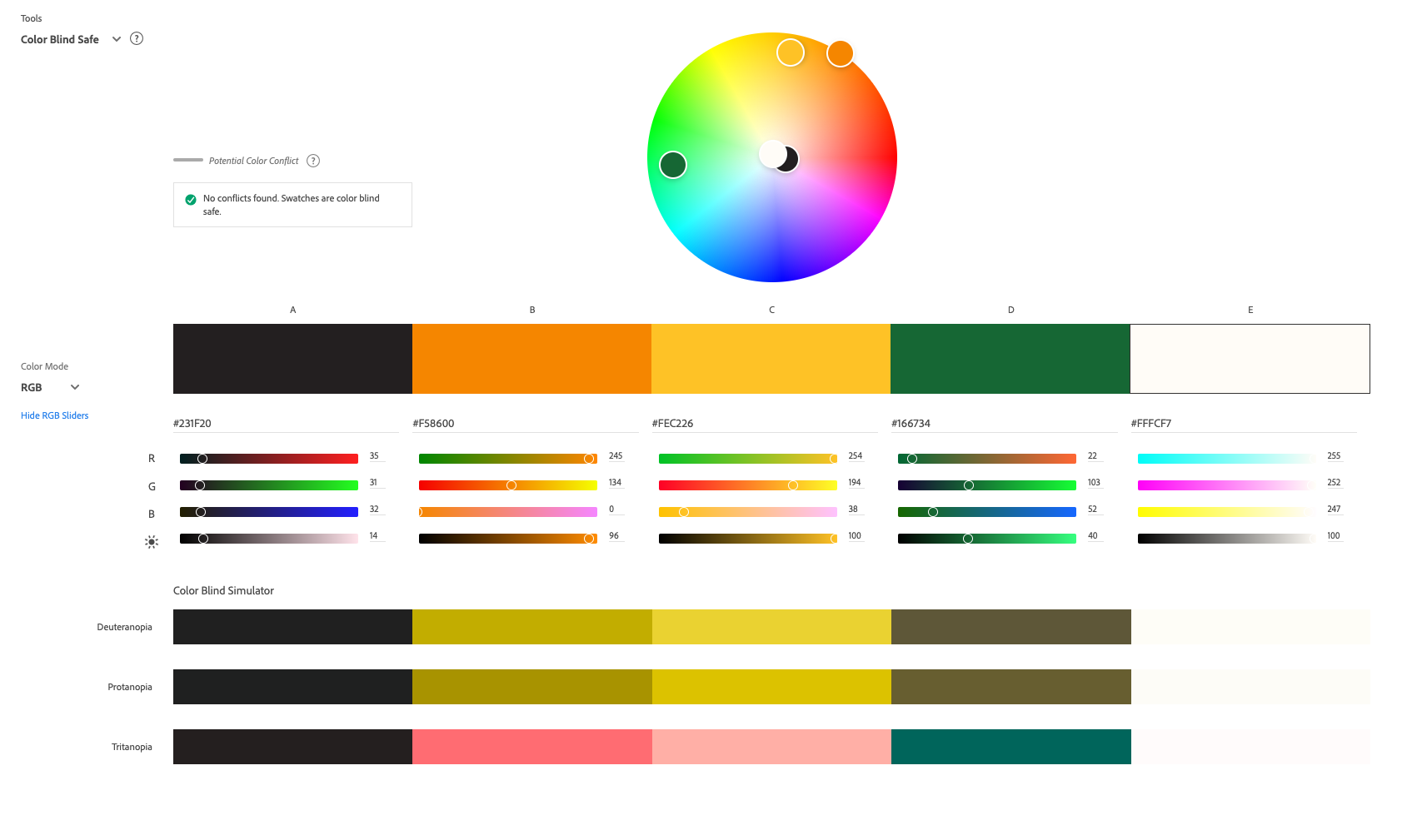
Color blindness audit.
To ensure that ASESO's visual identity was as accessible as possible, I adhered to the Web Accessibility Content Guidelines while choosing the line night of the text, as well as color contrast.
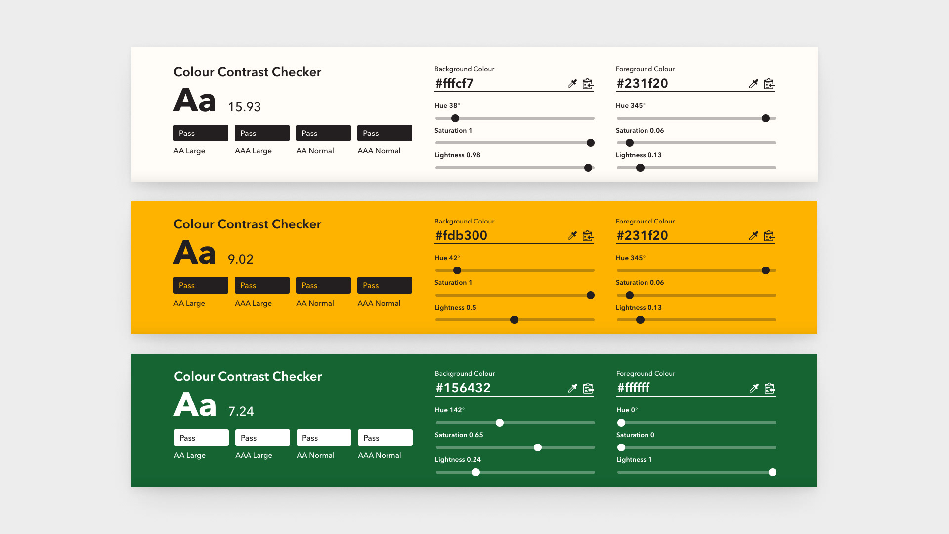
Color contrast audit.
Once I had compiled the components for the packaging, I used Adobe Dimension to build a virtual set and 3D mockups.
I chose a square bottle to compliment the geometric background pattern and lit the set with bright artificial sunlight to give feelings of warmth and invitation. Once the 3D mockups were rendered, I coupled the images with the backstory and posted them on social media to gauge people’s response to the product concept.
Across three social media accounts, 74 people engaged with the photo set. Several people thought that the product was real and wanted to know where they could find the golden milk.
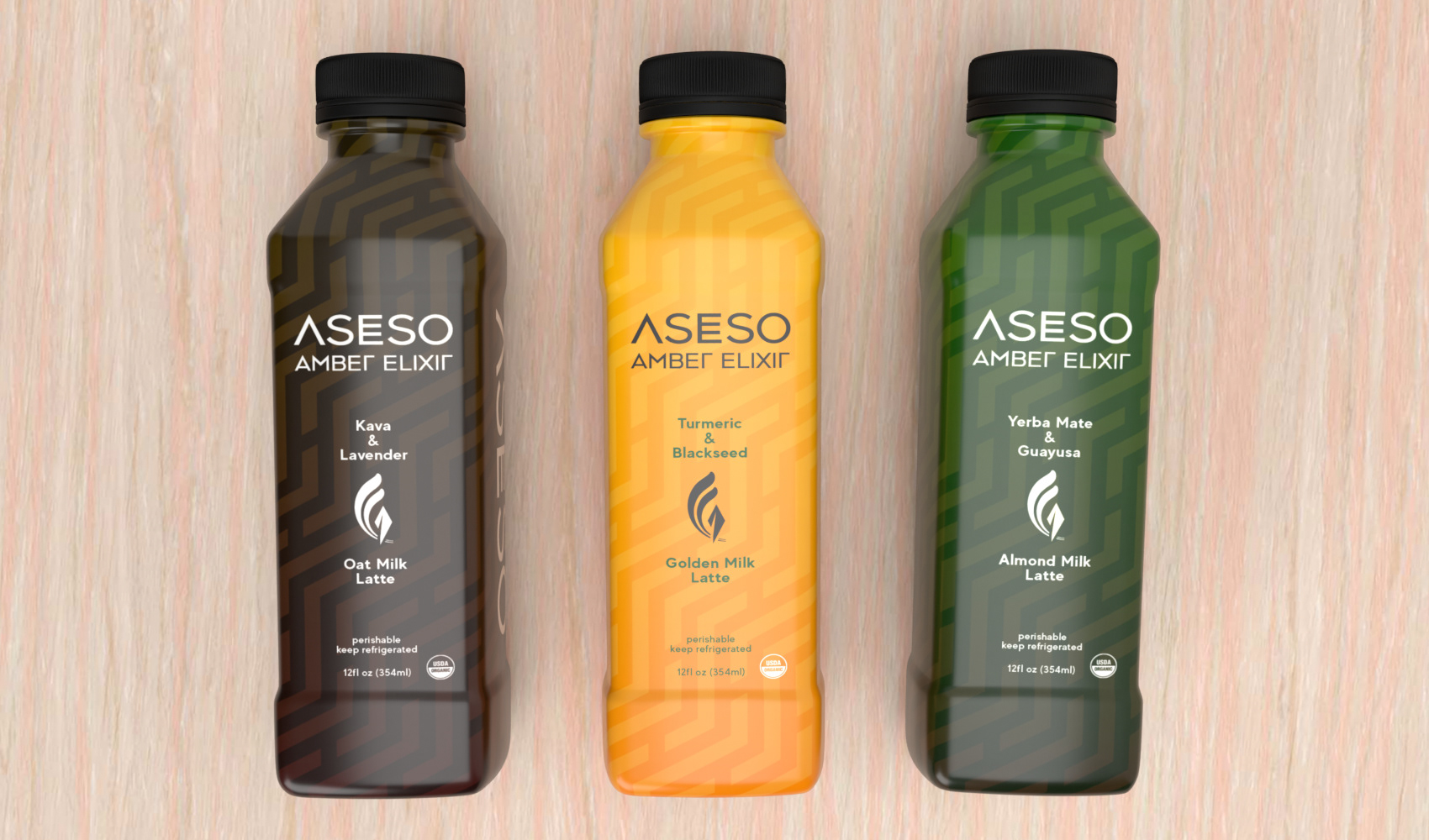
3D render of ASESO beverage line concept.
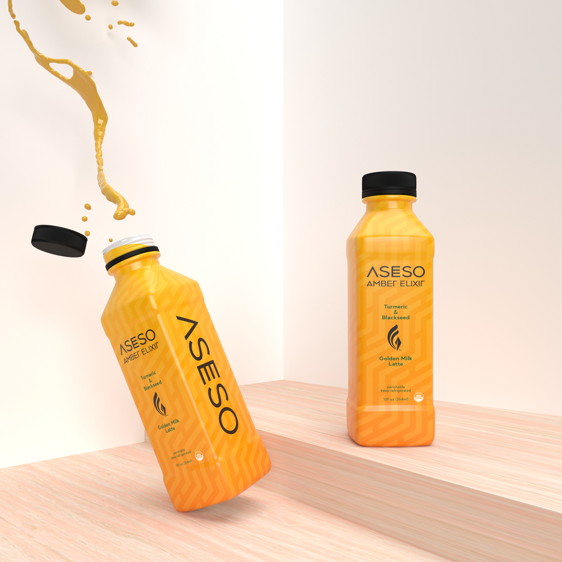
3D render of ASESO packaging design.
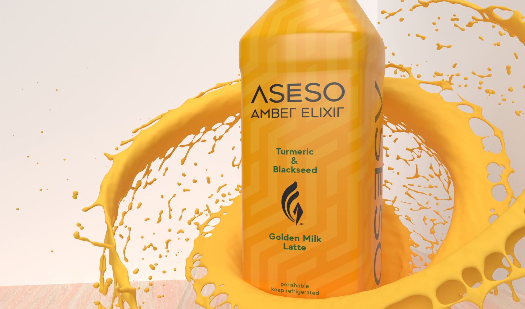
3D render of ASESO packaging design.
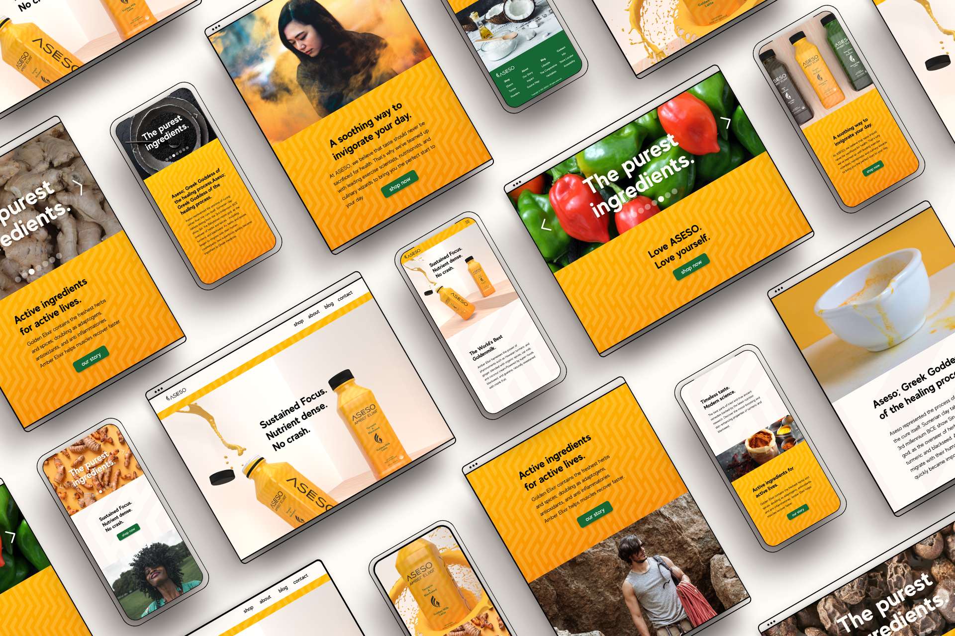
Next, I used Figma to build a wireframe for the landing page.
The goal was to tell the company story that I had created and augment it with complimentary lifestyle photography, brand assets, and calls to action. First, I would engage the potential customer emotionally, then impress them with a delightful looking health-beverage that was backed by science, and finally, they would have the opportunity to purchase the golden milk.
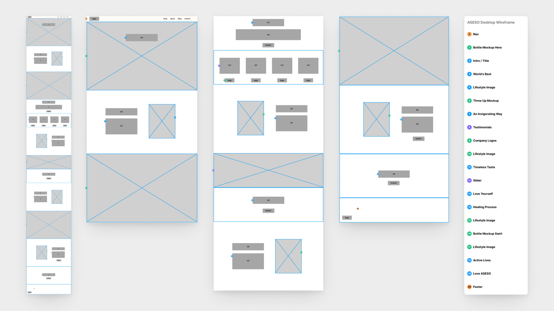
Annotated wireframe of the desktop landing page.
Once I had finished the low-fidelity wireframe, I created a simple component system in Figma that I could translate to Webflow.
I then built the live landing page in Webflow. As I built, I chose four breakpoints for different device screen sizes. Though Webflow writes its own CSS and HTML, we as designers have the opportunity to edit all of this.
I focused on tailoring the code so that the page could be easily translated by screen-readers used by people with low vision. For instance, headings were nested and used sequentially; from the largest (H1) to the smallest (H3). The touch-target sizes (CTA buttons) and color contrast adhered to the Web Content Accessibility Guidelines.
This would ensure that the site was easy to use by a wide variety of people.
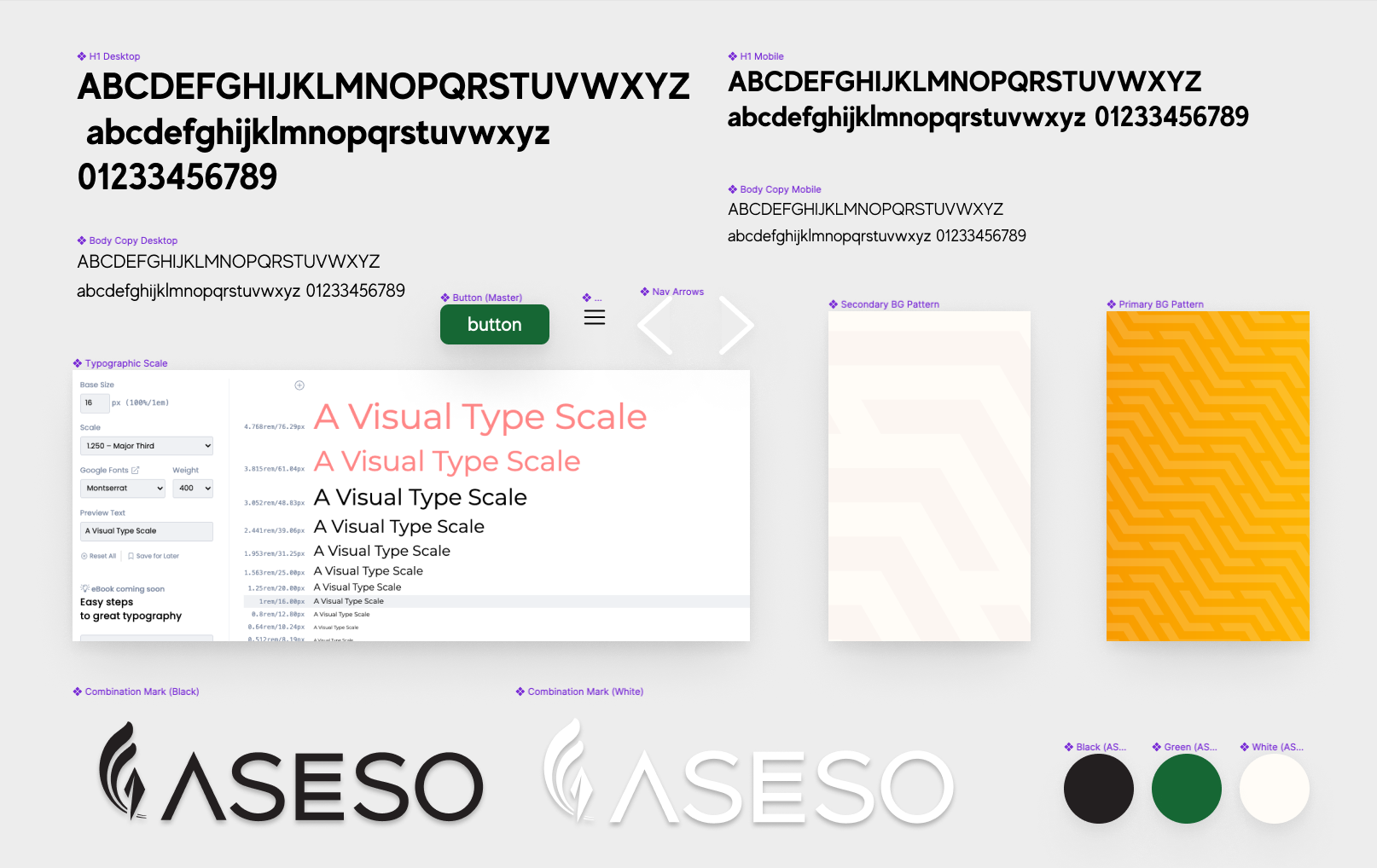
Component system in Figma.
Sharing a concept is one of my favorite parts of visual design.
I made the landing page public for a few days and asked for feedback via social media. Overall, people found the page very easy to navigate and enjoyed the story of Aseso that unfolded as they scrolled. More folks expressed how they wished that this was a real product that they could acquire.
Using Figma and photoshop, I created mockups of each four screen sizes. Seeing the landing page laid out alongside the product mockups, the story of Aseso really came to life. I could easily imagine Jasmin and Kai, the two personas that I had created to help guide the design process, falling in love with this health beverage.
Desktop landing page.
Mobile landing page.
Takeaways
My two biggest takeaways from this project were: the power of the narrative, and the influence that a well-designed, visually striking product can have on a person.
People seemed to connect to the story behind ASESO, and they were easily able to picture themselves purchasing the fictional golden milk to enjoy its benefits.
If I were to do this project again, I would add user testing to my process. I would AB test different types of packaging, I would interview people about their experiences with health beverages, and I would prototype test the landing page more thoroughly.
Well-polished visuals are essential to assisting the imagination and helping a design come to life!
I'm looking forward to more narrative-centric design challenges in the future.

← High Priestess Herbal Wellness

Branch →