Overview
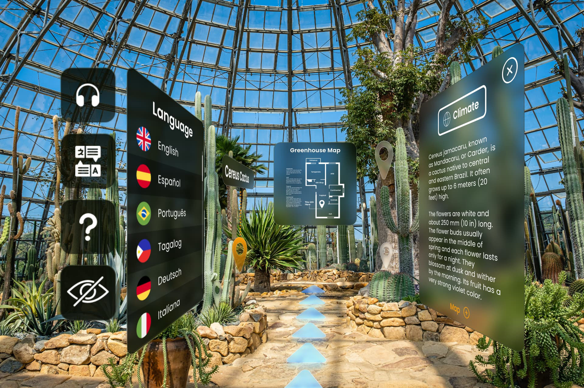
Anchor is an exploration of how Augmented Reality can add value to a museum setting. Staged in a botanical conservatory, Anchor is centered around plant identification and ecological information.
Timeframe
11 weeks (97 hrs)Jan – Mar 2022
Client
(School project)
Roles
Research, concept, UX, visual design, video editing, prototyping (AR & standard), motion design, and user testing.
Tools
Adobe Suite: AfterEffects, Premiere Pro, Illustrator, XD, Aero. Figma, Zoom.
Collaborators
(Solo)
———
Problem
Volunteer Park Conservatory is one of Seattle’s most beloved, regenerating spots for plant-lovers. While the nursery is full of beautiful natural wonders, the Conservatory’s current method of delivering information feels outdated and confusing.
As the technology of Augmented Reality becomes more sophisticated, the possible applications and popularity of AR make it increasingly useful and exciting.
Solution
The goal was to deliver an accessible, efficient, and delightful Augmented Reality interface that deepens and enriches conservatory visitors’ experiences.
How might we enhance the museum experience with Augmented Reality?
Research & Demographics
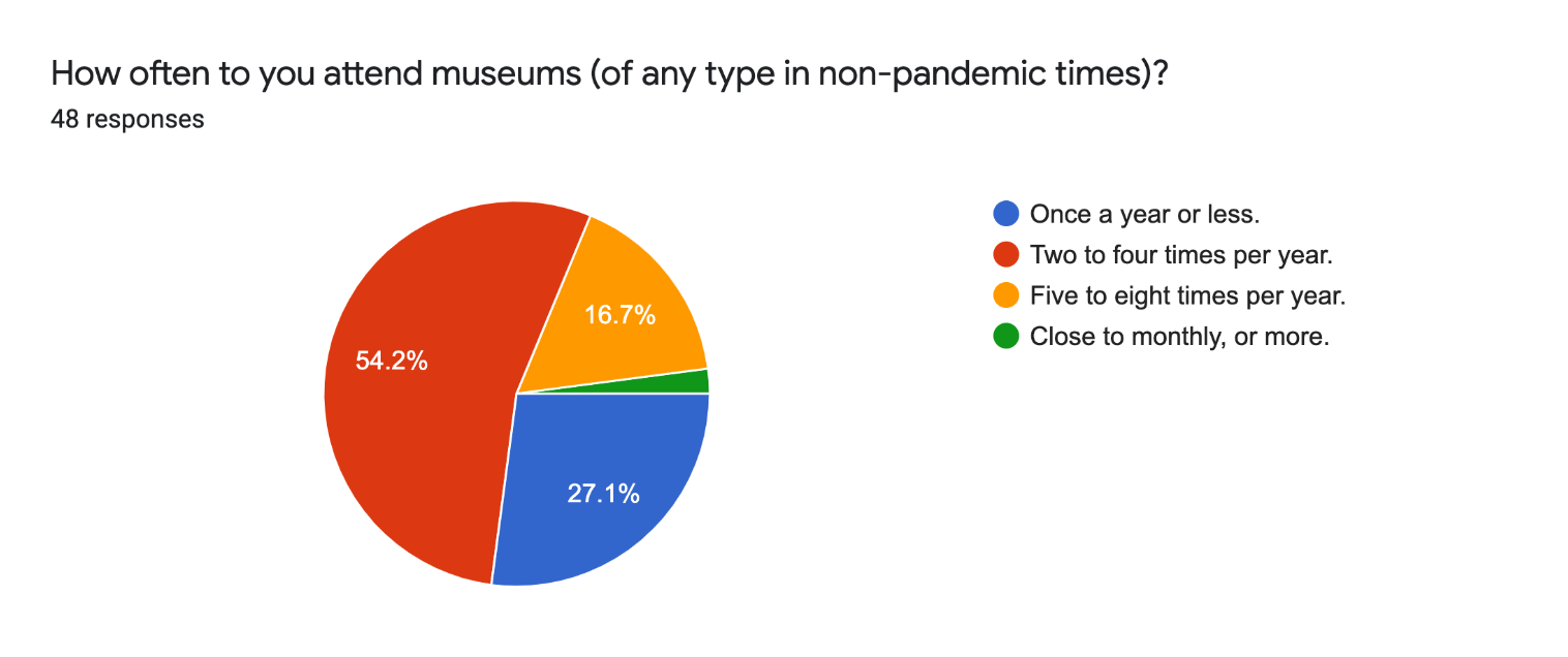
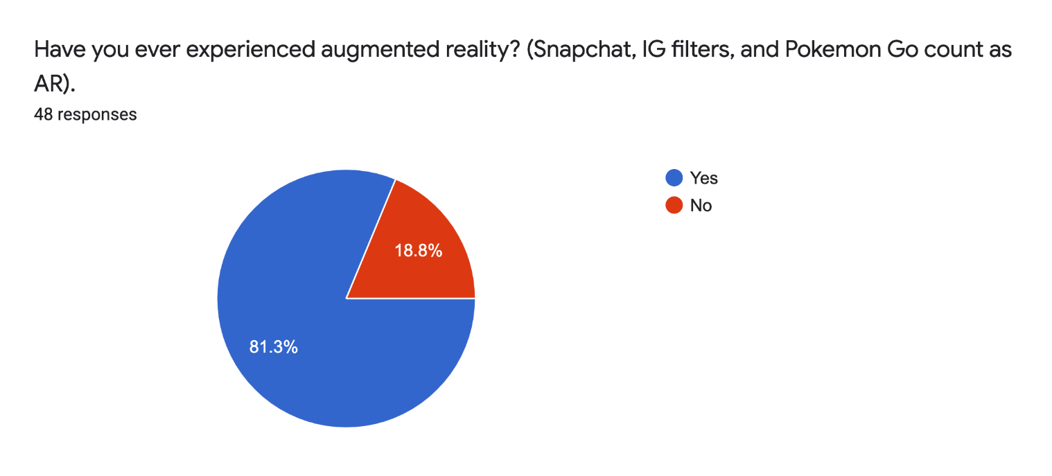
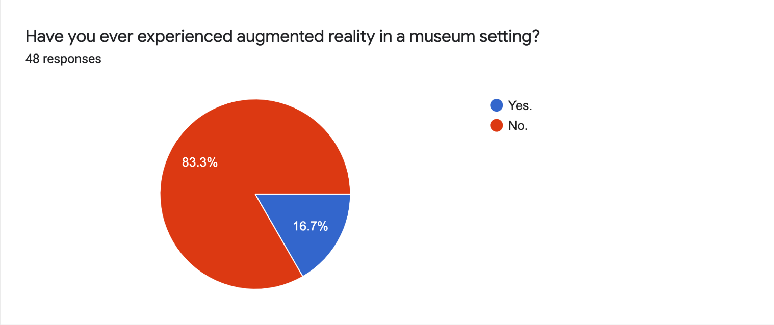
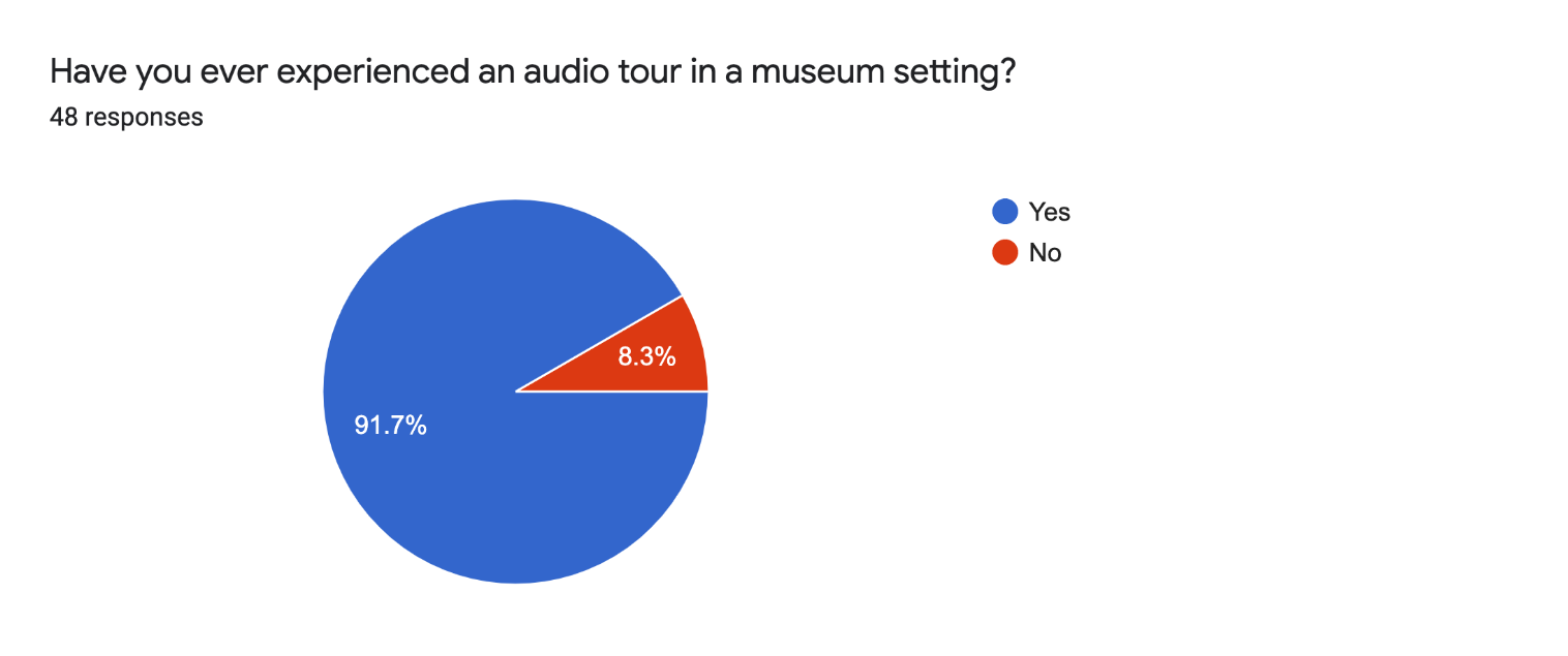
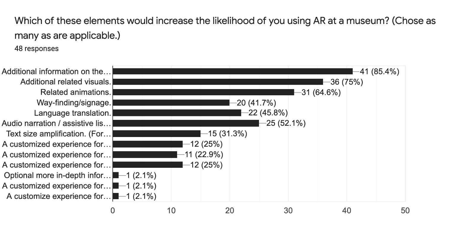
I began my research by surveying a broad demographic over social media.
48 individuals from age 22 – 65, with varying experience levels with technology, answered ten questions about their experiences regarding AR and museums.
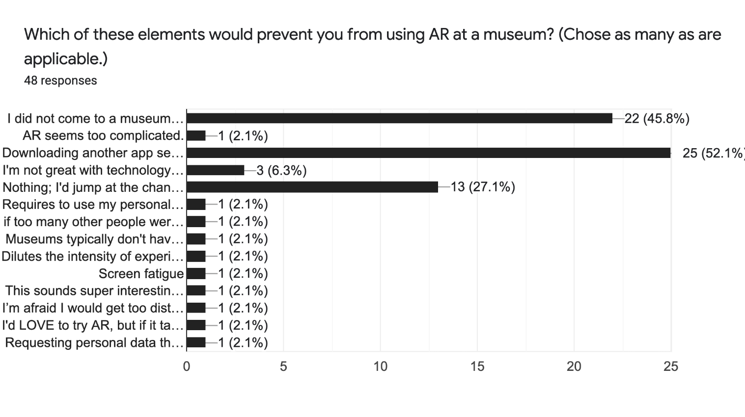
A pain point was identified in that users often don’t care to download an app on their device;
52% of users said that they wouldn’t want to download an additional app.
52% of users said that they wouldn’t want to download an additional app.
Users demonstrated that there’s an interest in AR, but we need to make sure that the experience features an easy-to-learn, unobtrusive, and engaging interface, that doesn’t distract from a user’s experience of the exhibit.
Moving forward, I used these answers to help guide me towards what users would need.
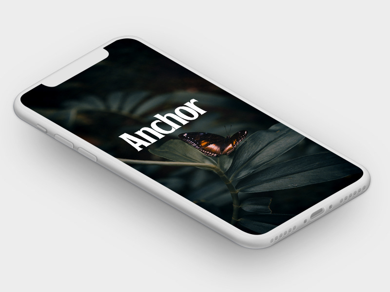
Anchor's splash screen.
Next, I researched AR-capable hardware.
I looked into wearable headsets such as HoloLens 2, and Oculus Quest 2. Tablets, and smartphones.
Ultimately I determined that a tablet would be the most accessible device for all, and the best option to house this AR experience.
Tablets are now a common hardware device and their use is now a familiar mental model. Most people have used a tablet, they are portable yet provide a large viewing window, and they are relatively affordable.
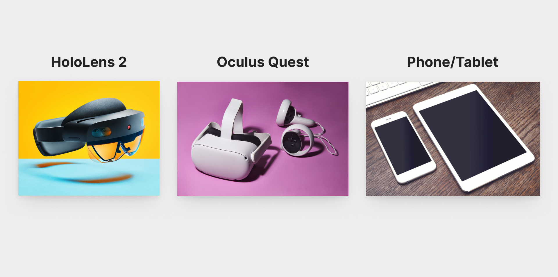
The most popular consumer AR devices.
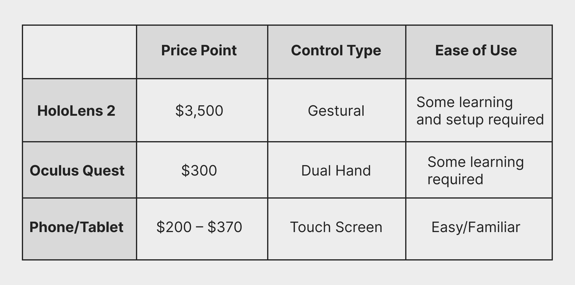
Comparison of the most popular consumer AR devices.
Based on a compilation of user characteristics derived from my survey, I created two user personas.
Because personas only provide a narrow scope of how a real person might behave, I also used the Mindset Segmentation method to build more realistic human personas.
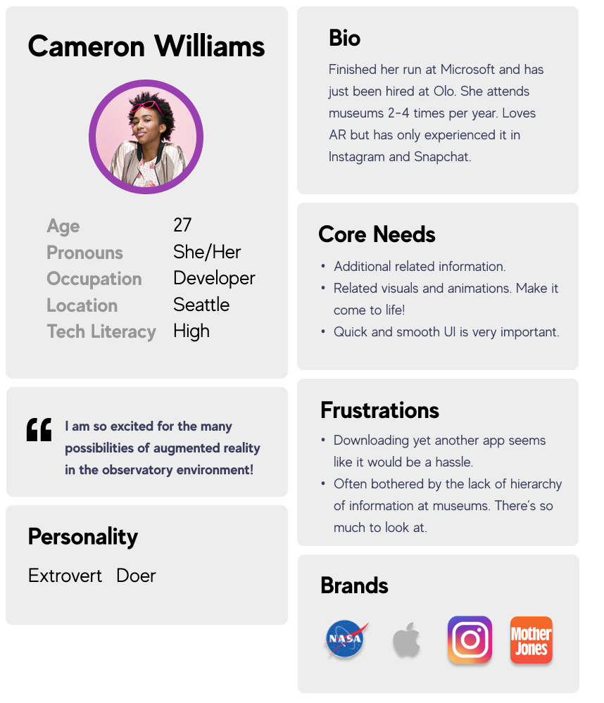
Cameron is a digital native.
She has grown up with the internet and works in tech. She’s excited about the possibilities that AR brings.
A possible pain point for Cameron would be unintuitive information architecture, and slow processing speeds if the app wasn’t built to work efficiently.
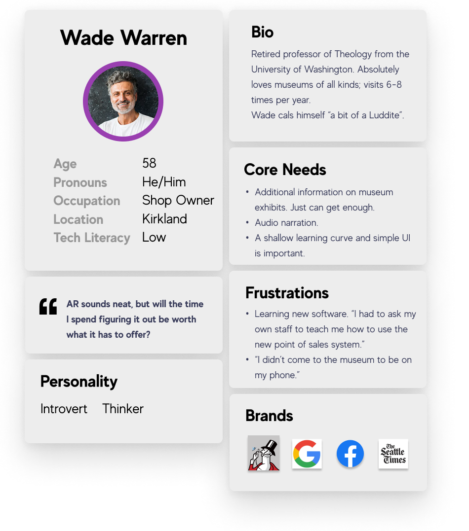
Wade is of an "older" generation.
He’s a bit technologically challenged and does not know what AR is.
Possible pain points for Wade would be to remedy the issue stated by many interviewees: “I didn’t come to a museum to be on my phone.”
With these archetypes in mind, I went to the Volunteer Park Conservatory with a friend.
We walked through several times and brainstormed as many possible touch-points, questions, and needs that a user might have.
I turned this brainstorm into a list of possible features that my interface could include, then I sorted these features using a prioritization matrix.
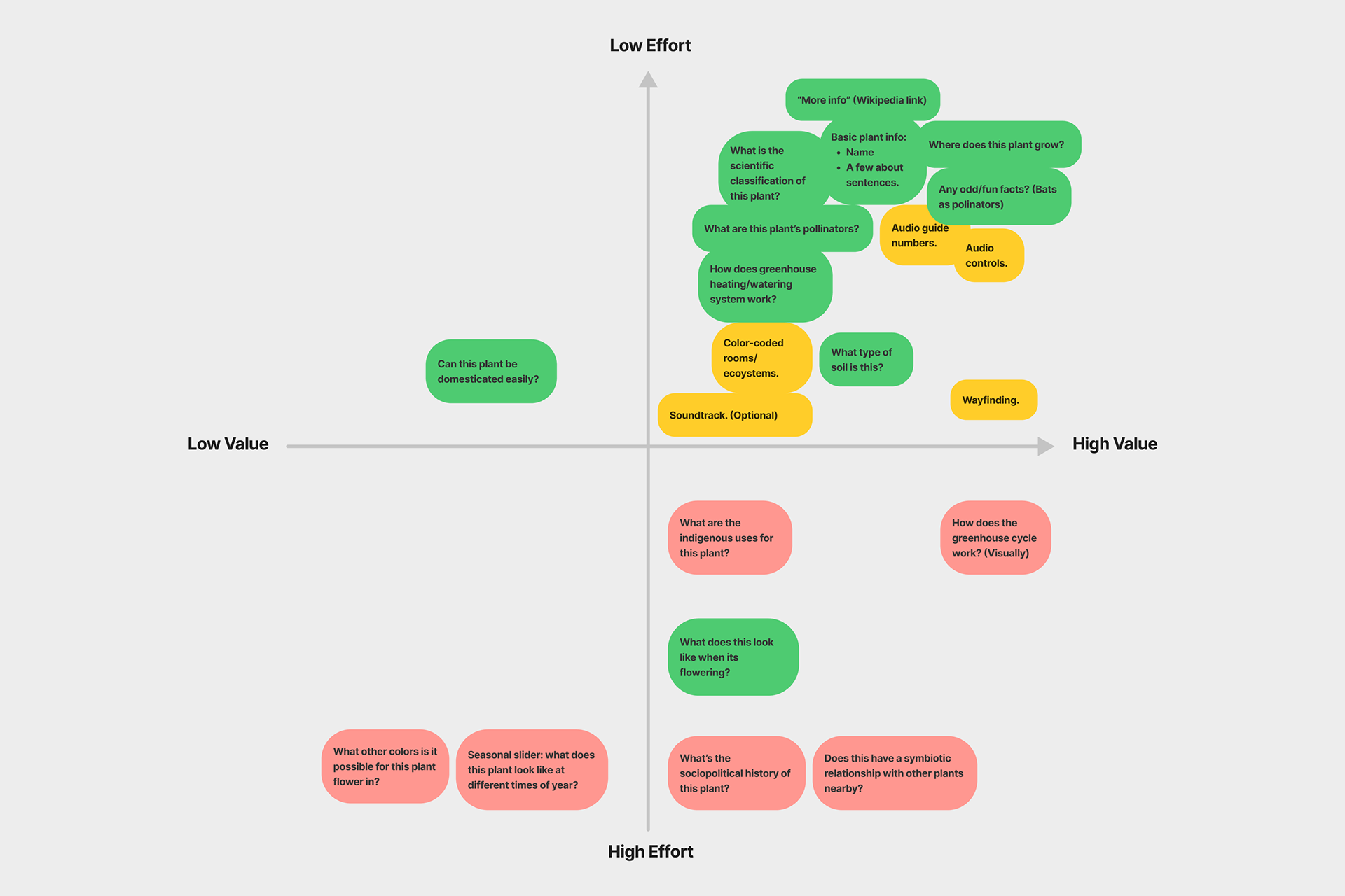
Prioritization matrix.
Using the most feasible and highest priority features from the matrix, I created an information architecture map to plan the most intuitive and efficient ways to address all of these user needs and touchpoints.
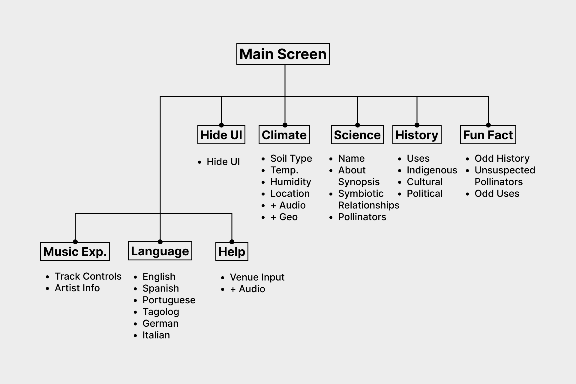
Information architecture for the user interface.
At this point, I was itching to start building the interface, but I knew that I should learn more about accessibility and inclusive design as it relates to AR first.
Additionally, I hybridized this information with best practices from Getty Museum’s Guide to Adult Interpretive Materials.
I researched how accessibility, ergonomics, and information hierarchy are different for UI in virtual space; as opposed to standard flat UI screens. I used this map to begin building a flat user interface.
Some considerations that stood out to me were:
• Cognitive overload can be reduced by intentionally directing the eye.
• Users can be easily disoriented and fatigued in AR; the experience should include breaks.
• The UI will have to be legible over the top of surfaces of a wide variety of colors, contrast, and textures.
• To allow for maximum accessibility, text in virtual space should be set at a larger line-height than even WCAG guidelines specify.
• Due to the minimal processing power of mobile devices, the UI should be comprised of small, flat files such as SVGs.
• Fields of text on any given “plaque” should never exceed 200 words.
In virtual space, people usually look straight ahead first, then down below the initial screen, then near their hands, then finally up above the first screen.
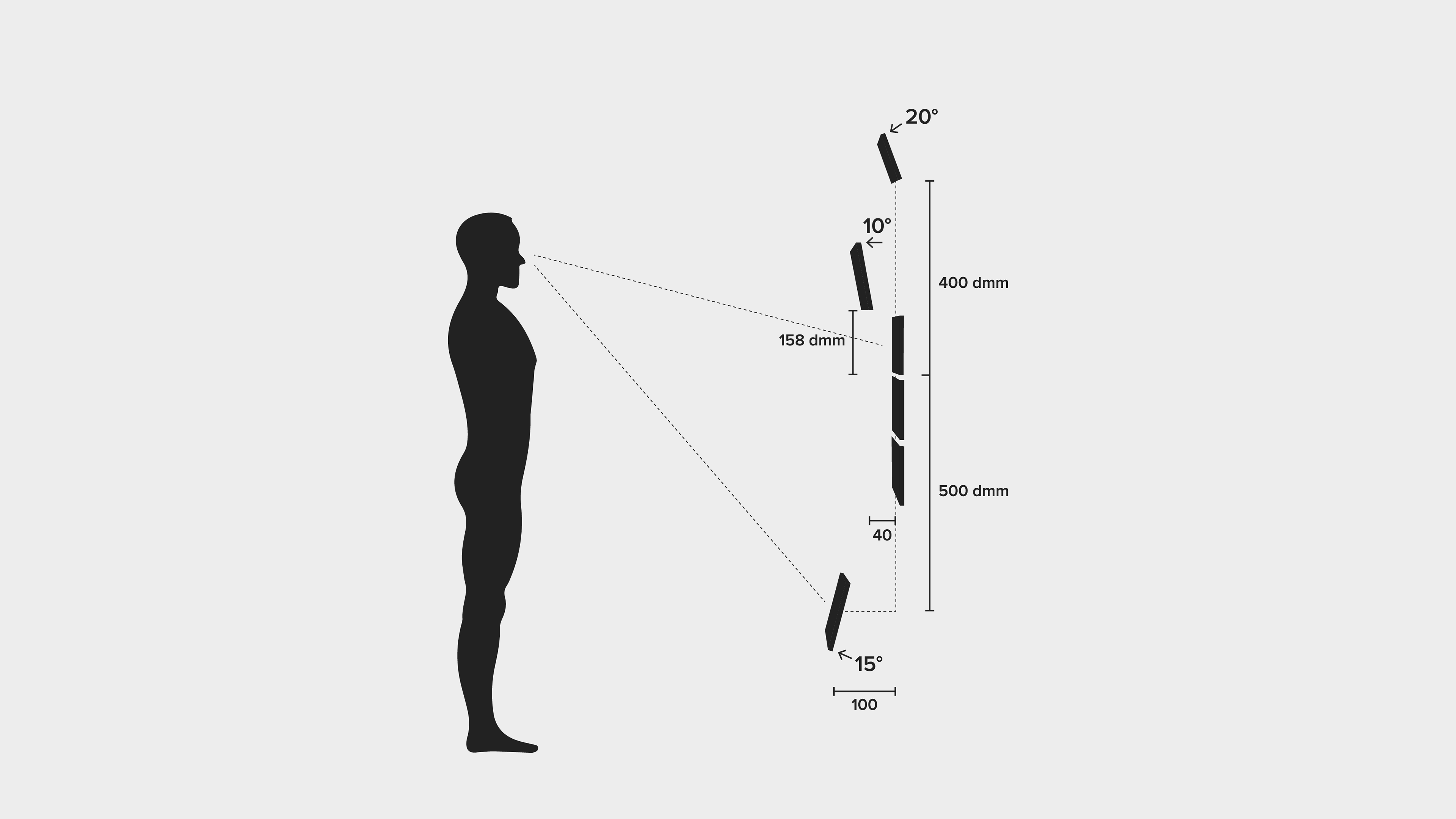
Ergonomic viewing angles in 3D space. (Adapted from Mike Alger).
Process & Work
With these considerations in mind, I conducted an audit of existing AR applications.
I used this mainly as visual inspiration for building a style tile. I chose rounded corners, a few bright but meaningful colors, and the highly legible font “Poppins”.
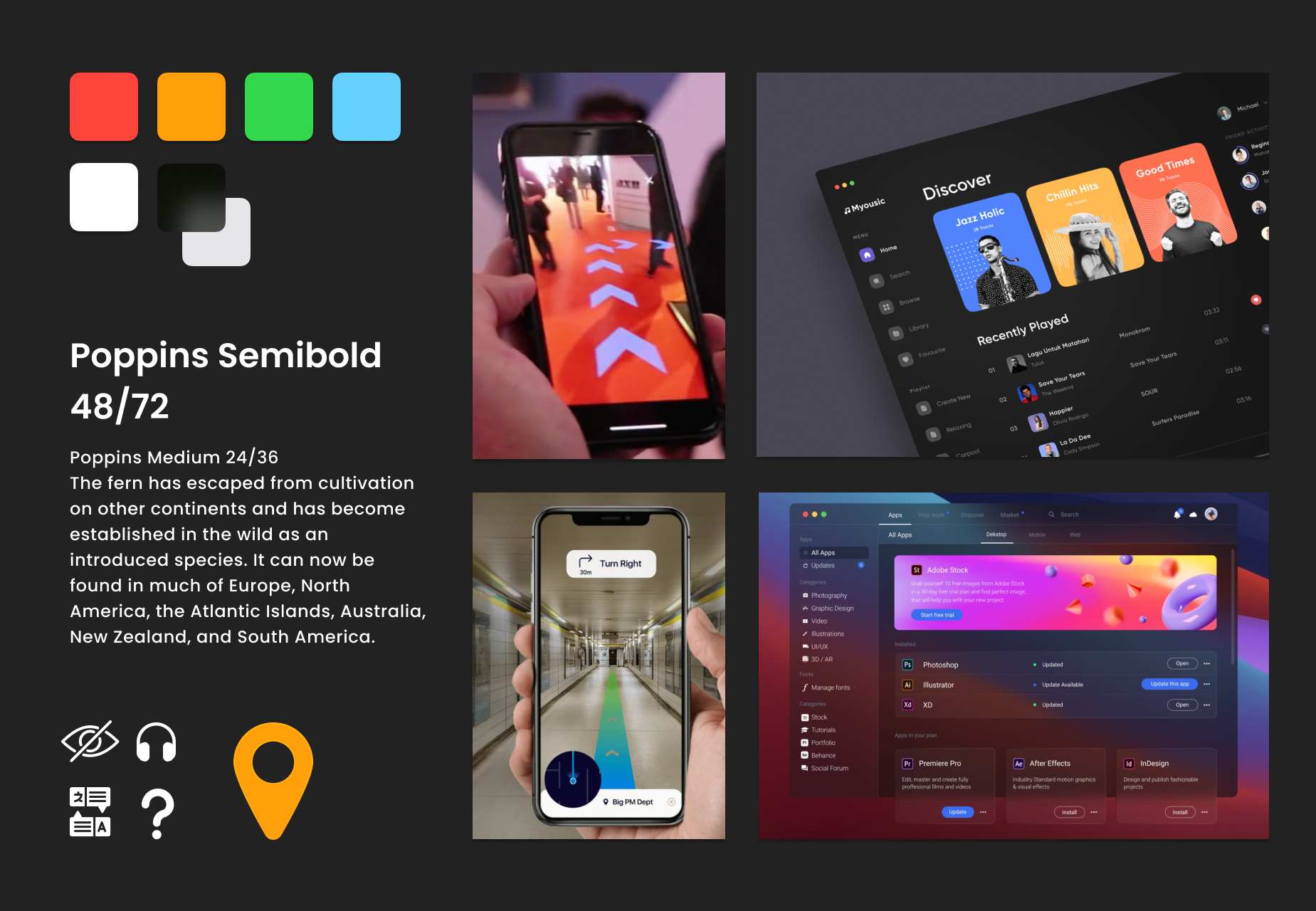
Moodboard for user interface.
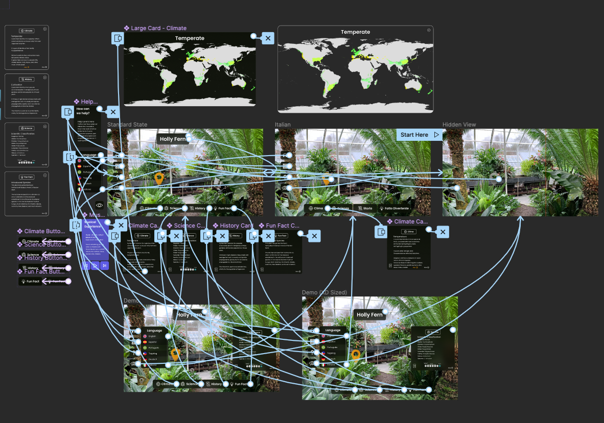
I began to build the interface atomically in Figma.
I asked my colleagues to critique the UI and help gauge if it would work for the first round of user testing. Based on their feedback, I darkened the background color of the cards so that the contrast ratio between the cards and text was more accessible.
I added more leading to the body text and removed some of the padding around the bottom buttons. I also chose to narrow the color palette to keep the UI from being too obtrusive.
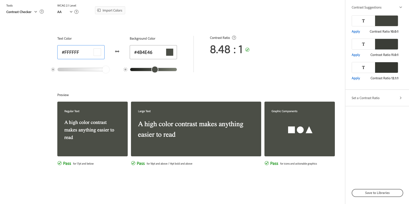
Color contrast audit of the first draft of UI.
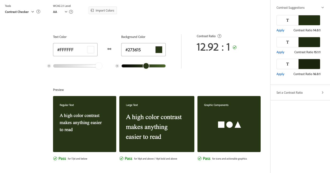
Color contrast audit of the final draft of UI.
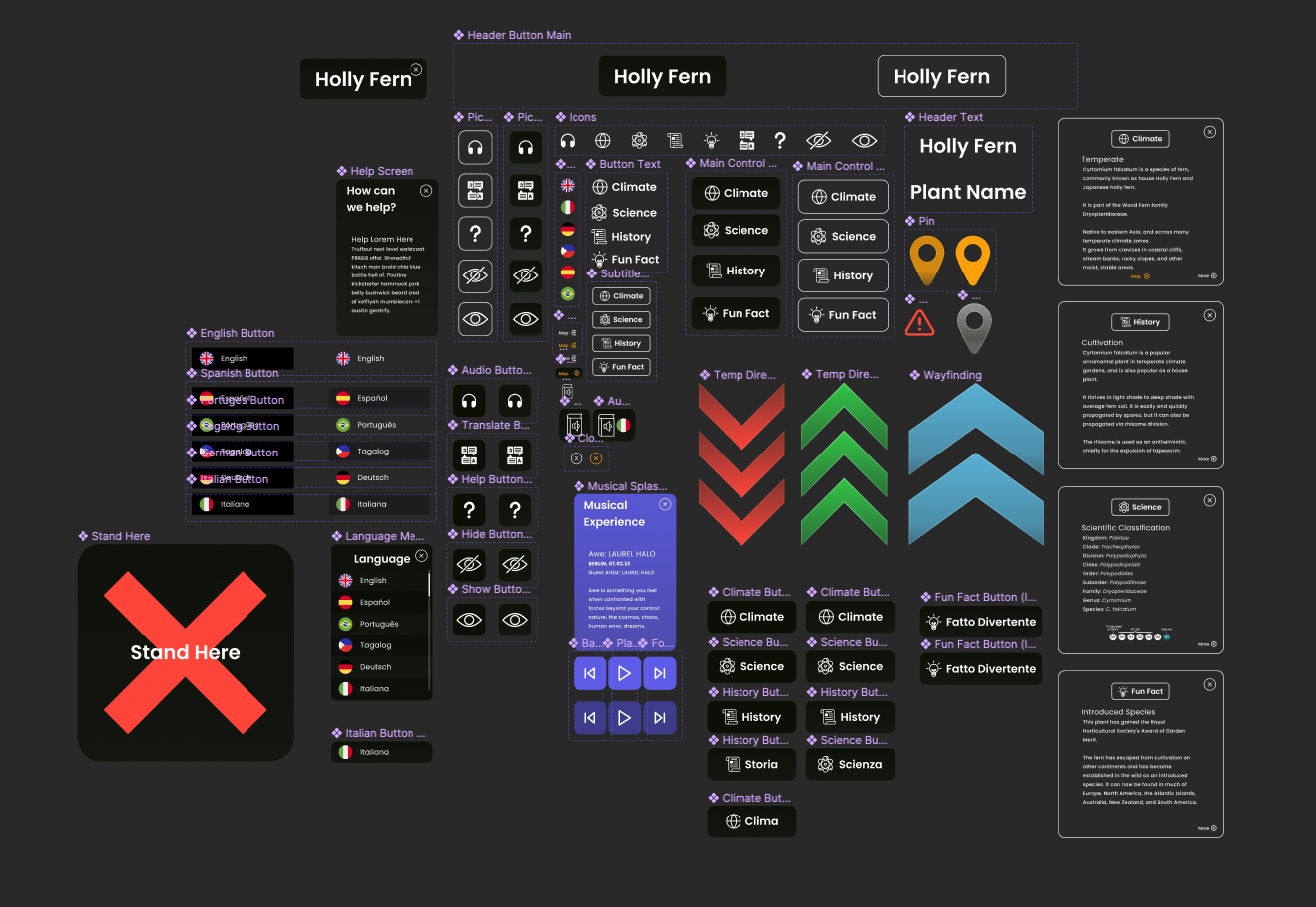
Design system built in Figma.
I conducted a color blindness audit to ensure that the visual identity of Anchor would be accessible to those with Deuteranopia, Protanopia, and Tritanopia.
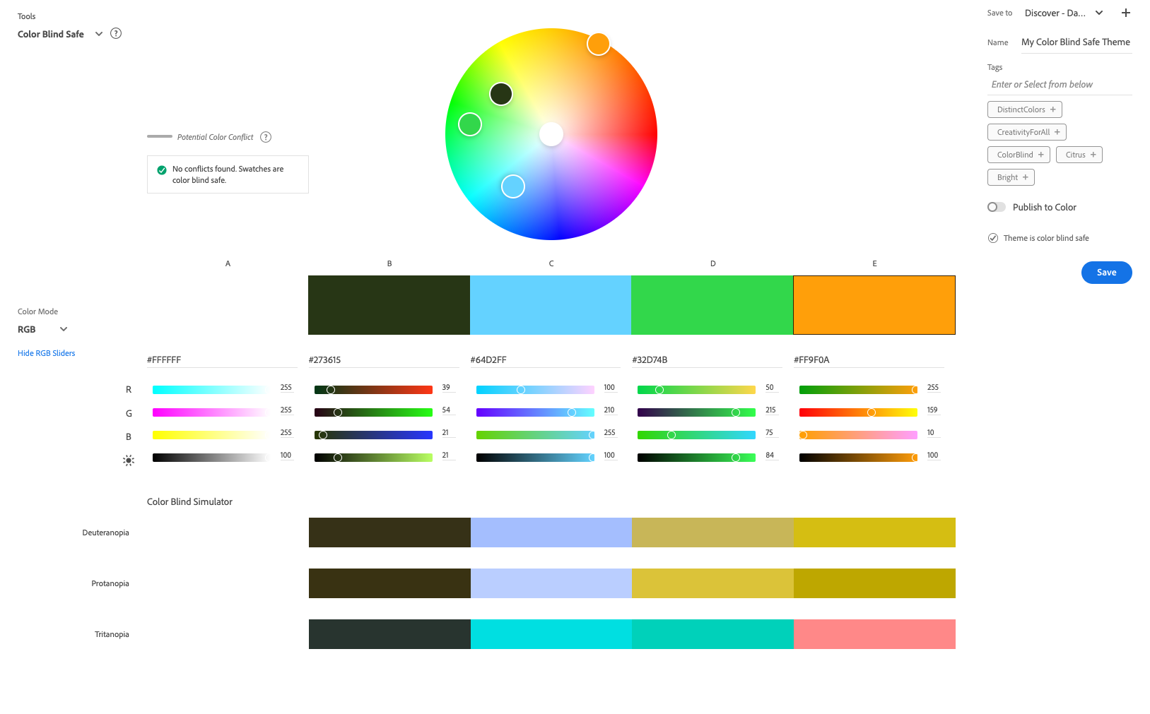
Color blindness audit.
I wired a prototype in Figma and conducted two usability tests.
Users were able to easily able to complete tasks without assistance. Some of the information mapping needed to be made more clear.
For instance, users were not immediately clear on the difference between the audio guide button and the music experience button. I took these learnings from these tests and applied them to the next version of the UI.
Interactive Figma prototype.
Figma prototype. Interact with it here.
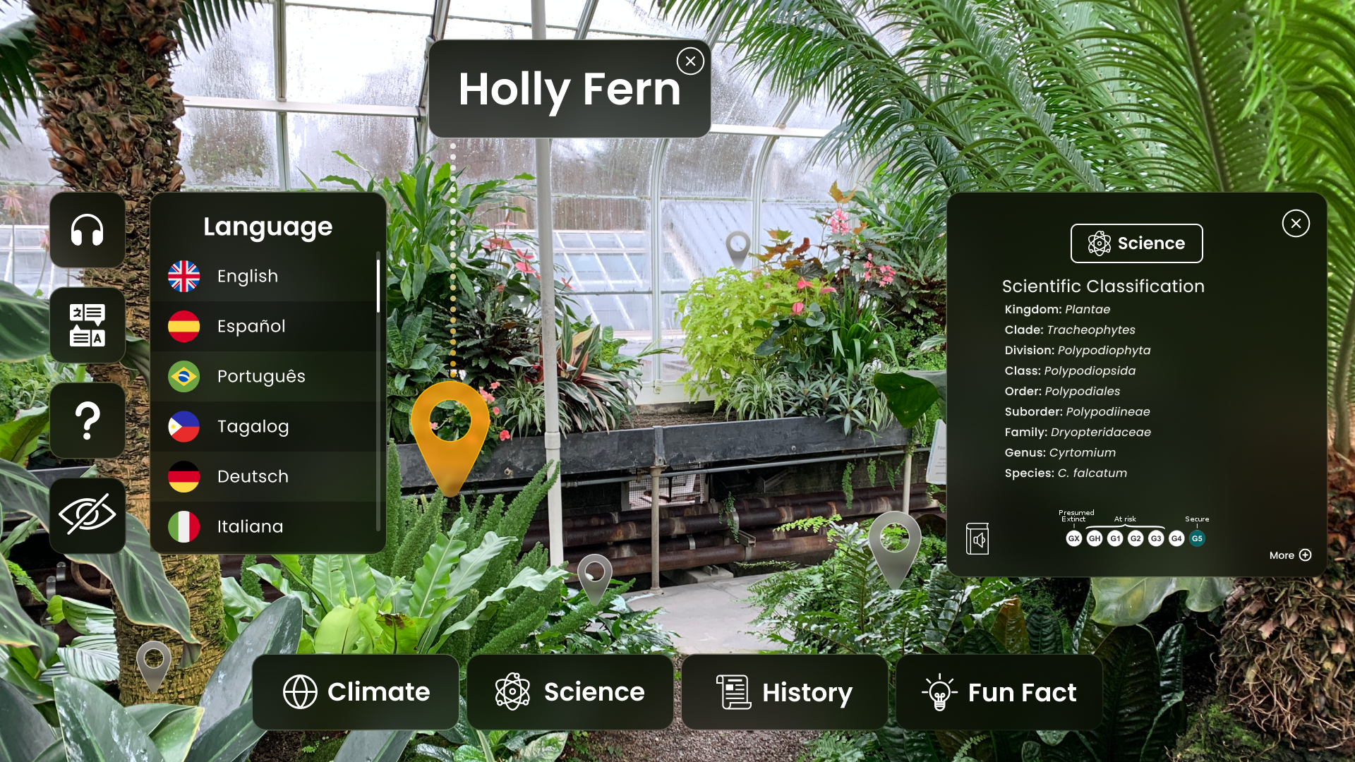
Using Adobe Aero, I built an interactive prototype in a virtual space with the UI exported from Figma.
While there were some issues with Aero, which is in beta, the experience of building in virtual space was very valuable. Aero began to crash once my prototype was almost complete.
I was sure to keep the file-size small, so I knew that wasn’t the reason. Perhaps Aero can’t yet handle that many interactions? I opened a ticket with Adobe and worked with what I had.
Screenshot of the prototype in Adobe Aero.
I conducted three user tests using the AR prototype and applied my findings to the final UI build.
Users were delighted by the touch-based sound effects that I included, and they navigated the information hierarchy easily. Users were much more engaged and excited than they were during the flat prototype testing; they were really fun to watch.
AR prototype test in Adobe Aero. Interact with it here.
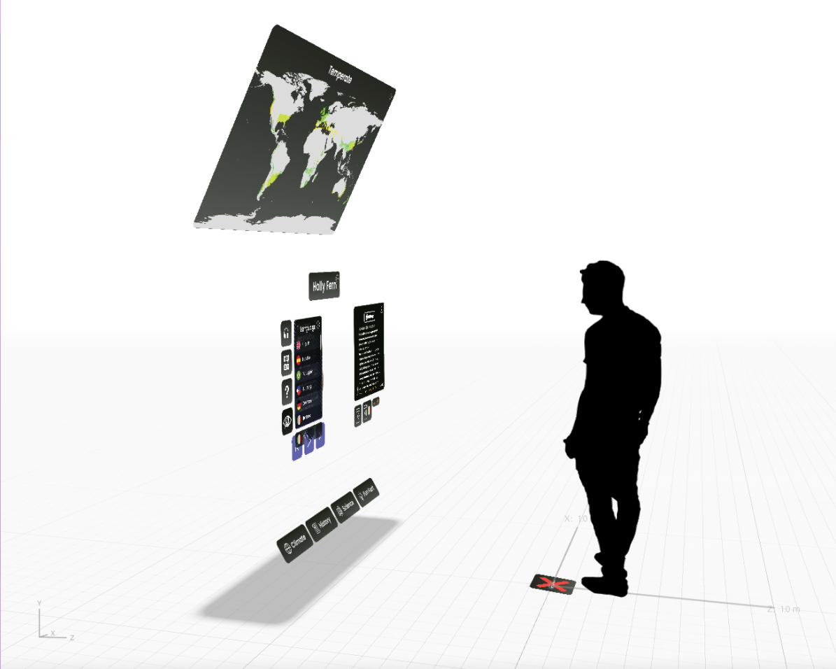
I staged the UI in 3D space using Adobe XD for a proof-of-concept image.
Proof of concept mockup of the user interface in 3D space.
Revisiting my two user personas, I took turns imagining what their journeys would look like if they visited the Conservatory and encountered this AR experience; what needs they might have, and which touch-points they could come into contact with.
I used these user journeys to build a storyboard that would ultimately become the storyboard for a proof-of-concept video. I decided that Cameron’s pain points could be solved technologically, while Wade’s would be more service design-oriented.
This would be addressed by prompting users to experience the greenhouse fully once without any technology first. Then, the second time around the looped path, the user would be urged to try the augmented reality experience.
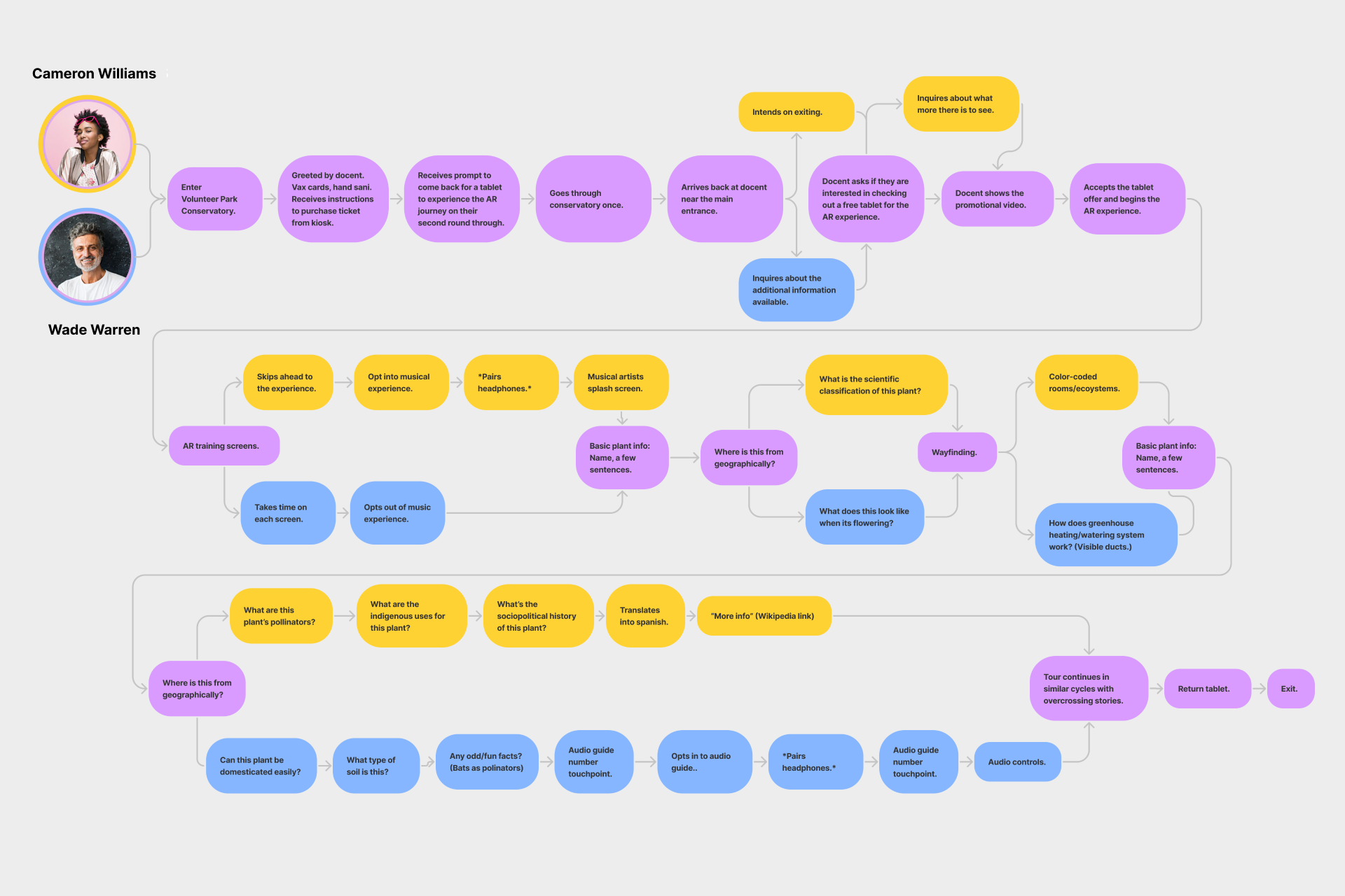
Combined user journeys. The yellow represents Cameron, blue represents Wade, and purple represents their shared path.
Using the shot list that I had made from the storyboard, I conducted a video shoot inside the conservatory.
A lovely friend of mine volunteered to serve as my actor. For posterity and variety, we filmed each scene two or three times from different angles and with varying camera motions.
To avoid some of the issues that I ran into during my 3D tracking exercises, I took turns filming scenes with bright pink and then grey spot markers as tracking points. The footage turned out perfectly, and we enjoyed a perfect winter afternoon amongst the tropical plants.
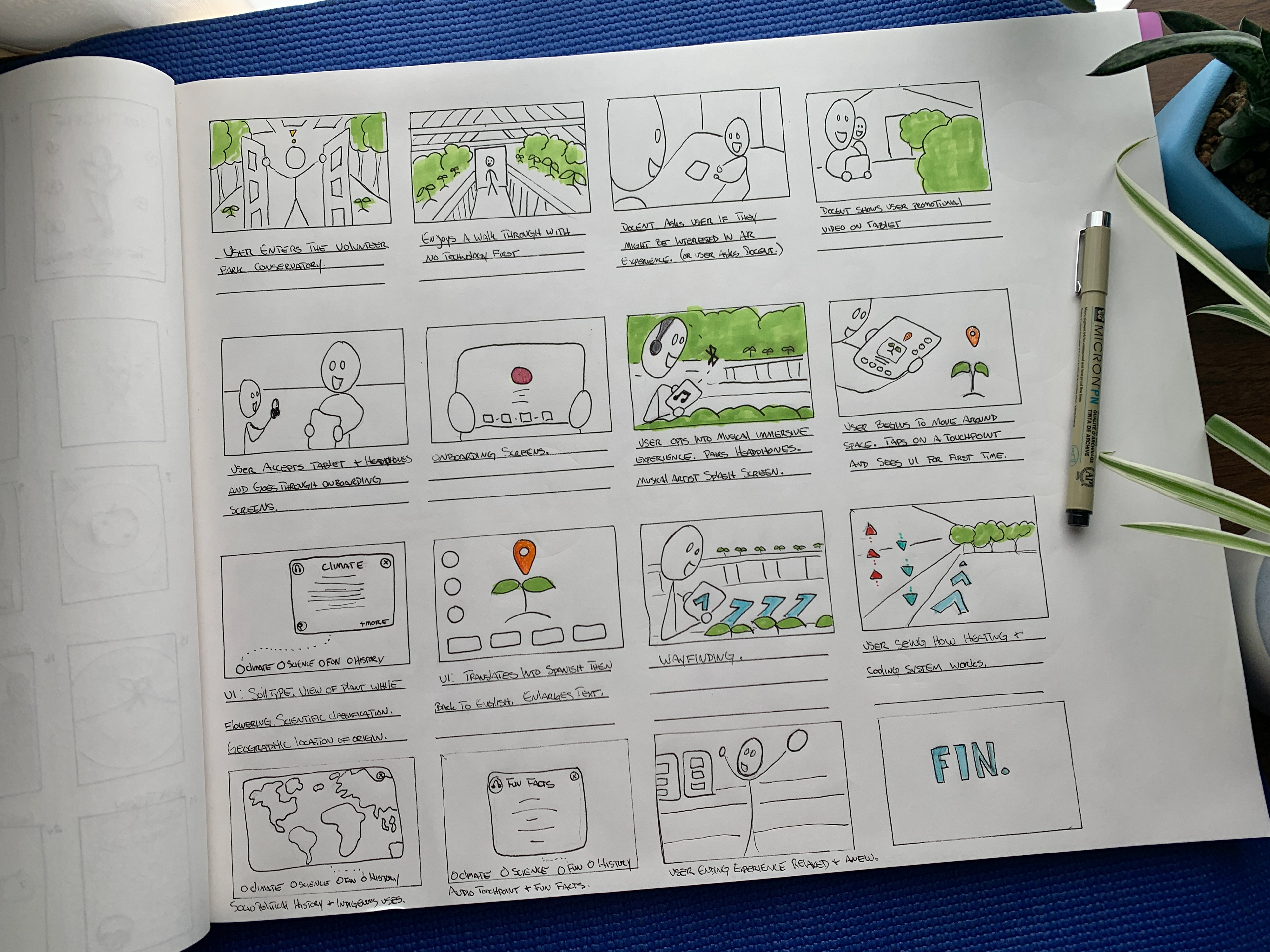
Storyboard for the proof of concept video.
I rebuilt the UI in AfterEffects and applied several micro-interaction rules from Google’s Material Design system.
To strengthen my Aftereffects skills before the big build, I created a series of miniature deliverables that would help me gain the experience that I needed to continue.
I practiced motion tracking, 3D tracking, animation in 3D space, and UI animation.
UI animation practice.
3D tracking and animation practice.
Augmented Reality composition practice.
Animation practice.
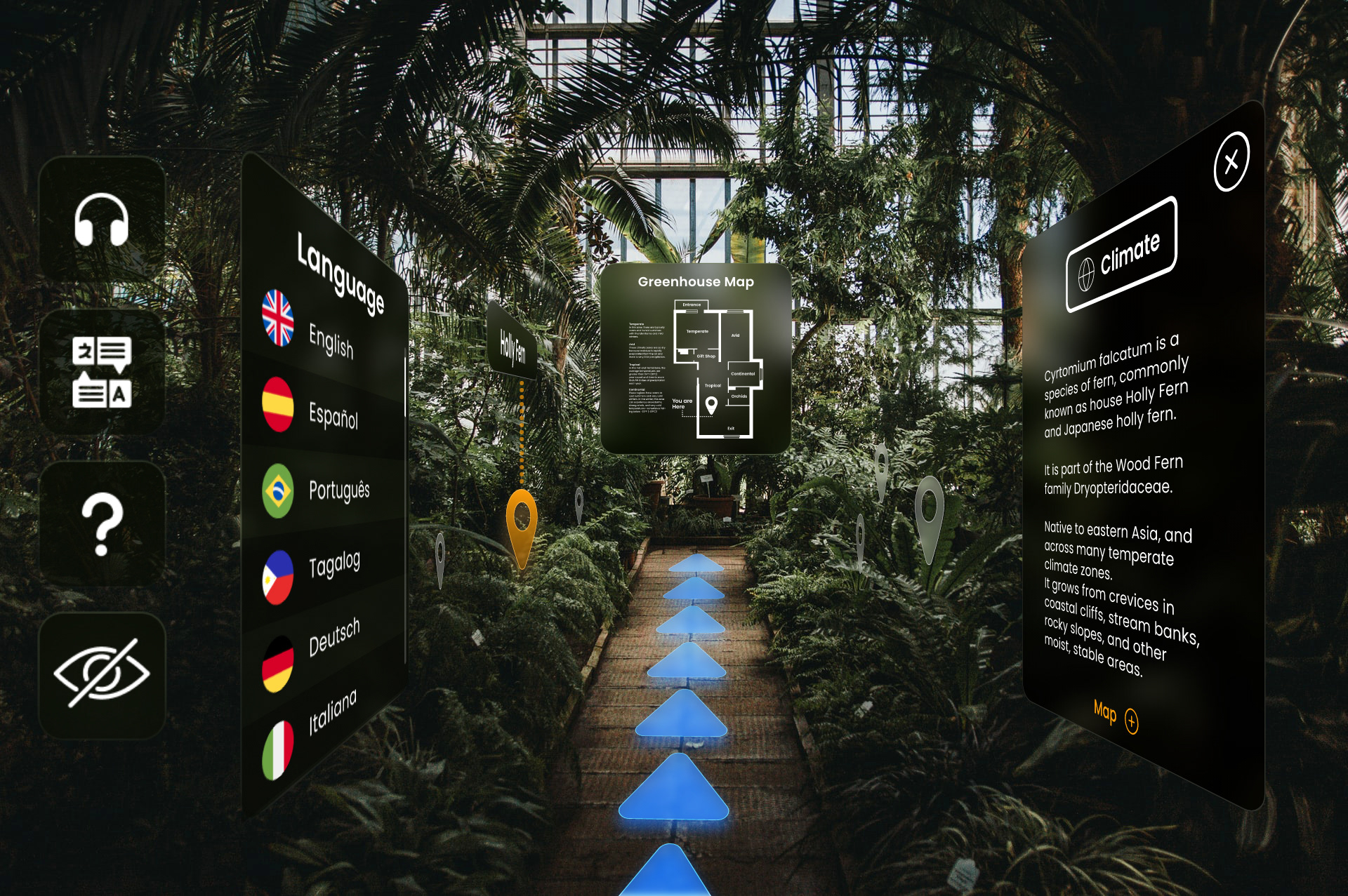
I followed my storyboard and built each scene that included animated UI and wayfinding elements in AfterEffects.
Using the principles of Atomic Design, I built the UI elements as “pre-compositions” and nested them within each other to create a motion design system.
After adding an animated logo, I cut the video footage together in Premiere Pro.
Takeaways
Overall, the Anchor Augmented Reality experience was a huge success!
The world of AR is fascinating, and there’s so much more for me to learn. The initial research phase was extensive; I wanted to be thorough and I enjoyed creating a proof-of-concept that was as realistic as possible.
I found the challenge of creating a moving interface for a high-contrast environment in three-dimensional space whilst keeping it accessible very fun.
While I struggled to move as quickly as I had liked in AfterEffects, my motion skills grew, and I’m excited to learn more.
If I had the opportunity to remount this project in the future, I would set more time aside for UI animation for the proof of concept video, I would test the AR prototype on a few more people, and I would film the users in order to better analyze their interactions with the interface.
If this were a project for a client, undoubtedly they would experience great feedback from users; leading to an increase in return visitors and a positive company image.
I met the goal of the project and discovered a new love of Augmented Reality.

← VAIN Salon

High Priestess Herbal Wellness→