Overview
The High Priestess Herbal Wellness is a cannabis company that reached out to me to design its packaging and define its visual identity.
Timeframe
66hrs
March – September 2022
Client
The High Priestess Herbal Wellness + CBD
Roles
Visual design, component system, typography, packaging design, web design.
Tools
Adobe Suite: InDesign, Illustrator, Dimension, Photoshop, AfterEffects. Figma.
Collaborators
(Solo)
———
Problem
The High Priestess Herbal Wellness was a brand new company entering the cannabis market.
They required a visual identity that better represents their blossoming brand, as well as packaging designs for a line of CBD products.
They required a visual identity that better represents their blossoming brand, as well as packaging designs for a line of CBD products.
Solution
The goal for this project was to create a beautiful line of packaging, as well as an updated visual identity that reflected the High Priestess’ elegant and effervescent personality. This design solution would be systematized so that it could be easily applied to future High Priestess products of various shapes and sizes.
Research & Demographics
The world of cannabis is saturated with beautiful packaging.
Alongside the owner and creator of The High Priestess Herbal Wellness, I gathered packaging inspiration from consumer products across the board; including cannabis. Because the company was small, I was able to work closely with the owner for the duration of the project.
During my competitive analysis, I took notes on which packaging I felt was personally engaging, what the most successful brands were doing, and which packaging the client responded to.
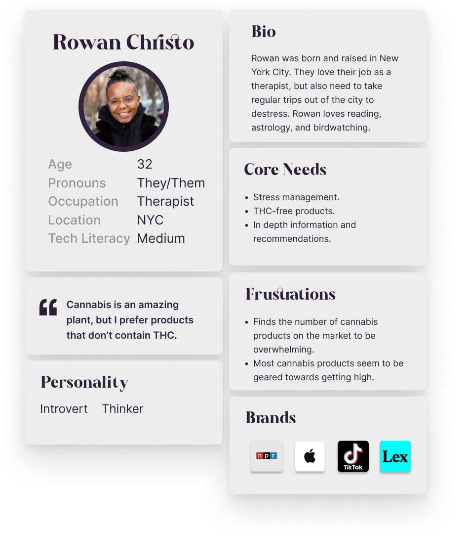
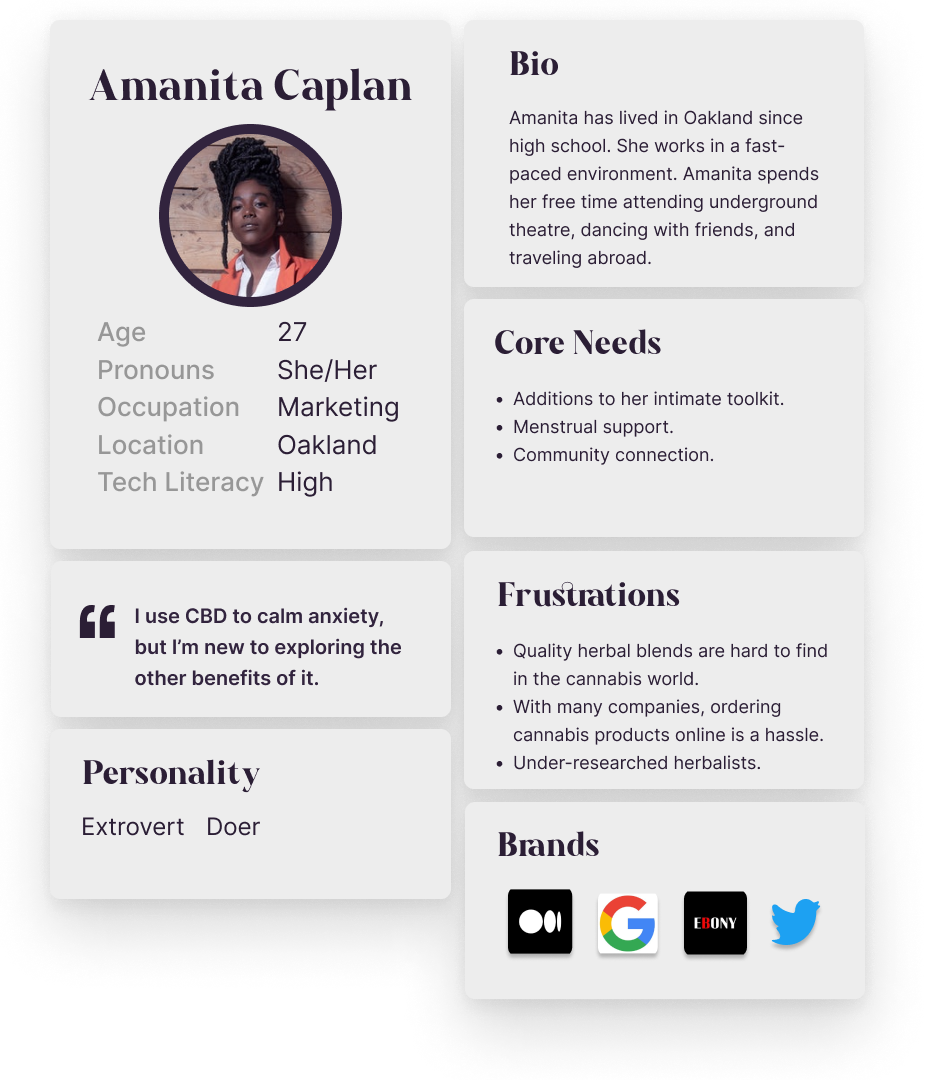
Using information about the target demographic that I had learned from the owner, as well as reading that I had done on my own, I created two user personas. These personas helped guide me as I moved forward with problem-solving and designing.
Process & Work
Once we had settled on a general direction, we began to explore color.
I used Shutterstock’s trend forecast for 2022 as inspiration for our base tones, I also explored palettes sampled from related photography. Finding a palette that was cohesive, vibrant, and accessible when paired with small text was an intriguing challenge.
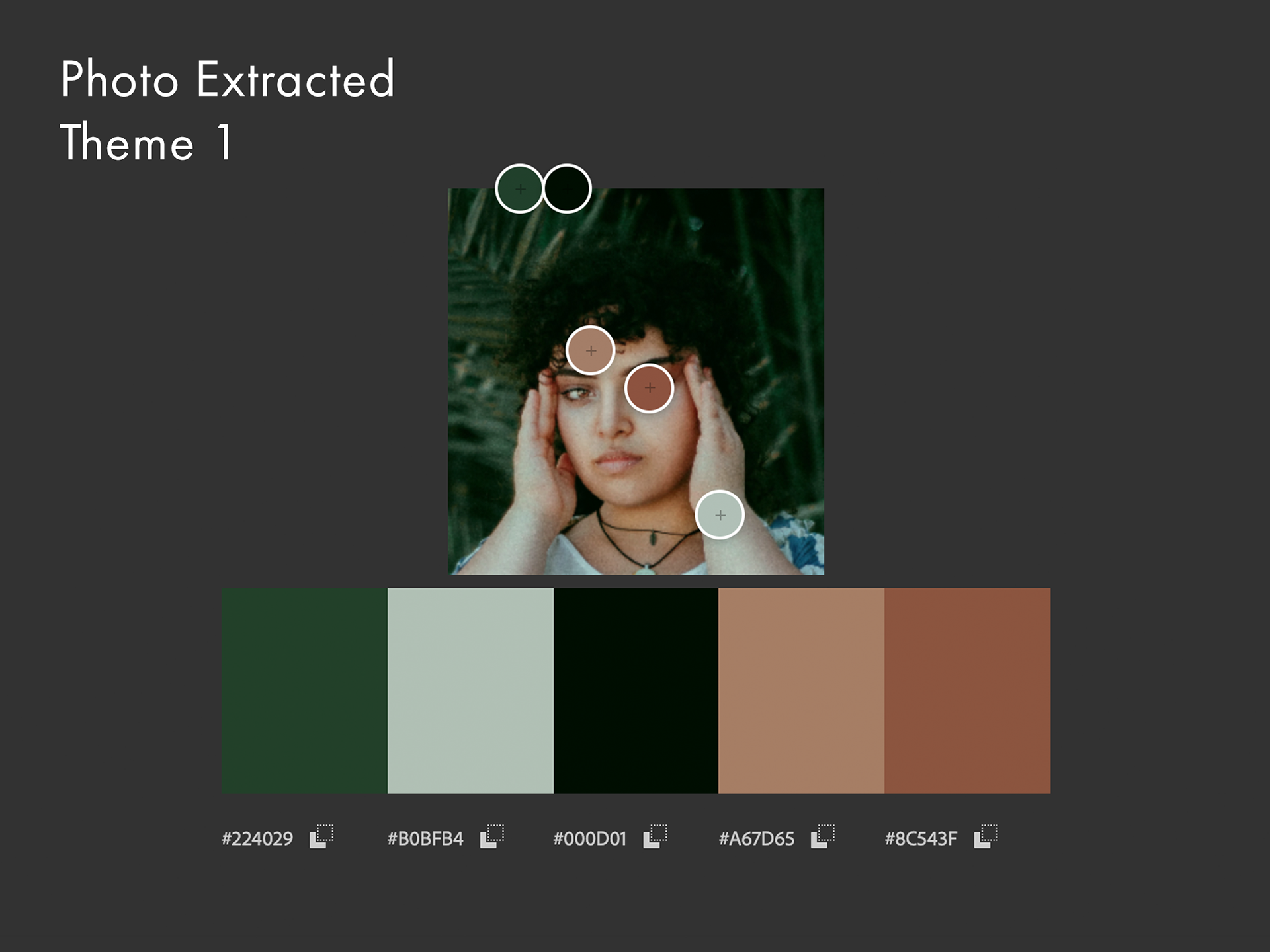
Photo extracted color palette theme 1.
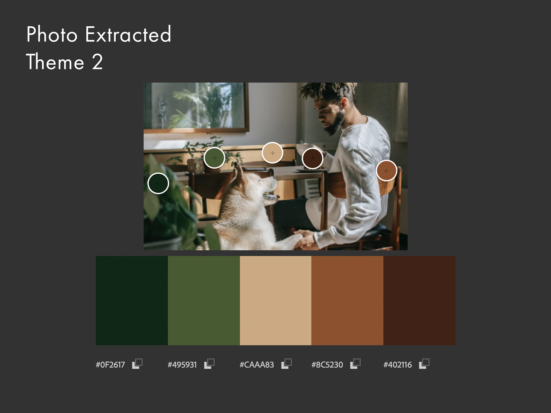
Photo extracted color palette theme 2.
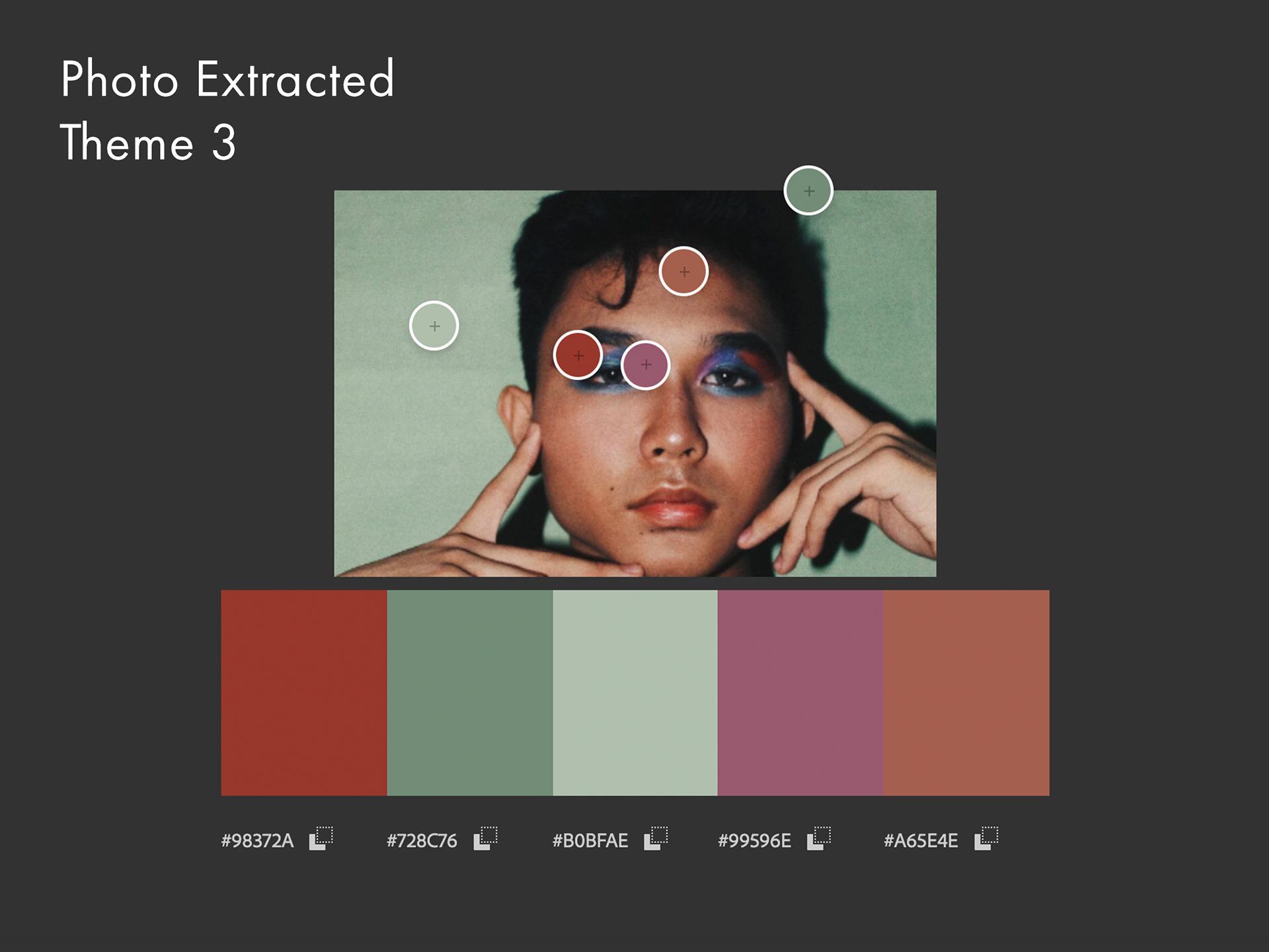
Photo extracted color palette theme 3.
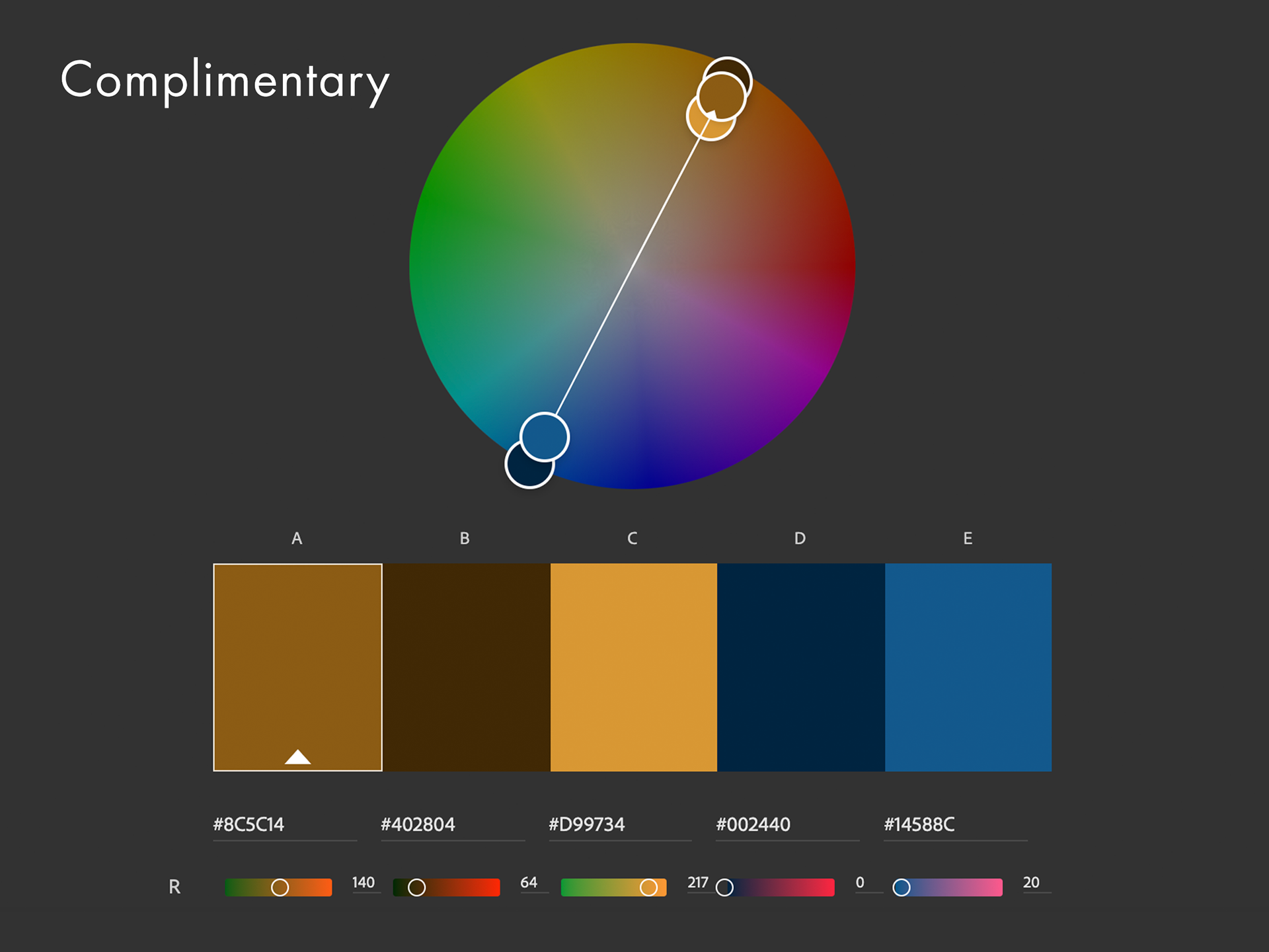
Complimentary color palette.
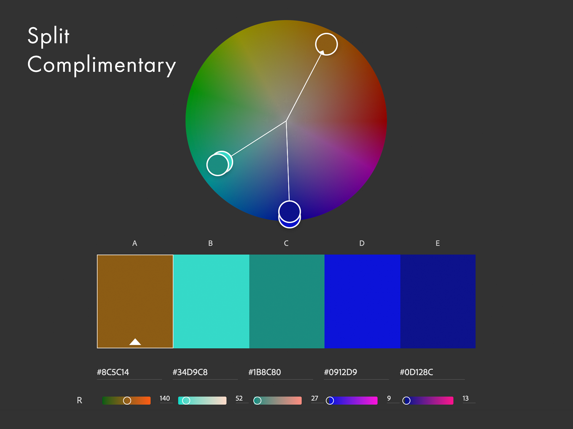
Split complimentary color palette.
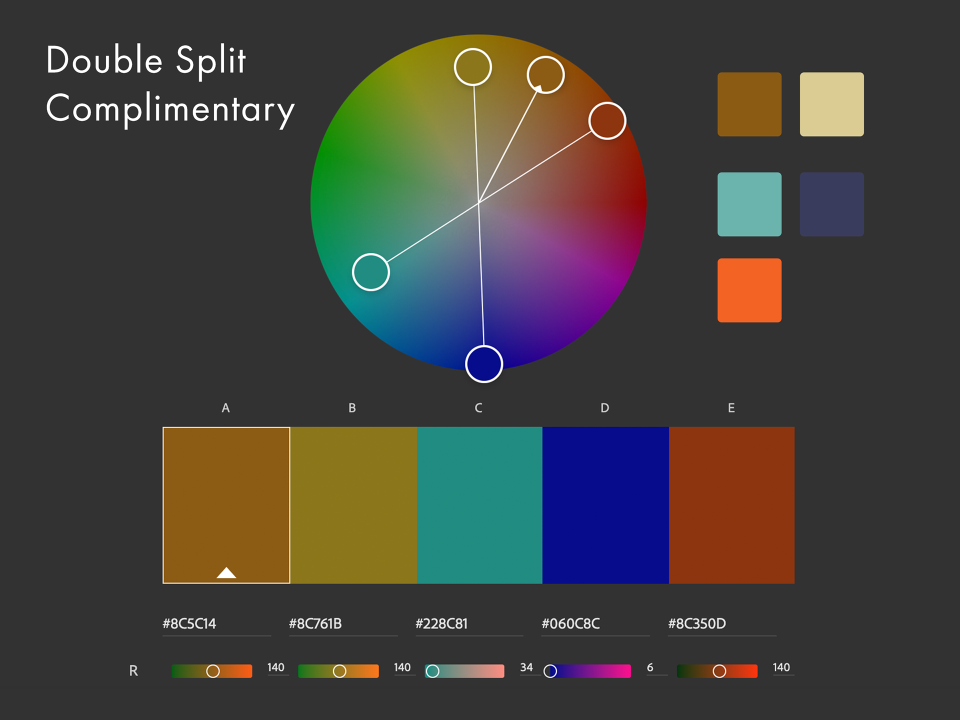
Double split complimentary color palette.
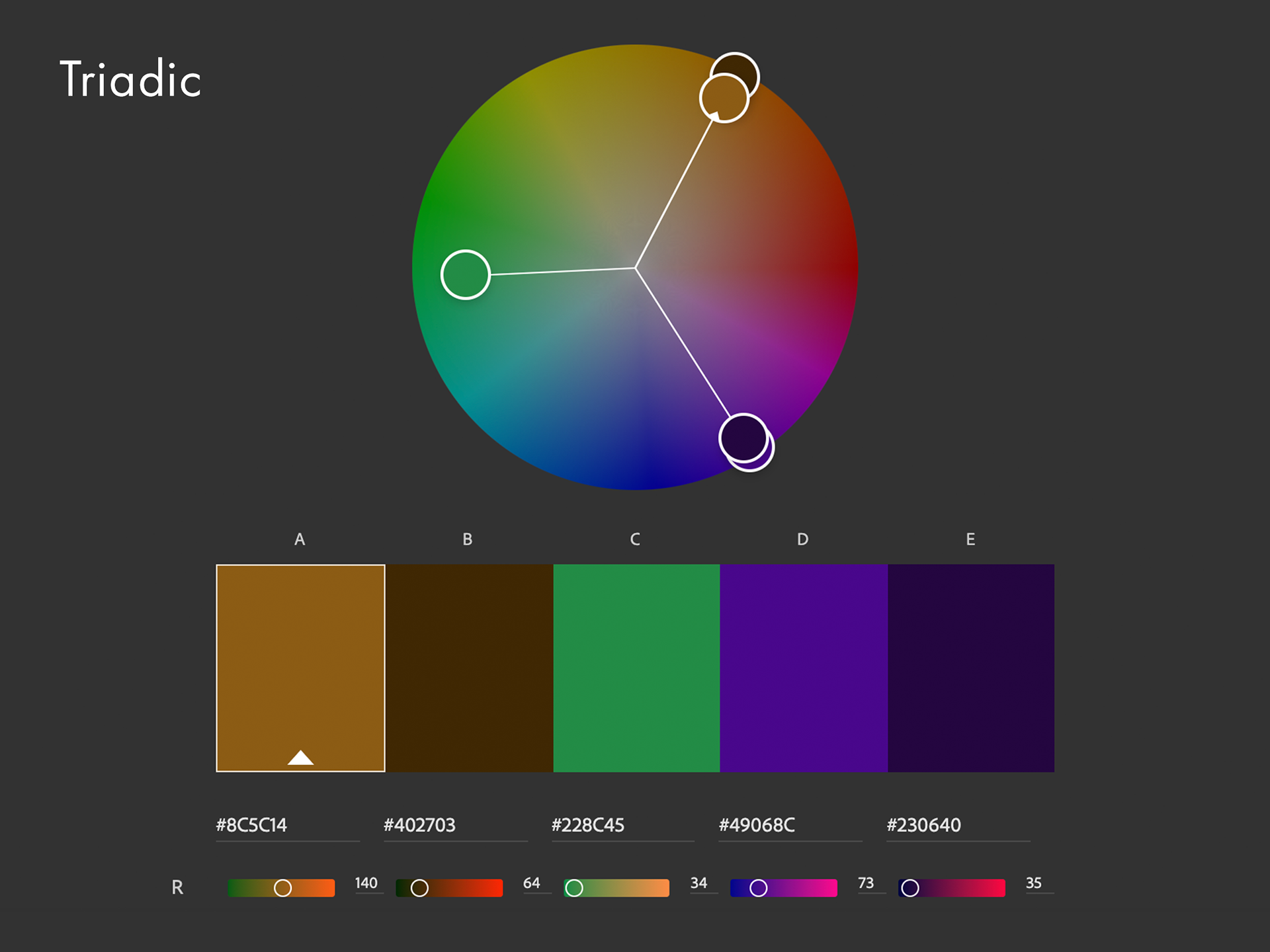
Triadic color palette.
We settled on a color palette of gem tones. I made sure that each color we chose had a high enough contrast ratio with text at AA Web Content Accessibility Guidelines standards.
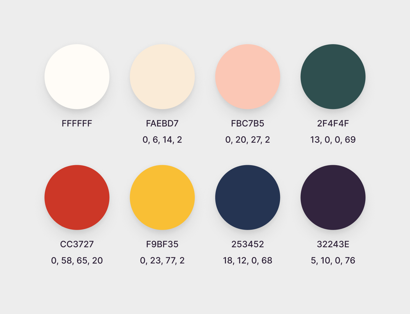
Final color palette.
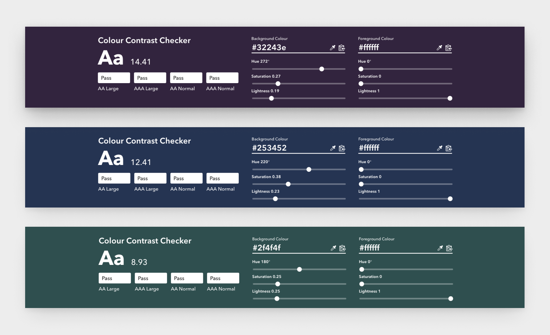
Color contrast audit.
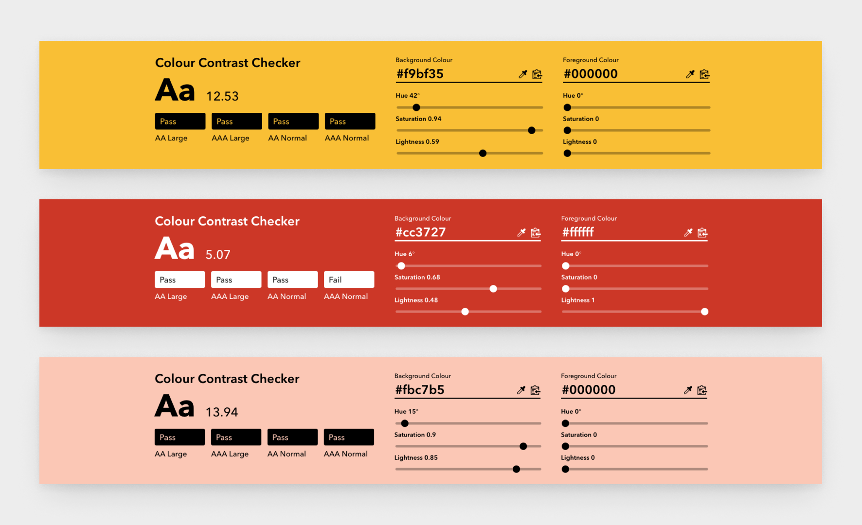
Color contrast audit.
Typography is one of the most important elements of a brand.
While exploring this for High Priestess, I didn’t hold back. I worked closely with the client, showing her many typeface combinations. While this made the process of decision-making slower, we ultimately arrived at a solution that we both felt fit the new brand.
The body text we chose remained true to the High Priestess website “Brandon Grotesque”, a modern sans serif. The product titles would be more expressive, set in an elegant serif with decorative glyph options; “Austragen”.
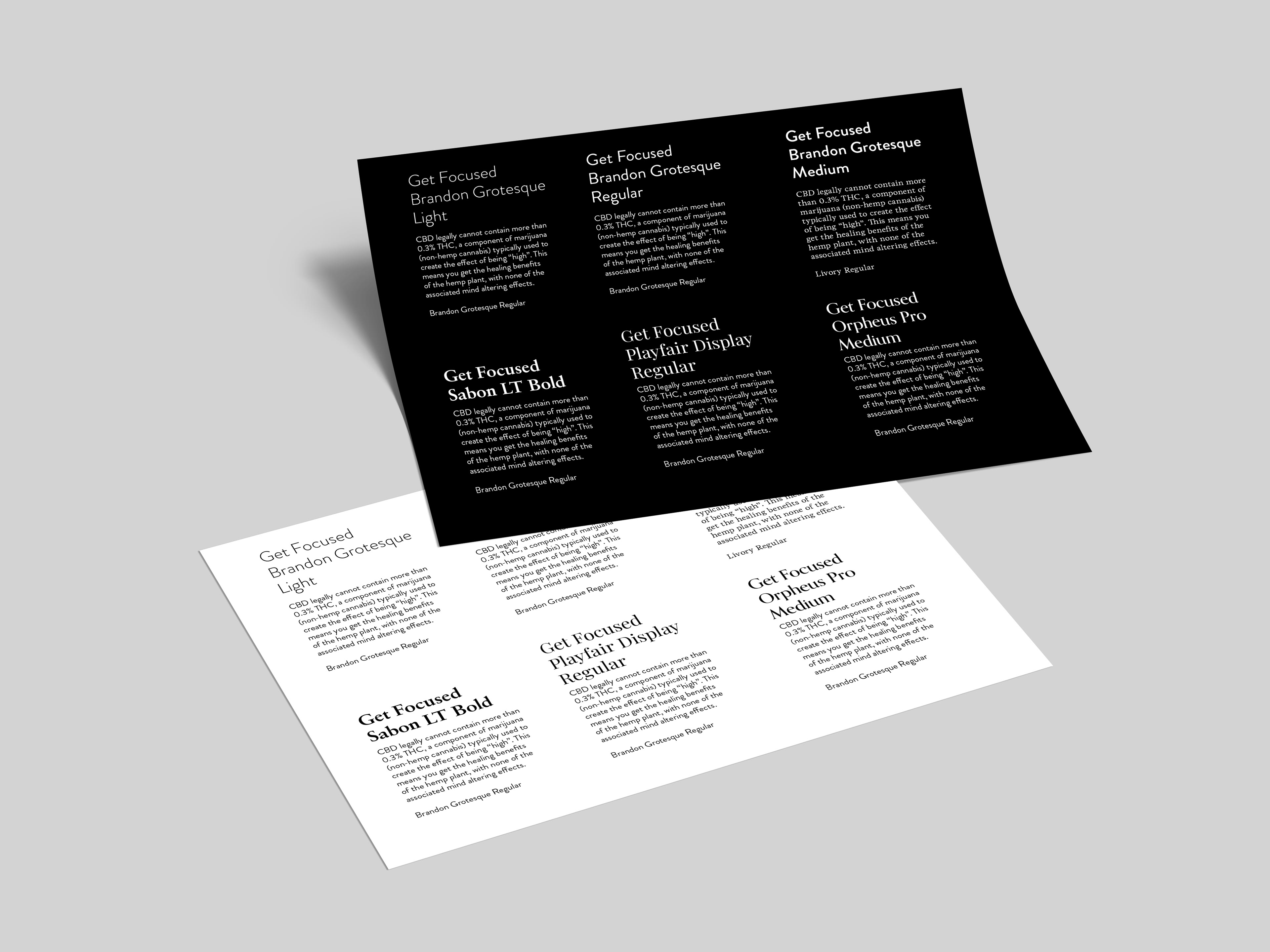
Typography samples.
Both the owner and I agreed that illustration should be incorporated into the visual design.
We agreed on a style based on old scientific botanical renderings. These illustrations applied to the bottle and labels would serve to complement the cannabis silhouette that I chose for the outer packaging, as well as allude to the herbal infusions inside of the vessels.
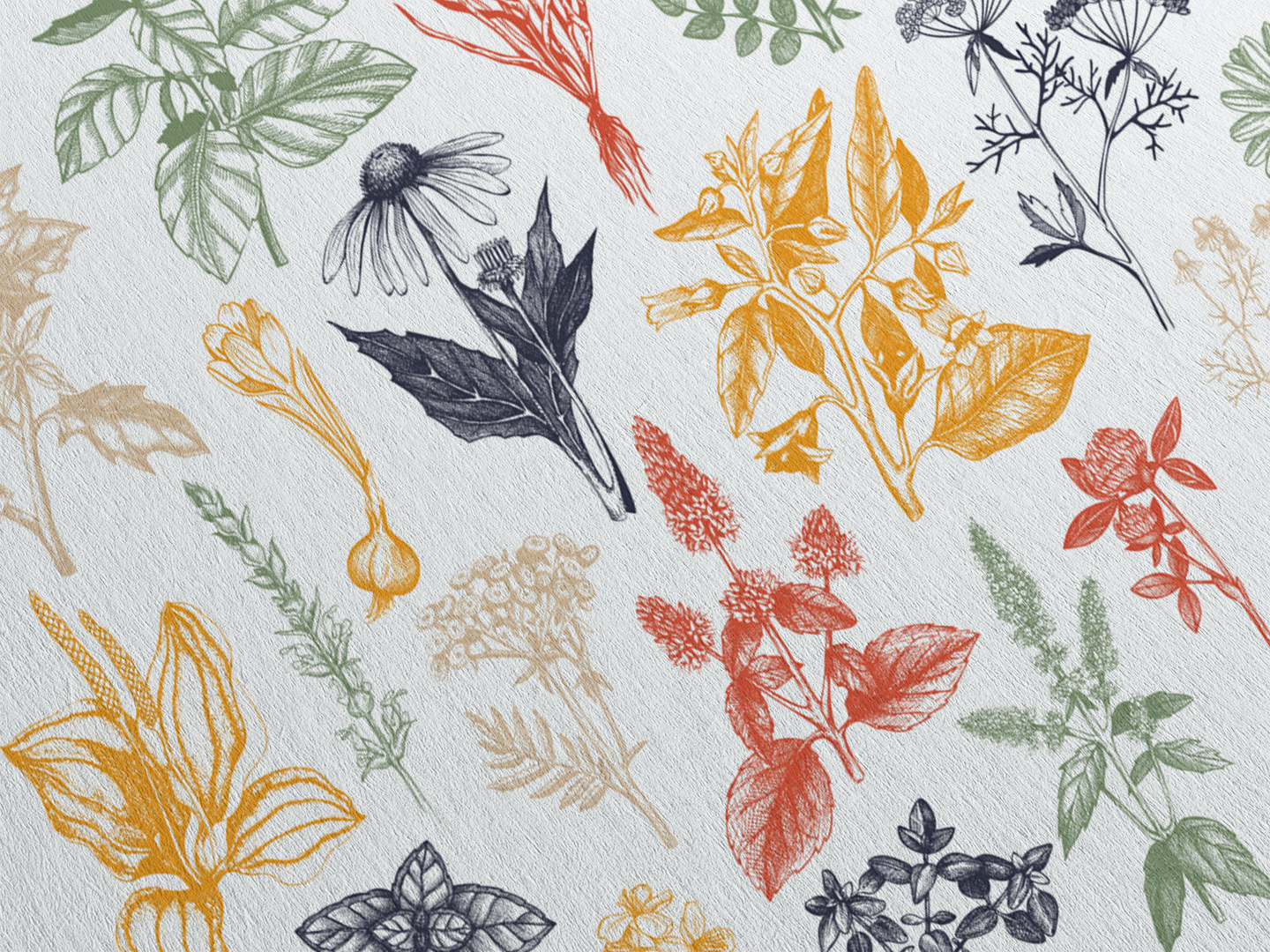
Herbal illustrations by Yevheniia.
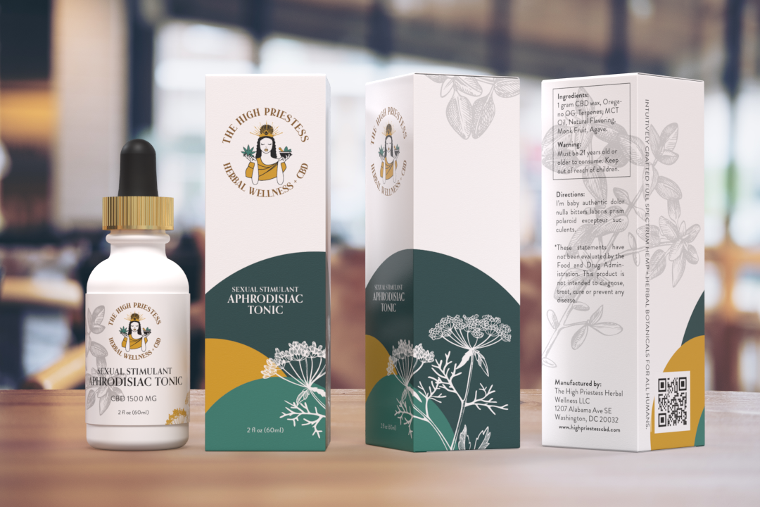
Using the component system that I had put in place, I began iterating packaging designs for a set of a box and & a bottle.
This one box and bottle set would be designed modularly so that all components could be repeated on boxes of different sizes and shapes. This same methodology was applied to the bottle/jar label.
I found the client’s original logo to be crowded and too detailed. This disconnect between the minimal modern packaging and brand personality would reflect poorly on the company. The original brandmark also limited the colors that I could use in my design. After several iterations, we decided that the logo needed a redesign.
Rough draft example 1.
Rough draft example 2.

Rough draft example 3.
The original logo also didn’t fully fit with the vision that the owner had for the company’s image.
It was very detailed and crafted looking. It was an illustration that would only work at a large scale, and was generally too complicated to use as a scalable brandmark on various collateral.
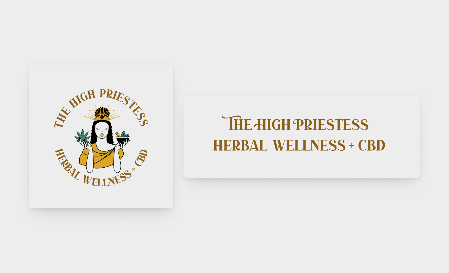
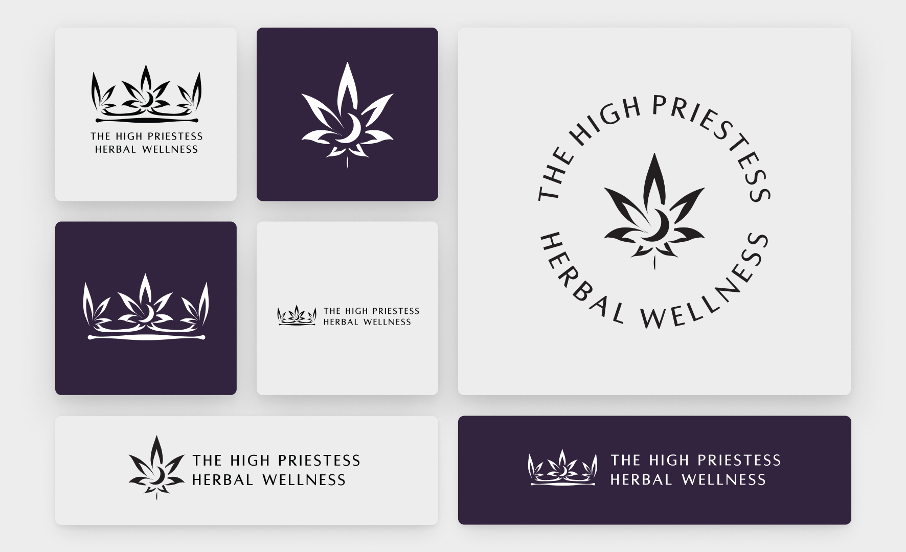
I happily redesigned the logo to be a simple stylized cannabis leaf surrounded by graceful text. Because the logo would have many applications, I created a logo suite, including a crown and several other lockups. This new logo system was versatile and could be applied at any size and over top of any color. This new brandmark reflected the elegant brand personality that the owner spoke of.
Original version of the logo.
My redesign of the logo.
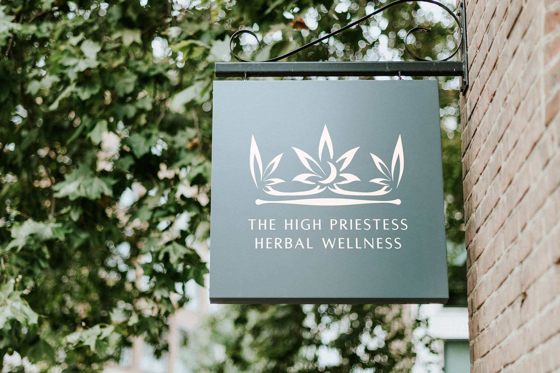
Mockup of the new logo.
The redesign of the brandmark unlocked more of my creativity.
I was able to go back to some of our original color explorations without limitation. It was an exciting challenge to find a set of colors that could be easily reproduced in CMYK. Whenever we settled on a color that was rich in vibrancy and high enough in contrast to be accessible to individuals with low vision, it was usually comprised of two or three process colors.
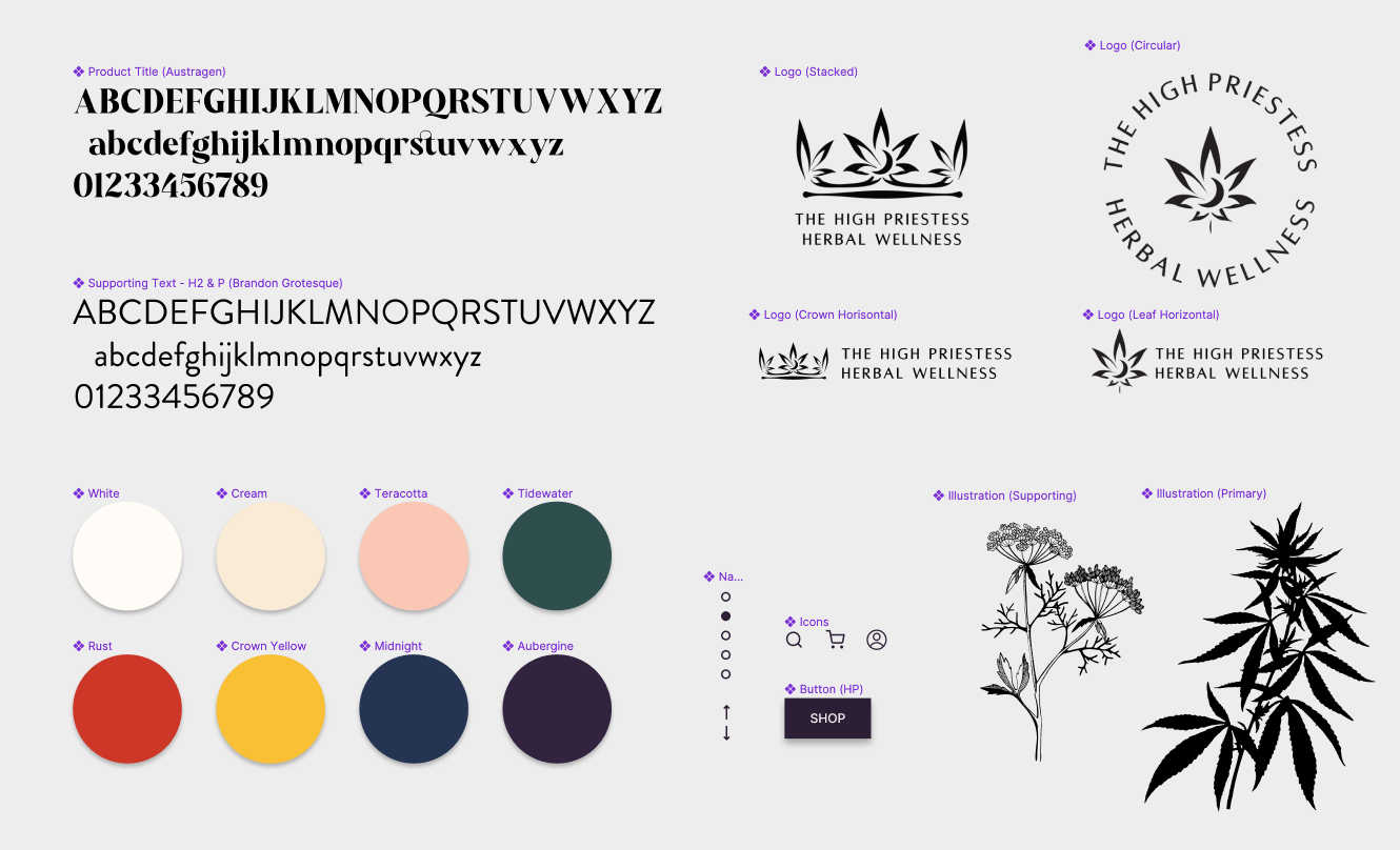
Component system in Figma.
As I thought ahead to the printing process colors.
I realized that with each plate required to create the color, the margin for error increased. If three printing plates were needed to create a color, knock-out white text that was set at a small 8pt size on a color field could look fuzzy or be completely illegible.
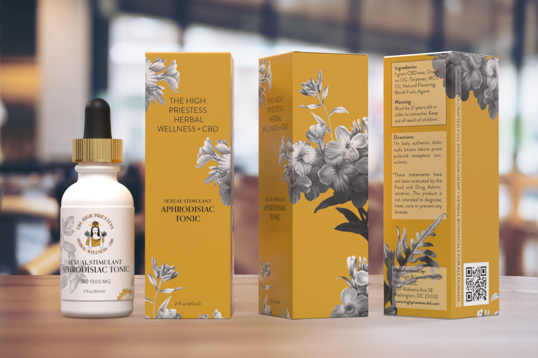
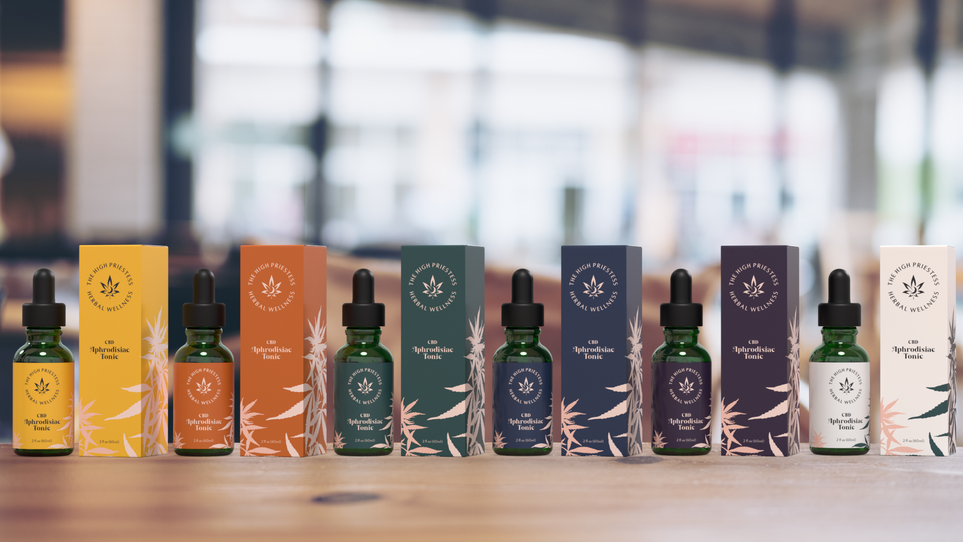
Ultimately, the client would end up using Pantone colors for each box. This way only one printing plate would be necessary and details would remain crisp. After more iterations, we arrived at box and label designs that would be systematically applied to the other products.
3D rendering of the semifinal draft of the color palette and label/box layout.
Once I received the proper dielines for all of the boxes and labels, we created a color system for each product.
Each color signified something about the product. I used Adobe Dimension to tailor 3D OBJ files to the correct sizes to render virtual product mockups. This came in very handy when exploring finishes and bottle materials. I printed out and folded each dieline to be sure that we were sent the proper dimensions.
This proved to be a necessary step, as the company who created the dielines sent us two mismeasured boxes. The mistake was corrected and I was able to layout using the proper dielines for each product.
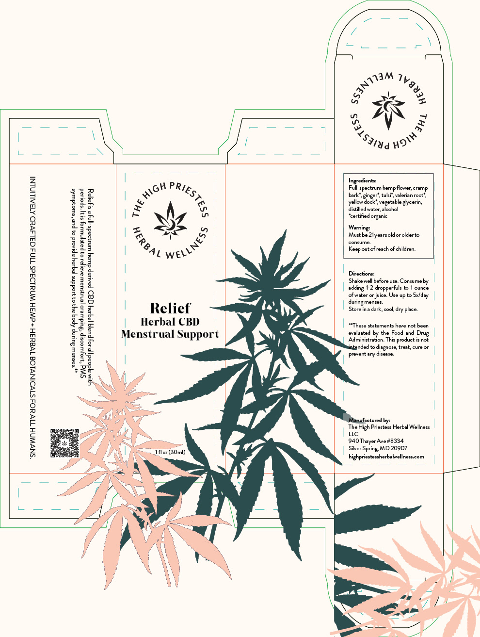
Box design with dielines.
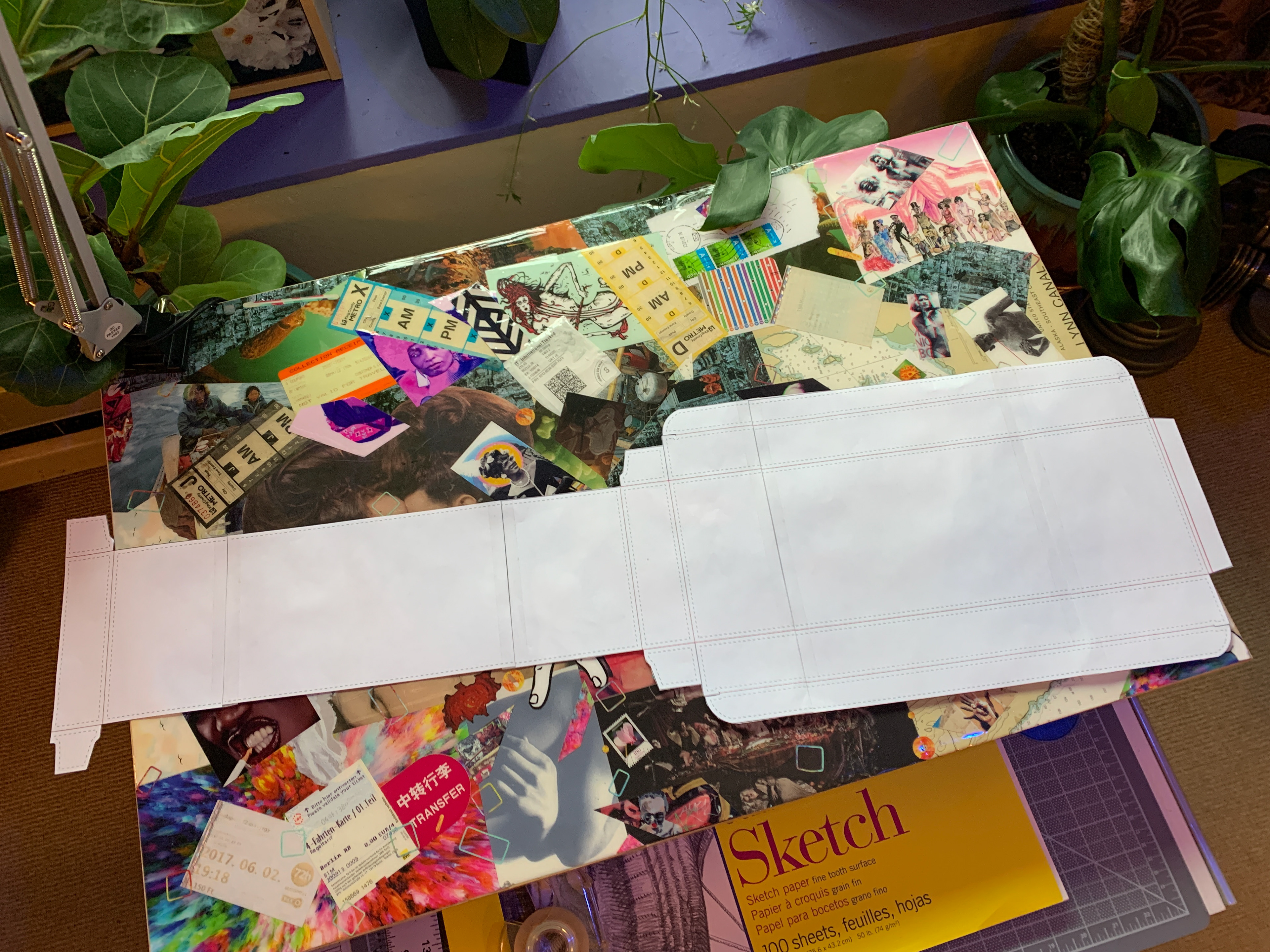
Incorrectly sized dieline. (Resting on top of a collaged desktop.)
Overall, I created twelve box designs as well as corresponding labels for the products inside them.
I began this project gently in the spring of 2021. Because I was still in class at this time, I spent the most time on this project during the following summer.
As fall approached and I started my second year of design school, I packaged these files and sent them to another designer to finish the project. This was a designer that the owner had worked with previously and was comfortable passing the project on to.
While my packaging designs were changed a bit before the products were launched, I’m quite proud of the component system and packaging work that I did for The High Priestess Herbal Wellness.
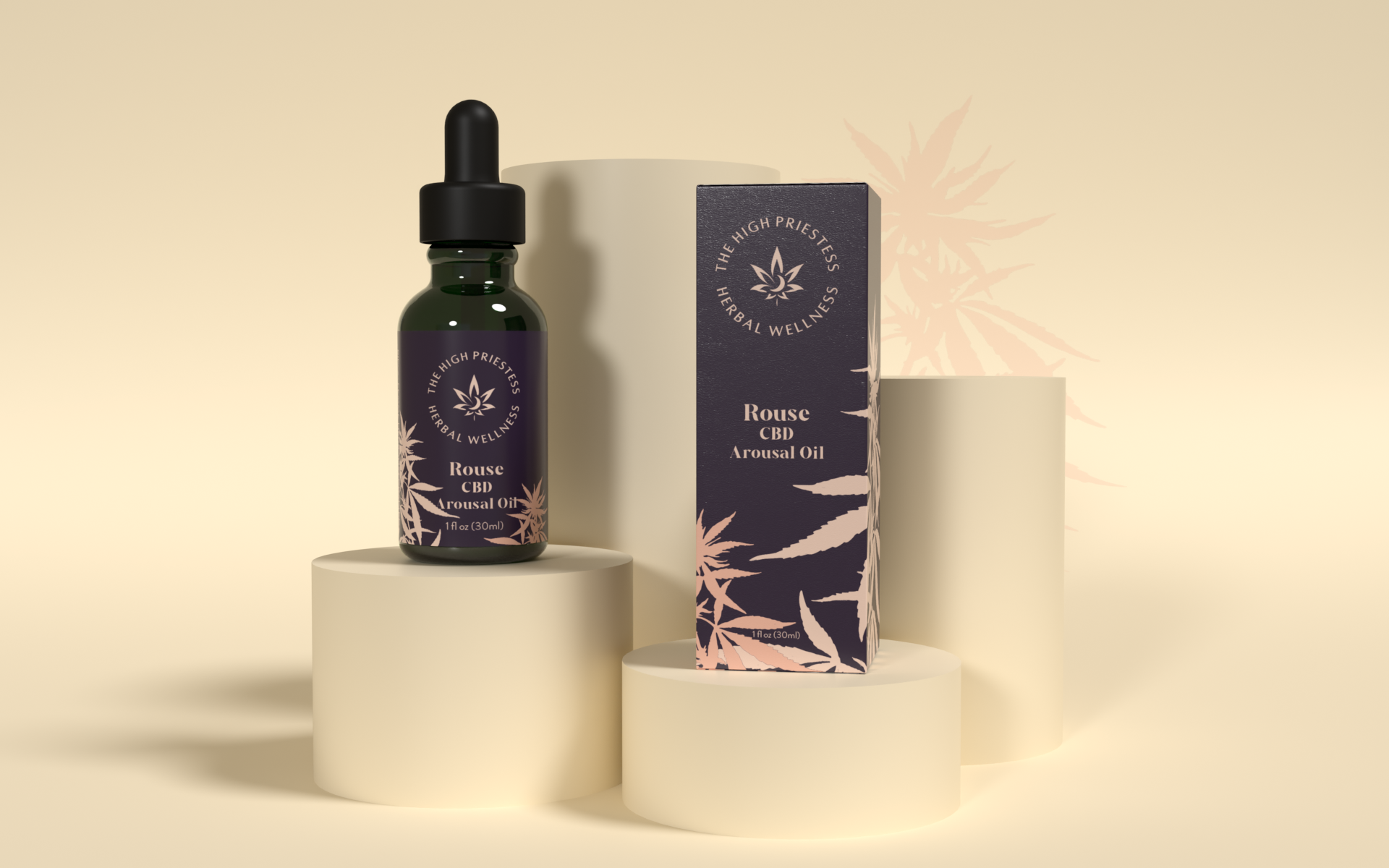
3D rendered mockup of the final box and label design for "Rouse".
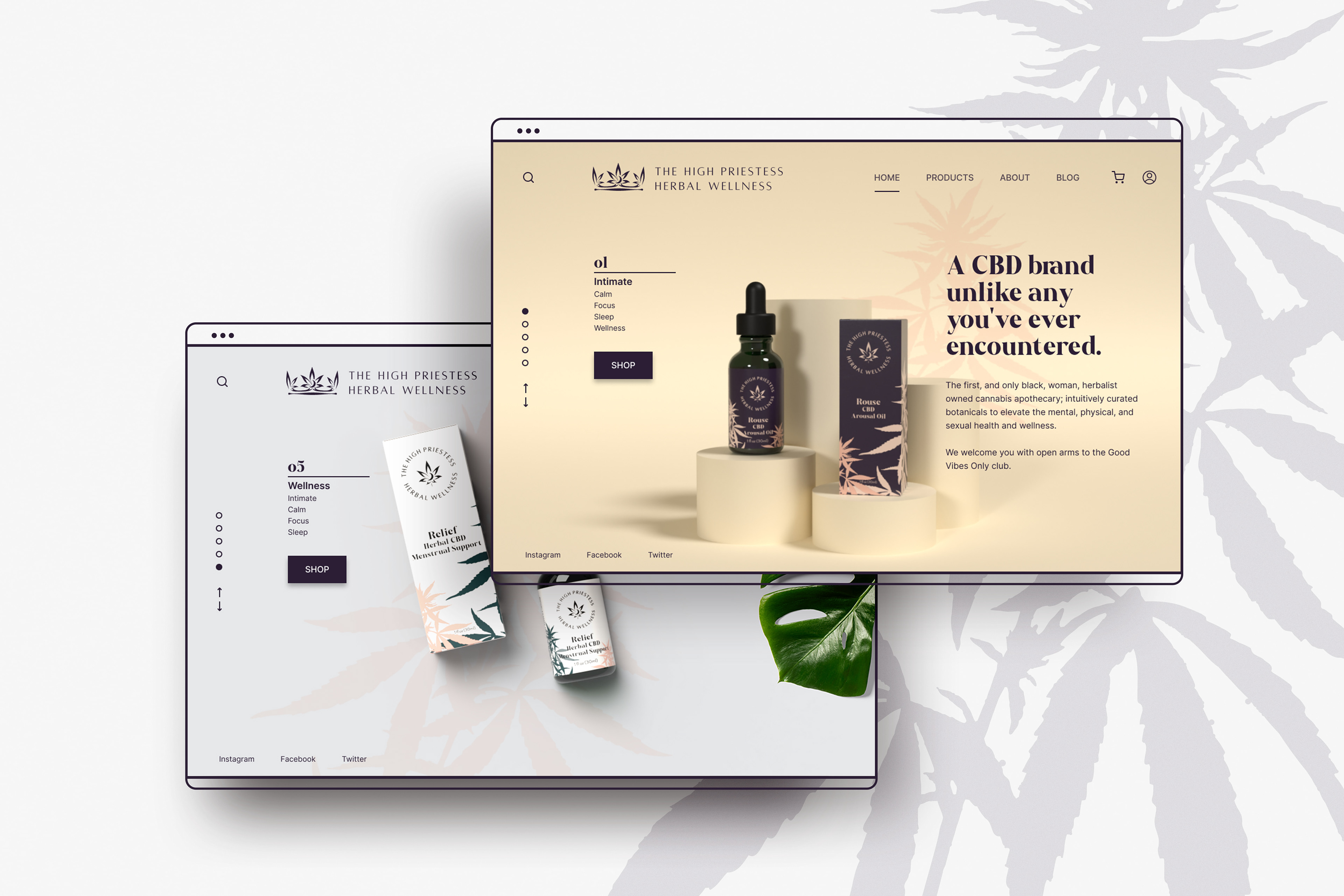
After the products were launched, I used Figma to design a landing page that reflects High Priestess’ visual identity
To connect the site's information architecture with my visual design concept, I used a simple annotated wireframe.
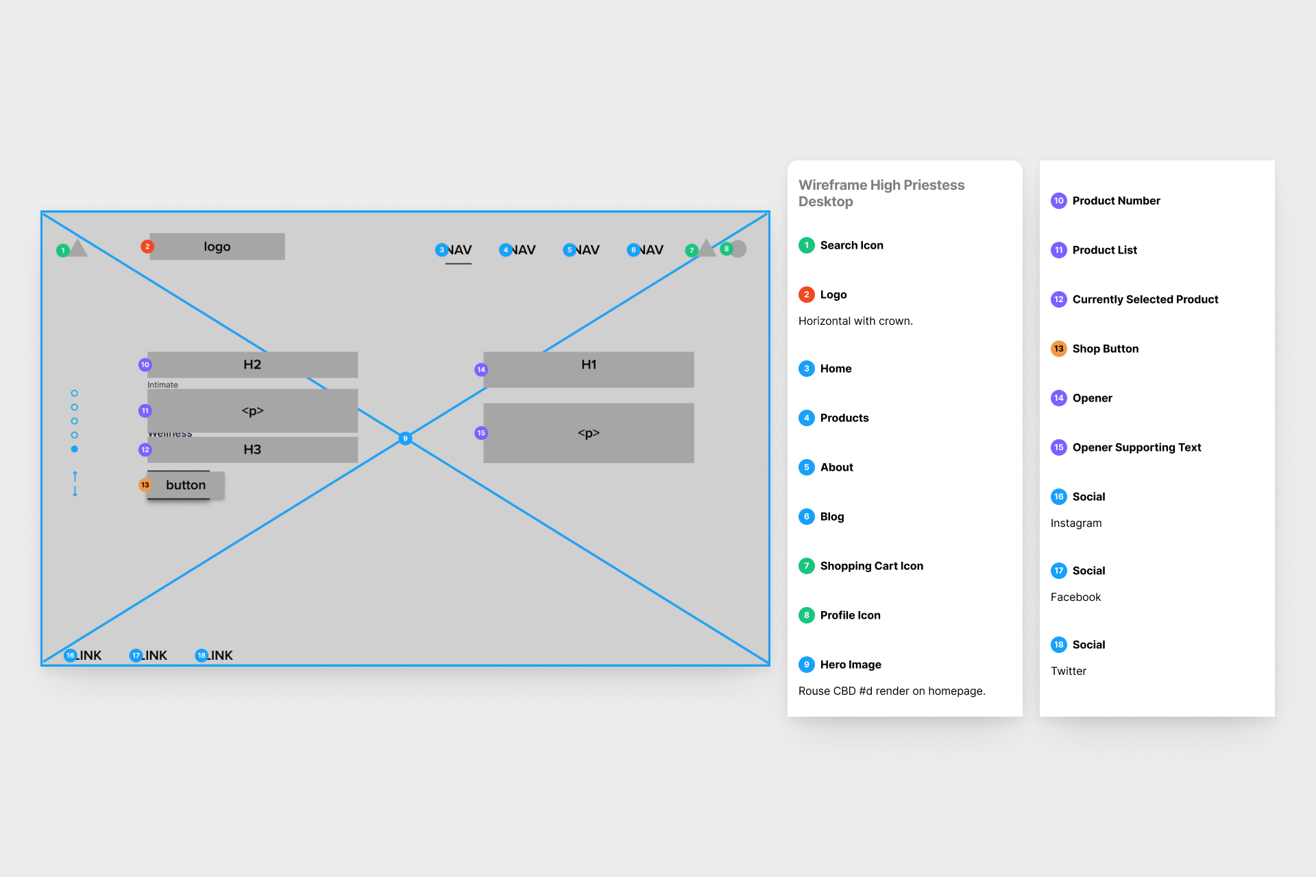
Annotated wireframe of the landing page.
Because online sales account for a large part of most retail revenue, I knew that a beautiful and easy-to-navigate website would be important. I featured 3D renderings of the products on sets of the corresponding colors.
To ensure that the site was usable by a wide range of people, I adhered to the Web Content Accessibility Guidelines regarding color contrast, text size, and spacing.
Video mockup of the homepage concept in action.
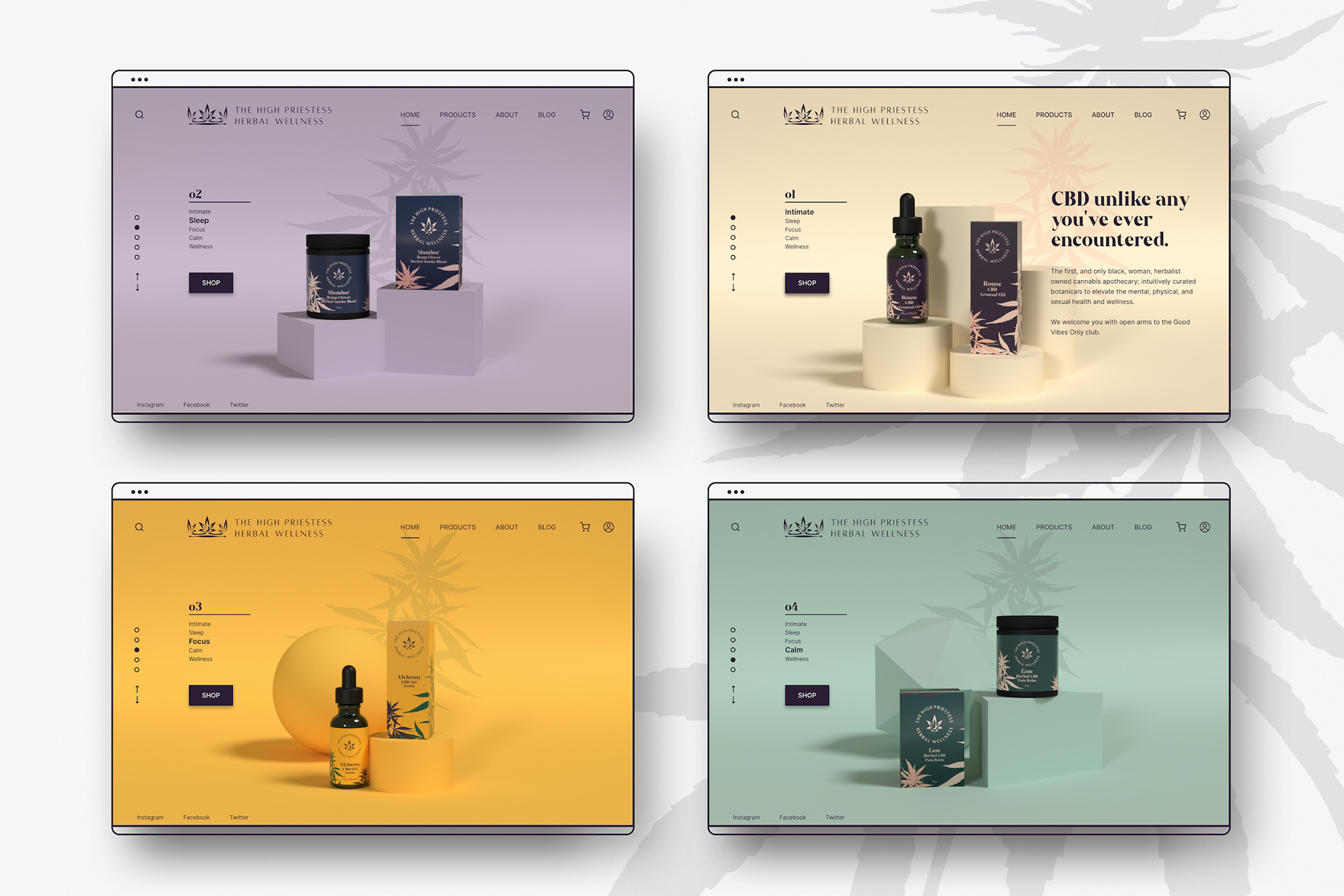
Mockups of the 3D rendered products and landing page concept.
Takeaways
The experience of working closely with the CEO of a small company, printers, dielines, and another graphic designer was invaluable to my growth as a designer.
File-naming conventions and folder structure were my saving grace in keeping track of this amount of information. The component system that I put in place was successfully passed to the next designer that High Priestess brought on board. High Priestess has had a successful launch and is growing quickly.
If I were to have the opportunity to remount this project in the future, I would set time aside for user testing. I would AB test the color palette, I would interview users about their previous impressions of cannabis packaging, and I would ask users to test a prototype of the landing page.
I’m very much looking forward to this type of problem-solving in the future!

← Anchor AR Interface

ASESO →